This post is written by Kaiser, not Andrew.
Harvard Magazine printed the following chart that confirms a trend in undergraduate majors that we all know about: students are favoring STEM majors at the expense of humanities.
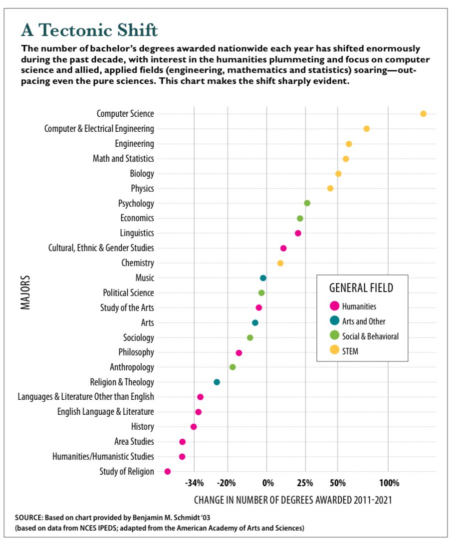
I like the chart. The dot plot is great for showing this dataset. They placed the long text horizontally. The use of color is crucial, allowing us to visually separate the STEM majors from the humanities majors.
Then, the axis announced itself.
I was baffled, then disgusted.
Here is a magnified view of the axis:
Notice the following features of this transformed scale:
- It can’t be a log scale because many of the growth values are negative.
- The interval for 0%-25% is longer than for 25%-50%. The interval for 0%-50% is also longer than for 50%-100%. On the positive side, the larger values are pulled in and the smaller values are pushed out.
- The interval for -20%-0% is the same length as that for 0%-25%. So, the transformation is not symmetric around 0.
I have no idea what transformation was applied. I took the growth values, measured the locations of the dots, and asked Excel to fit a polynomial function, and it gave me a quadratic fit, R square > 99%.
Here’s the first time I’ve seen this transform: -50 x^2 + 240 x – 7.
This formula fits the values within the range extremely well. I hope this isn’t the actual transformation. That would be disgusting. Regardless, they ought to have advised readers of their unusual scale.
Using the inferred formula, I retrieved the original growth values. They are not extreme, falling between -50% and 125%. There is nothing to be gained by transforming the scale.
The following chart undoes the transformation.

(I also grouped the majors by their fields.)
P.S. A number of readers have figured out the actual transformation, which is the log of the relative ratio of the number of degrees. A reader also pointed us to an article by Benjamin Schmidt who made the original chart. In several other analyses, he looked at “market share” metrics. I prefer the share metric also for this chart. In the above, a 50% increase doesn’t really balance out a 33% decrease because the 2011 values differ across majors.
P.P.S. Schmidt adds some useful information in comments:
Yeah, this is code that I run every year. Harvard Magazine asked if they could use the 2022 version, and must have done something in Illustrator. (Also they dropped a bunch of fields that don’t apply to Harvard–Harvard has no business major, so they hide business.)
I’ll switch it to label fractions rather than percentages next time, and grouping across areas as above is a solid improvement. But the real problem here is that there aren’t *enough* log scales in the world for it to be obvious what’s going on. They are better when discussing rates of change. A linear scale implies the possibility of a 150% drop. That’s worse than meaningless–it’s connected to a lot of mistaken reasoning about percentages. (E.g. people thinking that a 5% drop followed by a 5% rise would bring you back to the same point; the failure to understand compound interest; etc.) IMO charts shouldn’t reflect expectations when those expectations rest on bad mental models.
Here, FWIW, is the code.
p1 = c2 %>%
ggplot() + aes(color = label, y = change, x = reorder(Discipline, change, function(x) {x[1]})) +
geom_point() + labs(title=paste0(“Fig. 1: Change in degrees, “, y1, “-“, y2), y = paste0(“Change in number awarded “, y1, “-“, y2), x = “Major”, color = “General Field”, caption = “Sources: NCES IPEDS data; taxonomy adapted from American Academy of Arts and Sciences.\nBen Schmidt, 2022”) +
coord_flip() + scale_y_continuous(breaks = c(1/2, 2/3, 4/5, 1, 5/4, 3/2, 2, 3), labels=scales::percent(c(1/2, 2/3, 4/5, 1, 5/4, 3/2, 2, 3) – 1)) + theme_bw() + scale_x_discrete(“Major”) + theme(legend.position = “bottom”) + scale_color_brewer(type=’qual’, palette = 2, guide = guide_legend(ncol = 2))
My goodness, I could scream
a weird & unnecessary choice for sure
I think there is a dearth of intuitive transforms that squeeze large real numbers in towards zero more than they do small numbers — my usual ‘go-to’s are a ‘pseudolog’ (ie, for f(x) = x for |x| < 1, otherwise f(x) = log(|x|) * sign(x)) or the inverse hyperbolic sine f(x) = asinh(x), but IME many find the latter a bit confusing
Huh.
I usually go for a signed log with offset.
e.g.
sign(t)* ( log(abs(t) + offset) – log(offset))
Is one or the other better? Also wouldn’t your setup require (1+ log(|x|)) * sign(x)) instead for continuity?
ah whoops yeah you’re right! sorry was typing on the fly (on mobile iirc) nice catch!
Adding 1 to the abs value is definitely another option! Better for higher order continuity too, though I’ve had people tell me they like linearity in the (-1,1) range
log(proportional change) seems to do a good job of accounting for the strange scale here:
ln(1-.34) = -.42
ln(1-.2) = -.22
ln(1) = 0
ln(1+.25) = .22
ln(1+.5) = .41
ln(1+1) = .69
This idiotic scale was ripped off by someone at Harvard Magazine who was both uncritical and innumerate; it appeared years ago in another plot. For the original, look up Benjamin Schmidt, “The History BA Since the Great Recession.” I commented on this in a blog post a while back called “Local trends in college majors (Or: Do Oregon students choose offbeat degrees?)” and included the graph and comments — I’ll give a link in a reply, since links send my comments to Spam.
As promised: https://eighteenthelephant.com/2018/12/29/local-trends-in-college-majors-or-do-oregon-students-choose-offbeat-degrees/
(From 2018! I should revisit this.)
Thanks, I tried to find the one it was based on but gave up. So the axis goes back to Smith.
Thanks for this link. Interesting it’s been floating around.
Reading more carefully, I’m now more confused. The data on the Harvard Magazine graph appears to be more up-to-date (2021) than Schmidt’s original (2018), and the text below the graphic states that it’s based on a chart from Schmidt. But if someone (the magazine or Schmidt) updated the 2018 chart, (i) why would they have kept the bizarre, hand-fudged scale, and (ii) *how* would they have kept that scale, other than pushing points around by hand? (Schmidt’s 2018 article is quite good, by the way, despite the tortured chart.)
Poking around, the culprit seems to be Schmidt himself: https://twitter.com/benmschmidt/status/1562227440314982401
Again: *how* ?!
Yeah, this is code that I run every year. Harvard Magazine asked if they could use the 2022 version, and must have done something in Illustrator. (Also they dropped a bunch of fields that don’t apply to Harvard–Harvard has no business major, so they hide business.)
I’ll switch it to label fractions rather than percentages next time, and grouping across areas as above is a solid improvement. But the real problem here is that there aren’t *enough* log scales in the world for it to be obvious what’s going on. They are better when discussing rates of change. A linear scale implies the possibility of a 150% drop. That’s worse than meaningless–it’s connected to a lot of mistaken reasoning about percentages. (E.g. people thinking that a 5% drop followed by a 5% rise would bring you back to the same point; the failure to understand compound interest; etc.) IMO charts shouldn’t reflect expectations when those expectations rest on bad mental models.
Here, FWIW, is the code.
p1 = c2 %>%
ggplot() + aes(color = label, y = change, x = reorder(Discipline, change, function(x) {x[1]})) +
geom_point() + labs(title=paste0(“Fig. 1: Change in degrees, “, y1, “-“, y2), y = paste0(“Change in number awarded “, y1, “-“, y2), x = “Major”, color = “General Field”, caption = “Sources: NCES IPEDS data; taxonomy adapted from American Academy of Arts and Sciences.\nBen Schmidt, 2022”) +
coord_flip() + scale_y_continuous(breaks = c(1/2, 2/3, 4/5, 1, 5/4, 3/2, 2, 3), labels=scales::percent(c(1/2, 2/3, 4/5, 1, 5/4, 3/2, 2, 3) – 1)) + theme_bw() + scale_x_discrete(“Major”) + theme(legend.position = “bottom”) + scale_color_brewer(type=’qual’, palette = 2, guide = guide_legend(ncol = 2)).
Ben,
Thanks for the feedback—that’s super interesting.
Thanks for the clarification regarding majors – but I find it offensive that Harvard does not include business degrees because they don’t have an undergraduate business degree – when the graph and data comes from IPEDS. It seems like a classic Ivy League elitist attitude – if we don’t do it, then we can ignore what everyone else does. Note: I am not defending the undergraduate business degree (which I have plenty of issues with), but the accuracy of the picture from the data is my concern.
Thanks for sharing this!
Hi Ben,
Thanks for the response. With the log scale, you have the nice feature that the same length of each side balances out. I’m not sure of the utility of that, though. It only works well with sequential data where the numerator of the first ratio is the denominator of the second ratio. Have you tried plotting change in share of total? That also takes into account the change in the total number of degrees from year to year.
The problem with plotting change in share of total–if I understand correctly what you mean–is that tiny majors like linguistics or religion will appear to be steady while big ones like English and CS careen around. But the relative drops in all the humanities fields are actually pretty comparable.
It occurs to me that another way of thinking about the quantity being plotted here is to call it ‘pointwise mutual information’; it’s the ratio of what we see in the current year compared to our expectation based on the historical rate. A logarithm is baked into the formula for PMI because doubling (like computer science) is the same magnitude of change as halving (like history).
Of course PMI is not exactly what I’m showing, because I plot changes in absolute numbers, not ratios. That has extremely specific reasons here. I first made this chart in like 2018 or 2019 for the magazine of the American Historical Association. If you show historians that their market share of majors is going down, many will obstinately insist it’s only an artifact of more students going to college. (Historians are ironically uncomfortable with the idea that things are changing in the present day.) Since the absolute numbers look almost as bad as relative ones, I used them instead to try to convince historians that the field was actually in a rough place. But outside that context, there’s no especially good reason.
Hi Ben, the only choice I have is to put the response here, which might appear above your comment.
In terms of change of share, would it work if you define it as a relative ratio of share 2021 / share 2011?
Ultimately, which metric depends on what story you are trying to tell. Assume both Engineering and Religion went up 50%, so both have a factor of 1.5 and would show up in the same location on the log relative ratio scale. In what sense are they the same? Religion has in fact lagged despite the same relative ratio because Religion has been less popular to begin with. In this sense, Religion has to increase by more than 50% to catch up.
I’ll see if I have time to explore a few options, and I’ll blog more about this if I have any interesting finding.
Your mistake is inferring a formula. Looking at the fonts, etc I am pretty confident this was made with Adobe Illustrator. If not specifically that, then some similar graphic design software. But I would bet Illustrator.
Instead infer that someone took a vector graphic produced by Benjamin M. Smith. They then added the text and either stretched it out to “make the shift sharply evident”, or guesstimated axis values because they did not like the appearance of the original one.
I was visiting a friend at a marketing firm one time and happened to see a chart his colleague had made. When I mentioned there should be values on the axes to know what it represented, they were very confused. My friend said I was a “quant” or something like that and we all moved on with life.
Yes, I am pretty sure this is what happened.
I have seen people use Adobe Illustrator (or something equivalent) for “typesetting” math formulas, and even musical score (yes, you are reading this right, drawing the notes manually, instead of using something like Lilypond to produce beautiful scores).
“Drawing” a mere graph is commonplace. People committing these crimes against data would be amazed to hear that there is software for this, other than Excel.
So you are pretty confident that it’s purely by chance that their lines -34% (~ 2/3 – 1), -20% (4/5 – 1), 0% (1 – 1), 25% (5/4 – 1), 50% (3/2 – 1) and 100% (2 – 1) happen to match the relative positions of log(2/3), log(4/5), log(1), log(5/4), log(3/2) and log(2)?
Looks like a log transform. This could explain why (-20,0) is the same size as (0,25). Both are 4/5 ratios. The labeling is %-change but the scale is log-ratio.
They couldn’t do a straightforward log transform because of negatives. If they did the sign(x) * log10(abs(x)) sort of thing, the values near zero should have been negative bigly but no such discontinuity exists. So it’s more complicated than that.
You can get rid of the negatives by adding 100%. So 0% change is 100% of last year, 25% increase is 125% of last year, etc etc. This is what you want to log transform.
25% more is *1.25
20% less is /1.25
50% more is *1.5
34% less is /1.5 (ish)
This is then sensible to log transform.
There aren’t any negative values if you convert from percentage change to relative scale.
So:
0% => 1.00
-20% => 0.80
+25% => 1.25
And log(0.80) = -log(1.25) which is why the distance between -20% and +25% is the same.
The scale on the x-axis is *log ratio of number of degrees awarded in the last year over number of degrees awarded in the first year.* Nobody is taking a log of a negative number. They are just labeling -20% (80% is the ratio of degrees granted) at the log(4/5) point on the x-axis, 0% at the log(1) point, and +25% at the log (5/4) point, which are equally spaced on a log scale. It’s a pretty normal and perfectly reasonable way to label a log scale.
Why is business not listed as a degree?
That’s a good question. How majors are aggregated is strange throughout. I’m intrigued that Engineering is one big category except for Computer Science and Computer Engineering; then you have “Arts” which is different from “Study of the Arts”, and “Religion & Theology” is different from “Study of Religion”, etc.
Statistics being lumped together with Mathematics…
Yes, I was going to point out that most statisticians work on “social and behavioral” topics. Or maybe that makes psychologists who do NHSTs mathematicians!
Anyway, it seems unfair to criticize or mock the graph-making skills of someone whose real challenge is idea-making.
Log[1+x].
y = log(x+1)
Or equivalently, y = log(n_2021 / n_2011).
The only real problem here is that the labels on the axis are “% change” (e.g. +20%) rather than “relative ratio” (1.2).
> It can’t be a log scale because many of the growth values are negative.
The most natural scale for % change is log of the multiplier, which is exactly what this is. Am I really reading a statistics blog here?
It makes no sense to use log of the multiplier as the scale and then label it with percentage values that obscure that transformation. It’s like having a linear scale and choosing tick labels from the Fibonacci sequence. Sure, you could do it, but …
I know nothing about statistics, and it’s just very obviously a log scale, and it makes perfect sense in this case. I’m similarly perplexed as you are as to this blog and some of the comments here. This is no rocket science.
Kaiser:
Scaling issues aside, I agree that the graph is improved by grouping majors the way you did.
Regarding the scaling: it seems that some of the commenters figured this one out. But I agree with you that in this case a linear scale is clearer. I see no benefit to the logarithmic scale: it doesn’t make the patterns easier to see, and it just creates an unnecessary puzzle for the reader, as we saw here.
Just two things:
1. If you’re gonna make this graph, you should have a hard boundary at 0 (that is, -100% on the graph). In the current version the graph goes below -100%, which obscures the proportionality.
2. I’d prefer a y vs. x scatterplot, showing % of undergraduate degrees now vs. % ten years ago.
3. As Dale says, it’s bizarre to have a category “cultural ethnic gender” and nothing for the huge “business” category.
It might be interesting to make the size of the dots proportional to the absolute number of graduates in each major.