Yair Ghitza and Mark Steitz write:
The Deep Maps model of the labor force projects official government labor force statistics down to specific neighborhoods and types of people in those places. In this website, you can create maps that show estimates of unemployment and labor force participation by race, education, age, gender, marital status, and citizenship. You can track labor force data over time and examine estimates of the disparate impact of the crisis on different communities. It is our hope that these estimates will be of help to policy makers, analysts, reporters, and citizens who are trying to understand the fast-changing dynamics of the current economic crisis.
These are modeled inferences, not reported data. They should be seen as suggestive rather than definitive evidence. They have uncertainty around them, especially for the smallest groups. We recommend they be used alongside other sources of data when possible.
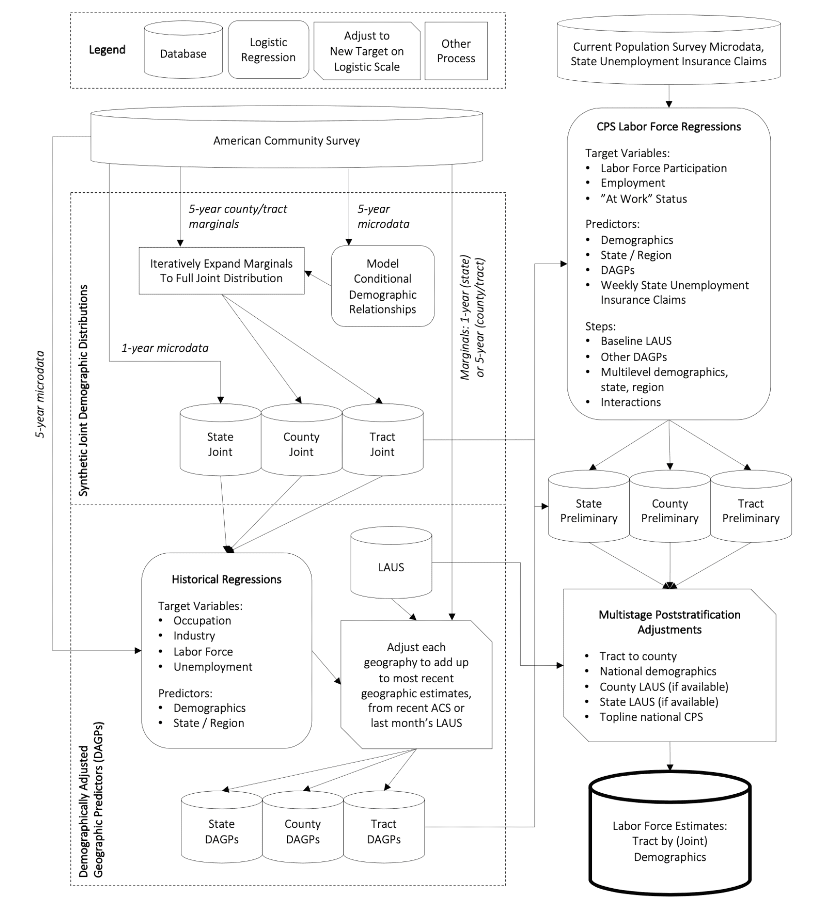
This project uses publicly available data sources from the Census, Bureau of Labor Statistics, and other places. A detailed explanation of the methodology can be found here; the code here.
This is worth looking at, and not just if you’re interested in unemployment statistics. There’s this thing in statistics where some people talk about data munging and other people talk about modeling. This project demonstrates how both are important.
I suspect it will take me months (if not years) to truly decipher what has been done here, so I am hoping someone can give me a concise intuitive response to my question. Overall, this is a valuable effort and the writeup appears to adequately describe the many caveats about what they have done. My question concerns the geographic granularity of their results. They point out the relatively large margins of error in the underlying data (e.g., the American Community Survey data) for small subgroups, but they don’t appear to use these margins of error in their analyses. If I look at the results, the large variation across census tracts seems plausible to me for the amount of variation, but perhaps not for the comparisons between individual census tracts. They note this in their writeup – some of the geographic boundaries appear to show too much variation between adjacent areas.
I guess I find the variation of results (for example, unemployment due to COVID) across geography plausible, though perhaps not the estimates for any individual geographies that are highly granular. The model is capable of producing highly granular estimates, but we know the accuracy declines with granularity given the increasing margins of error of the underlying data. Yet their results seem to sweep this under the rug, despite their admirable and accurate cautions about their methodology.
Can anyone shed light on how granular we can/should view the results compared with the uncertainty in the underlying data? Maps take on a life of their own – I find their appeal seductive. I can well believe that some areas of New York City had 50% unemployment while others had 5% unemployment – but I’m not sure I believe the map can accurately portray the areas for each, or whether the 50% and 5% are reasonable point estimates for these granular areas.
It is one of those times where you wait for the model to demonstrate some kind of predictive skill. If the model predicts something surprising and it comes true, then you expend the effort to look under the hood.
Since this isn’t mentioned in the first paragraph it is safe to assume it has not been done (at least yet) in this case.