This is Jessica. In a recent visualization paper with Alex Kale and Yifan Wu, we looked at how well people could draw causal inferences from graphs. This seemed interesting since talking about doing exploratory visual analysis, we often casually allude to how people use plots to investigate possible causal relationships. Visual analysis software makes it easy to flip through different filters and add and remove variables to plots, which might seem well intended to support assessing causation. But, there isn’t much research assessing how well graphical formats, either static or interactive, help people assess the compatibility of data and various causal models. So, we set out to see how well visualizations of contingency table data like one could easily generate in a tool help people assess cause and effect.
We did a few online experiments that involved showing people data and asking them to allocate belief across a set of possible data generating processes, which we summarized for them as DAGs. For example, in a first experiment on a relatively straightforward causal attribution task, we plotted contingency data like the bar charts below, and asked them to allocate probability across the two DAGs to the left. Specifically, we asked “How much do you believe in each of the causal explanations described below?” and told them to imagine having 100 votes to allocate across the two possible explanations. They were told to imagine that these explanations are the only plausible ones, and that there is no reason to believe a priori that one explanation is more likely than the other.
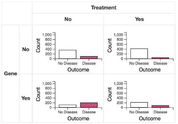
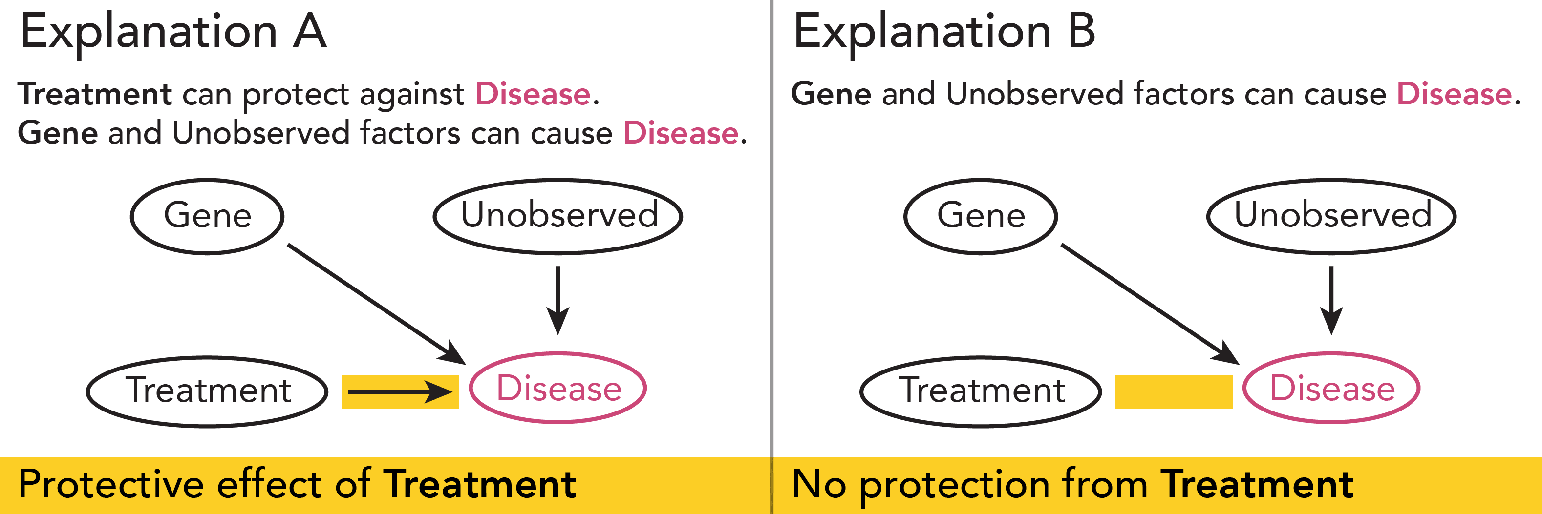
We evaluated people’s responses against posterior probabilities calculated using what has been called causal support, basically posterior log odds of one data generating process (or possibly a set of them that share some structure) over a set of alternative data generating processes, given a dataset.
We also did a second experiment where the task was harder: there were four possible DAGs, same nodes as those above, but they had to judge potential confounding of the treatment effect from a gene.
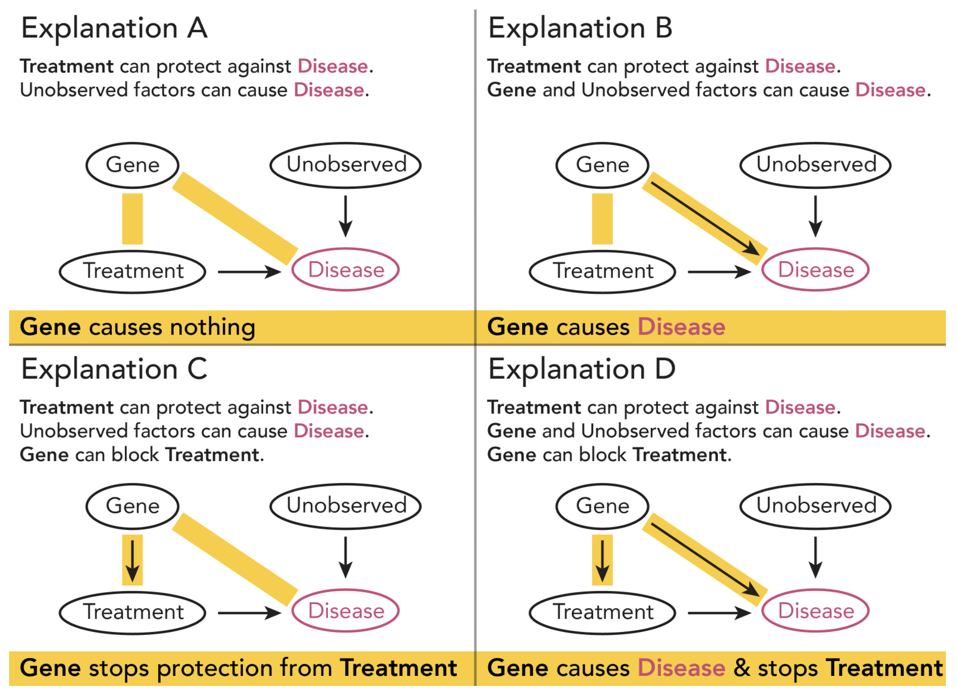
We modeled results from both experiments using a linear in log odds model, estimating both sensitivity to changes in the ground truth level of causal support (i.e., underlying log likelihood ratio), and bias in perceived causal support.
Here’s a plot of sensitivity (LLO slopes, where 1 means the ideal, one-to-one relationship between users’ responses and causal support) for the first experiment. People were not very sensitive with any of the visualizations we tested.

Some of the visualization conditions we tested were interactive (e.g., interactive bar charts where clicking on a bar in one chart filtered to only those observations in the other chart, or collapsible table-style bar charts or icon arrays). But interacting alone didn’t necessarily help people with the probability judgment, since some visualizations, like the collapsible ones, were less likely to lead to interactions to show counterfactuals.
In the conditions where the sensitivity was greatest, we saw a tendency among users to be more sensitive to causal support at negative values of delta p, a parameter we varied along with sample size to generate the stimuli. Delta p captures the difference in the proportion of people with disease in each data set depending on whether they received treatment, and when negative evidence is toward disconfirming the treatment effect. We also saw a strong tendency to discount sample size, which we’ve seen in other work comparing people’s inferences from graphs to Bayesian model predictions. It could be something cognitive like non-belief in the law of large numbers, or something related to logarithmic perception. We also saw a fair amount of bias in probability allocations when we looked at the average response when there is no signal (causal support is 0), again across conditions.
For the confounding detection task, we asked people to describe how they used the graphs, as we often do in these kinds of experiments to try to better understand the results. While many (about 45% of 519) gave uninformative responses, of the remainder, about 80% described using what should have been an adequate strategy. So, it doesn’t seem we can write off the results as driven by people not knowing what they were supposed to be looking for, though it should be noted that these experiments were run on Mechanical Turk, not an analyst population, so definitely worth following up with a study on analysts.
At any rate, these results were interesting to us because they suggest that visualizations don’t necessarily make it easy for people to assess causal explanations, despite how much we might like to tout the value of exploratory visual analysis and interactivity for building intuitions about causal relationships. If we see something similar with more experienced visual analysts, we might consider building in causal modeling into visual analysis tools, to help analysts check their intuitions about causality against a statistical estimate. This is along the lines of the kind of tools Andrew and I suggest here, and something we are currently thinking about in my lab. But, this work suggests to me there’s still a number of unanswered questions around how much an approach like causal support should align with human judgments about possible generating processes.
For example, the fact that people seem more sensitive to disconfirming evidence wasn’t something we had expected. It reminds me a bit of the idea in an older paper that Andrew blogged a few months ago. The paper distinguishes trying to identify where there may be cause and effect using covariance or probabilistic contrasts, where one relies on and seeks out direct information about covaration between elements of an event, versus hypothesizing some possible mechanisms and looking for information about whether the target event satisfies the necessary preconditions. The paper does some experiments to look at whether people seem to seek information in a way that supports the latter (finding that they do). They describe the difference in approaches as a difference between empirical generalization driving the analysis, versus theoretical constructs or principles that hold as long as their preconditions are met. The way we presented a set of possible DAGs, and the causal support model in general, aligns with the causal mechanism approach. It’s possible people in our experiment sought disconfirming evidence as the easiest way to test a hypothesis that some process generated the data. But which form do existing visual analysis tools tend to better support? Maybe there are ways to make tests for confirming/disconfirming easier for people, through different visualizations or more support for representing models in tools.
One tricky part is that, at least when using causal support, we have to assume that people reason about a finite set of mechanisms they believe are the plausible ones. I wonder how natural this is. If I imagine about being shown some data on co-varying factors, like shark attacks and ice cream sales, and asked to think of possible explanatory variables, I’m not sure how long I’d have to brainstorm before I’d feel confident concluding that I had throughly explored the set of possible explanations. Would my probability allocations across those ever look like I had assumed the set was complete? Even if they did, how easy is it for a person to translate their internal degrees of belief in each model to a set of probabilities that sum to 1? Maybe there’s a way to benchmark that amount of noise that we should expect in experiments like this simply from the difficulty of this translation, or to improve the elicitation through some kind of incentive structure. Suggestions or related work welcome!
Auto-correct has changed “causal support” to “casual support” in a couple of places.
Ah, casual support. Sounds much less tedious. I think I caught them all, thx!
“Even if they did, how easy is it for a person to translate their internal degrees of belief in each model to a set of probabilities that sum to 1? ”
I don’t think that people generally do this. Maybe they never do. Of course, it depends on what you mean by “belief”, but I suggest that “internal degrees of belief” are basically non-cognitive while “a set of probabilities that sum to 1” is highly cognitive – it takes careful thinking about and is hard to do. These two modes are not very compatible, and there is no reason they should be mathematically consistent.
To me, this suggests trying to approach the matter through the lens of fuzzy logic – basically that people assess how well data seems to fit a variety of templates. This approach removes the need for orthogonal categories and measures that must sum to unity.
I don’t disagree. There’s some work in psych (like the original causal support paper) that elicits people’s degrees of belief in various relationships, but rather than trying to compare directly to Bayesian probabilities the responses are used to look for patterns that support people reasoning about cause in a certain way (similar to the paper by Andrew’s sister that I cited in the post). I would like to think that there are ways to do which could give more information on mismatch than simply computing correlations between causal support probabilities and responses, but it’s definitely tricky to make absolute comparisons.
Great stuff – tx for sharing. In the 1980s Beat Kleiner and colleagues did such experiments regarding the display of contingency tables. A point worth looking into, is the dynamic effect of conditioning DAGs. This is not the filtering mentioned in the blog. The DAG lets you condition on inputs (prediction) or outputs (diagnostics) and assess effects (via Bayes theorem…). This is different from the static experiments done here. See for example https://papers.ssrn.com/sol3/papers.cfm?abstract_id=2172713 and https://onlinelibrary.wiley.com/doi/10.1002/9781118445112.stat03928.pub2
Thanks, I’ll check these out.