This is Jessica. G. Elliot Morris points me to some recent visualizations of the Economist’s forecast for the upcoming election in Germany, which emphasize a range of plausible outcomes over point estimates. Forecast displays that lead with the uncertainty came up as we were writing this paper with Andrew and Chris Wlezien last fall, and in this previous post where I was questioning whether there is a middle ground in communicating election forecast uncertainty, given that the demand for forecasts seems tied in part from a desire for quick answers. I think this latest Economist forecast display achieves a nice balance, in that they use a representation of uncertainty that’s likely to be more familiar (intervals) but avoid providing the crutches of points estimates and probabilities of winning.
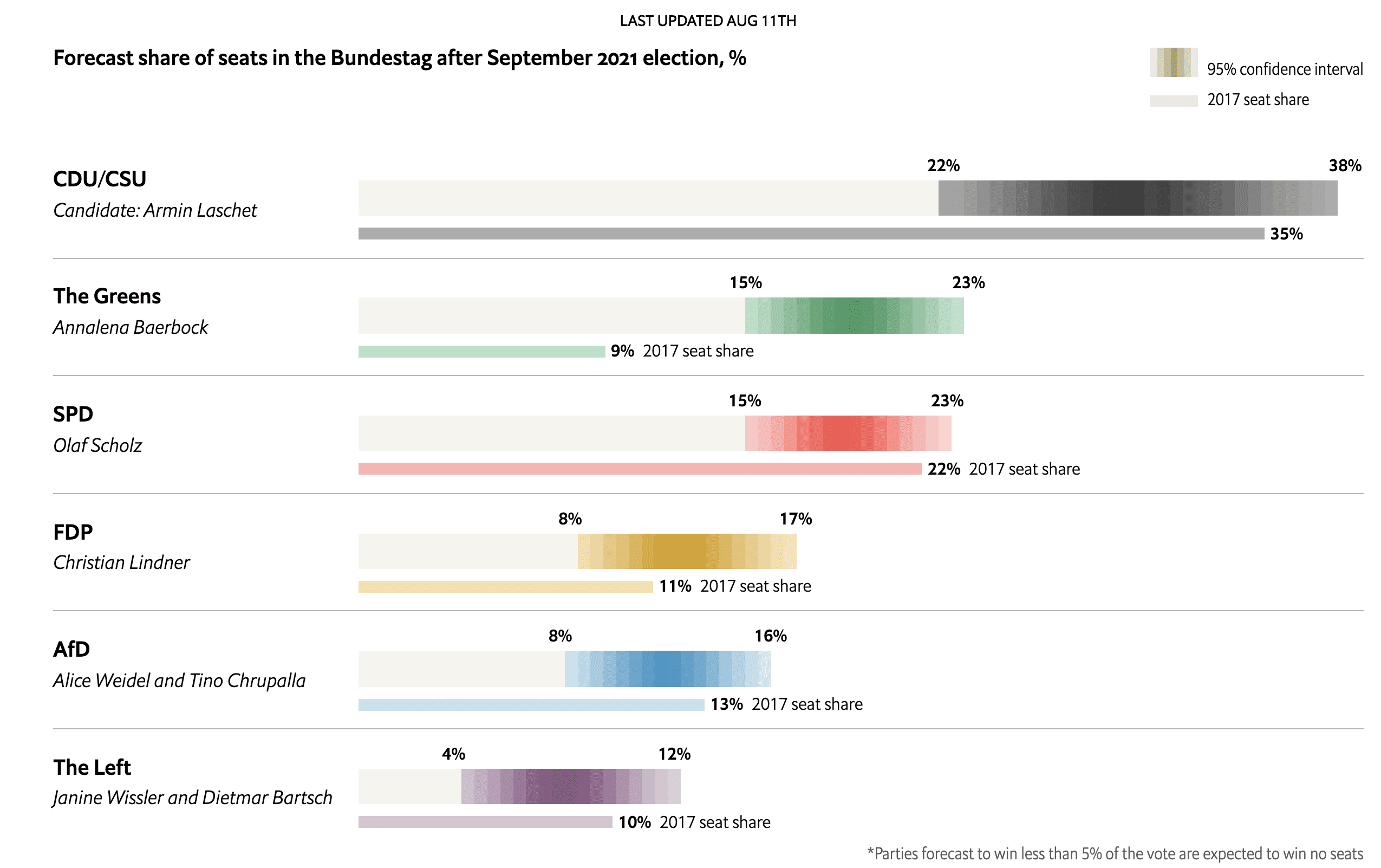
The shaded ranges depict an ensemble of predicted seat shares generated by applying the forecast model (based on polls and fundamentals) repeatedly while varying parties’ vote shares within the error range inferred from historical data. But check the modeling description for more detail.
One could compare this to FiveThirtyEight’s 2020 U.S. Presidential election display which seemed like a bold, uncertainty-forward move over their previous forecast displays, for example by making the first thing you see upon landing on the page a grid of maps colored by predicted probability. But FiveThirtyEight’s ball-swarm chart, which got a lot of appreciation for the frequency framing of probability, still made it very easy to get probability of winning if that’s what one was after. I like the absence of direct probability of win information in the Economist German forecast. I also like that the Economist is avoiding any high-level text pointing to the candidate favored to win (FiveThirtyEight’s map grid was still accompanied by large text describing who was predicted to win). Maybe there’s some extra sense of uncertainty invoked simply from the act of having to figure it out from a graph rather than hearing it from the title directly. So the latest Economist display seems like a bold move.
Their hybrid interval plus gradient reminds me of Bank of England fan charts, which similarly combine gradients and intervals:

There are multiple things to like about BOE’s fan charts. They also suppress the point estimate for the future projection, plus they often use a gradient interval depiction to show uncertainty around the historical data, i.e., to denote that these estimates might get revised (and these errors estimates are often propagated to the future projections, similar to what Economist is doing by accounting for polling error). Visual judgment-wise, using a stepped gradient rather than a continuous color ramp may reduce the error that arises when people try to estimate probabilities from a continuous color gradient, since color lightness is an error-prone channel to read values from. In the Economist display, it’s not clear what the interval probability breaks are, but it would be nice if they were designed with easy increments and an odd number of shades so that even if the distribution isn’t symmetric, the color lightness still decreases the same amount each step out to the end of the interval. This is standard with BOE charts, which typically show a 90% interval broken divided into 30% increments (left) or 10% increments (right).
I’m also reminded of an animated forecast visualization Amanda Cox, Josh Katz, and Kevin Quealy once did, where they showed an estimate from each of multiple models as an animated dot. They annotate point estimates (medians) but the annotation is also animated according to the changing distribution.
So is withholding the point estimate a good idea? There’s not a lot of empirical evidence that I’m aware of, perhaps because this idea goes against the grain to some extent (e.g., in some applications of uncertainty visualization, mean emphasis has alternatively been suggested as a good strategy, since distribution location is needed for visual identification of different distributions and judgments like clustering). The only empirical research I know of that looks at the effect of removing a point estimate from an interval is an online experiment Alex Kale, Matt Kay and I did, where we had people look at representations of two distributions, one representing their score in a fictional game without purchasing an intervention and one representing their score if they purchased the intervention. We varied within subjects whether they saw a mean annotation atop the chart (testing quantile dotplots, animated hypothetical outcome plots, density plots, and intervals). The task put to the participants was to decide whether or not to purchase the intervention, which cost them money but improved their chances of winning an additional monetary award. We set it up so we could compare their decisions to the utility maximizing decision of a risk neutral player. We found that while quantile dotplots led to more accurate estimates of effect size (specifically, estimates of the probability of scoring more points with the intervention), intervals without means led to the least biased decisions when the variance in the distributions was relatively high, as it seems to be in these German election predictions.
Overall though, in that experiment the effect of annotating the mean was relatively small, even on displays where it was otherwise more ambiguous (like intervals and even more so, animated hypothetical outcome plots, where depending on the amount of variance it can be hard to estimate intuitively). The slight effect seems to be in large part because at least in our MTurk sample, many people reported relying on heuristics like mapping the amount of visual distance between what they perceived as central tendency in each distribution to an effect size scale, and strategies like this were used even when they had to estimate the means. Still, election forecasting seems like a good application for thinking carefully about these small display tweaks, since you have potentially millions of people looking at these displays.
Hmm, maybe this was mentioned before, but what is the objection to having the probability of winning? Laypersons misinterpreting that value?
+1 same question, cause we could plot probability of winning with uncertainty or whatnot as well. Like on the last US election the state predictions and discussion of correlations and whatnot were interesting from a diagnostic standpoint — but as a lay-person I think the overall win/loss was more interesting.
We talk about them in the first paper link in the post above. Small changes in expected vote share correspond to large changes in probability of winning. One issue is that the precision in estimated vote share that probability of win can imply is often unrealistic (e.g., 80% vs 81% can imply that we have access to more information about estimated vote share than we actually do). Another is that probability of winning, by amplifying small differences in vote share, can make people underestimate the closeness of a race, which may have implications for behavior (see for instance this paper: https://www.journals.uchicago.edu/doi/pdf/10.1086/708682)
> One issue is that the precision in estimated vote share that probability of win can imply is often unrealistic
Oh oh. I’m reading this is the underlying data here are various polls, and we’re stacking a lot of machinery on top to get the national results, and a specific win/loss thing, due to this precision thing, could be vulnerable to any number of tough assumptions along the way.
So from this perspective we dodge the win/loss plots because we don’t actually feel super good about the predictions.
I know this is not part of the discussion but I’m intrigued by the BOE fan charts.
Why the length of the intervals increase from the beginning of the data?
Are they conditional on the first data point?
Also, how random are the data since they always lie on the highest density part of the chart?
I think you mean the width of the intervals? For the observed data, the further in the past it is, the less likely its going to get revised (according to historical data on revisions to estimates). For the future projection, the further in the future we are predicting, the more error we expect.
The black line shows what values are currently on record. The intervals on the observed data are showing the range of possible revisions to those estimates, based on what is known about how estimates have previously been revised. They aren’t predicting bias in the historical data, just uncertainty.
Jessica (or others), do you have any thoughts or examples on dependent or related uncertainties? In the German election example here, if CSU under-performs then maybe you expect the Greens to over-perform a little but SPD to over-perform a lot because of voting preferences (just making that up, I know nothing about these parties). I can think of some dynamic displays with sliders or the like but I wonder if there’s a good static way of showing that kind of uncertainty.
The Bayesian models that the Economist has been using account for correlations, but yes, it would be very cool if a display let you see predictions conditional on some correlated event occuring.
Since posting this, people have informed me of several other gradient-interval examples from forecasts, including CNN’s 2018 House races (https://www.cnn.com/election/2018/forecast/house) and Washington Post 2020 election graphics, but I can’t find a link to the latter.
Reading this led to a heated debate with a colleague. He says it’s always presumptuous/paternalistic/unethical to withhold data from the public. I reminded him of the mass insanity that arose over COVID models early on, and suggested that might’ve been avoided had authors hidden point estimates in their papers, at least in the pre-prints. He reminded me that, had they done so, I’d have howled about a lack of transparency–and that several unethical or inaccurate analyses were caught out early because we had full access to the data. As for the published findings, journals are terrible at deciding which data should be disclosed or not. I countered that any concerns about keeping certain statistics out of the non-scientific media are offset by the virtue of preventing people from being misled. He countered that anything hidden by one news source is going to be revealed by another, so we’re just claiming the higher ground to feel good about ourselves. Better that people should receive the point estimates from responsible outlets that also give all the caveats. And so on.
Seriously, I’d stop talking to this guy altogether if we didn’t share office space in the same skull.
I’m not sure what you are saying here – is not providing the point estimate “withholding data?” If that is your colleague’s position, then it makes no sense at all. Providing the distribution of possibilities is more data than providing the point estimate. If she/he wants to quibble that a point estimate is data in addition to the distribution, then there are many other (perhaps infinite) points that could be provided as well – including points that have nothing at all to do with the analysis.
I’m all for making data available, even more extreme than most people in that regard. But I find the point estimate the antithesis of data – it dangerously summarizes the data in unproductive ways. I do think that withholding data about the distribution around any point estimate is wrong, the opposite of what you seem to be describing.
Seems like your colleague is missing the point that any visualization is a summary that will emphasize some information more than others (i.e., there’s no such thing as a fully “objective” visualization and that most visualizations that encode probability density will make it possible to focus on the mode if they want. Also in this case, the point estimates do appear further down the page.
As a German, and as a resident of Germany, the first figure is really depressing.
What’s even more depressing is that the people who could have made viable candidates among the Greens and the SPD are both shameless plagiarists. The Greens politician Baerbock copied stuff out from articles to write her book (her defence was that it wasn’t a scientific piece of work, so there). The SPD politician Giffey plagiarized her dissertation and had her title taken away. Nothing happened really to either one of them. These people are all such an embarrassment. First, this was just funny, with the president of the EU, and former defence minister (von der Leyen), the education minister (Schavan), and god knows who else plagiarizing stuff in their dissertations. Further back, the defence minister Guttenberg was actually surprised to discover that his dissertation had plagiarized passages (from the reports, it seems he read his dissertation for the first time after the plagiarism was discovered).
This post reminds me of the cone of uncertainty in hurricane forecasting. National Hurricane Center used to present the cone with the center track line but they removed the track line back in 2009. Studies have found that people focused more on the track rather than the cone. (https://www.aoml.noaa.gov/general/lib/lib1/nhclib/Bibliographies/Cone%20of%20Uncertainty%20Literature%20Review_4_10_19%20%281%29%20%281%29.pdf)
Rather than thinking about “suppressing the point estimate” think about why we think the point estimate means anything and/or should be given at all? In probabilistic prediction there is no meaningful point estimate unless the distribution is point-like.
The honest thing to do is show the distribution.
When I was trying to understand Nassim Taleb’s specific issues with Nate Silver’s work back in 2018, I came to the same conclusion, though perhaps I’d go even further and say it is *dishonest* to display the point estimate, because it allows for weasling out of your prediction. There’s barely any probability mass at the exact point estimate, so when your prediction is off by x%, well, that’s just variance! (this is essentially Taleb’s criticism that 538 had no “skin in the game”, put in slightly less abrasive terms)
Much better, both for communicating with the public as well as being more honest with yourself, to settle on some pre-defined credible interval, and when a result is outside that interval… it must be incredible either in the colloquial sense or the literal one!
(In fairness to 538, they do conduct calibration analyses and yes, their point estimates of e.g. 30% do occur roughly at a 30% clip, but I still take issue with them presenting the mean so prominently. The mean is meaningless!)