A few years ago, James Coyne asked, “Can you make sense of this diagram?” and I responded, No, I can’t.
At the time, Carol Nickerson wrote up explanations for two of the figures in the article in question. So if anyone’s interested, here they are:
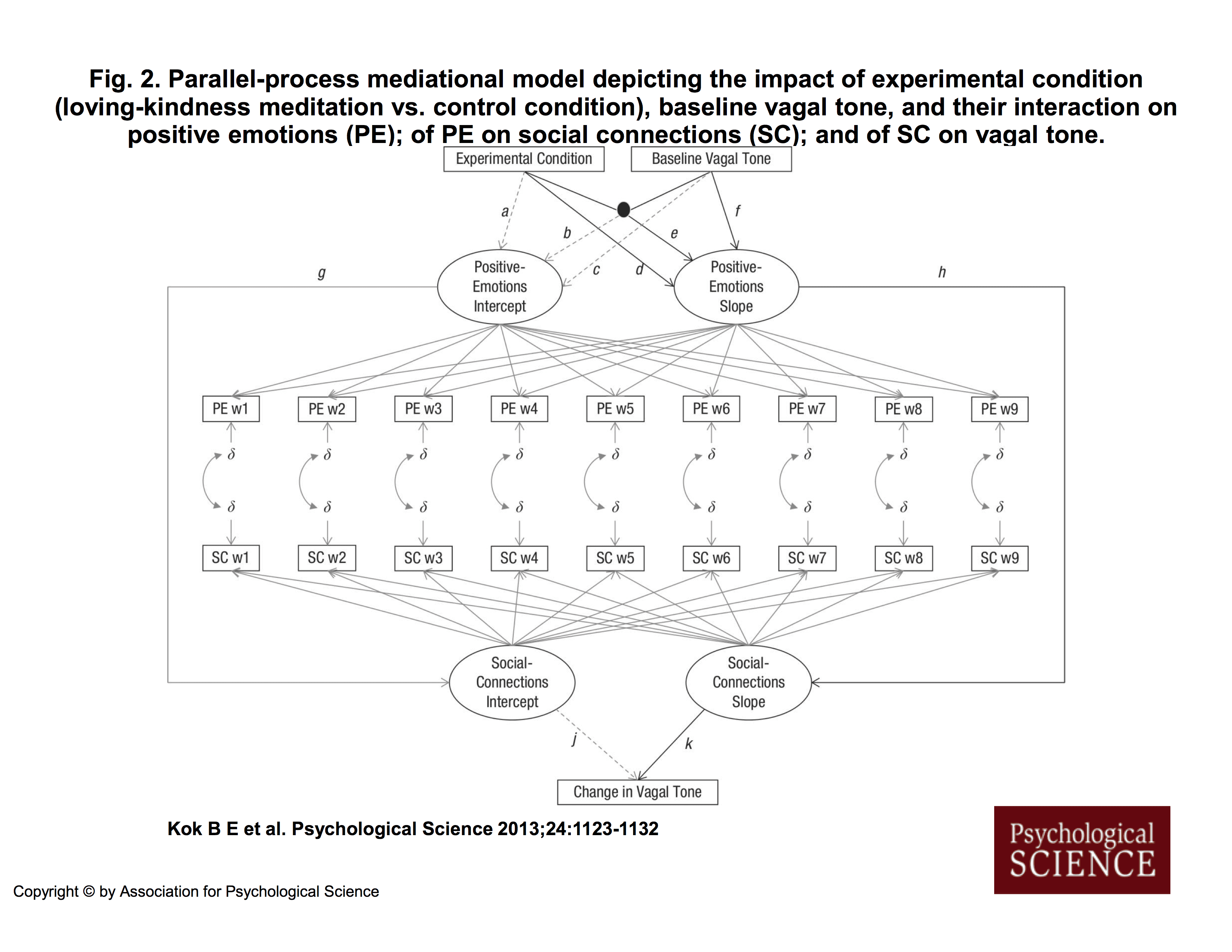
Carol Nickerson’s explanation of Figure 2 in Kok et al. (2013):
I am not by any stretch of the imagination an expert on structural equation modeling but here is what I believe that this diagram is attempting to convey. But first, a bit on the relevant SEM symbol conventions:
Variable names in square or rectangular boxes represent manipulated, measured, or observed variables. “Experimental Condition” is a manipulated variable, for example. “Baseline Vagal Tone” (start point HF_HRV) is a measured variable. “PE w1”, which stands for “Positive Emotions week 1” is a measured variable. (Actually, it is the mean of a set of measured variables.) And so on.
Variable names in circles or ovals represent “latent” (hidden) unmeasured or “inferred” variables. “Positive Emotions Intercept” and “Positive Emotions Slope” are unmeasured variables; they are inferred from the 9 weeks of positive emotions measurements. More on this in a bit.
Long straight lines (or “paths”) with an arrowhead at one end indicate relations between variables. The arrowhead points to the predicted (criterion, dependent) variable; the other end is attached to the predictor (independent) variable(s). Kok et al. stated that they were using black lines to represent hypothesized relations between variables, solid gray lines to represent relations between variables in the literature that they expected to be replicated, and dotted gray lines to represent relations about which they did not have hypotheses and which they expected to be non-significant. For convenience, Kok et al. labeled with lower case Roman letters the paths that they discussed in their article and supplemental material.
Most lines represent “main” effects. Paths that intersect with a big black dot indicate a “moderator” effect or an “interactive” effect. A criterion variable is predicted from all the variables that have lines with arrowheads running into them. So, for example, “Social Connections Slope” is being predicted only from “Positive Emotions Slope”; this path is labeled “h”. But “Positive Emotions Slope” is being predicted from “Experimental Condition”, “Baseline Vagal Tone” (start point HF-HRV), and the interaction of these two variables; these paths are labeled “d”,”f”, and “e”, respectively.
Kok et al. conceived of change, or growth, or increase (or decrease) in positive emotions as the slope of a line constructed from 9 weekly measurements of positive emotions. Suppose that we have a graph with the x axis labeled 0 (at the y axis) to 8 for the 9 weeks, and the y axis labeled 1 to 5 for positive emotions scores. Then we plot a participant’s 9 weekly positive emotions scores against these time points on this graph and fit a line to them. That line has a slope, which indicates the rate of change, or growth, or increase (or decrease)in positive emotions across time. The line has an intercept with the y axis, which is the start point; no growth in positive emotions has occurred yet. On Kok et al.’s Figure 2, the 9 lines from the oval labeled “Positive Emotions Slope” to the 9 rectangles labeled “PE w1”, “PE w2”, etc., indicate that this growth (slope) is being inferred from the 9 weekly measurements of positive emotions. The 9 rectangles are equally spaced, perhaps to indicate that the 9 measurements are equally spaced across time, although usually there are numbers near the lines that indicate the measurement spacing. The 9 lines from the oval labeled “Positive Emotions Intercept” to the 9 rectangles labeled “PE w1”, “PE w2”, etc., similarly indicate that the intercept or start point of growth is being inferred from the 9 weekly measurements of positive emotions. [Note: This is a conceptual explanation. I don’t have MPlus, so I don’t know what the computer program is actually doing.]
The Greek lower case letter delta (the “squiggle”) with a short gray arrowheaded line to each of the PE rectangles indicates that positive emotions are measured with error at each week. Ditto for the SC rectangles. Delta is used for error on predictors, usually, and lambda is used for error on criterion variables. All measured variables have error, of course; Kok et al. omitted error for most of the variables because this is assumed. They included error for the special situation described below.
Kok et al. were also interested in change, or growth, or increase (or decrease) in perceived social connections. Again, they conceived of change as the slope and the start point as the intercept. But they realized (or perhaps a reviewer pointed out) that participants were recording their positive emotions and their social connections at the same time, so that these measurements were not independent. Therefore, they (actually, the MPlus computer program) adjusted for “correlated residuals”. In SEM, correlations are indicated by circular lines with arrowheads at both ends. You can see these short circular lines in the diagram between the deltas for the PE rectangles and the deltas for the SC rectangles. These lines just indicate that the residuals (errors) for each week’s PE and SC are correlated, not independent (as is required for many statistical techniques).
So, let’s match the diagram to Kok et al.’s hypotheses and text, working from the top. Their three hypotheses were
(1) Experimental condition (control group, LKM group) and start point vagal tone (HF-HRV in the article, RSA in some of the sections of the supplemental material) interact to predict change in positive emotions over the 9 weeks of the study; LKM group participants who entered the study with higher vagal tone showed greater increases in positive emotions.
(2) Increases in positive emotions predict increases in perceived social connections.
(3) Increases in perceived positive social connections predict increases in start point to end point vagal tone.
From the top of the diagram, the black lines labeled “d”, “e”, and “f” indicate that change in positive emotions (the oval labeled “Positive Emotions Slope”) is being predicted from the variable experimental condition (the rectangle labeled “Experimental Condition”), the variable start point HF-HRV (the rectangle labeled “Baseline Vagal Tone”), and the interaction of these two variables (the big black dot). This part of the diagram represents Hypothesis 1. [Note: It is not stated in the diagram or the article that HF-HRV was subjected to a square root transformation, an oversight that I brought to Kok’s attention at some point. Accordingly, she inserted this information into the top of the supplemental material, which seems an odd place for it.]
The black line labeled “h” leading from the oval labeled “Positive Emotions Slope” to the oval labeled “Social Connections Slope” indicates that growth (increase) in social connections is being predicted from growth (increase) in positive emotions. This part of the diagram represents Hypothesis 2.
The black line labeled “k” leading from the oval labeled “Social Connections Slope” to the oval labeled “Change in Vagal Tone” indicates that change (increase) in vagal tone is being predicted from growth (increase) in social connections. [They have taken a shortcut here, probably for simplicity. They didn’t indicate that change in vagal tone in based on the residuals from a regression of end point vagal tone on start point vagal tone; ordinarily this would be shown in the diagram and mentioned in the article. It is not mentioned until the supplemental material.] This part of the diagram represents Hypothesis 3.
In the supplemental material, Kok et al. included tests of hypotheses like the three above,
but substituted “Positive Emotions Intercept” for “Positive Emotions Slope.” For the intercept analogue of the slope hypothesis for Hypothesis 1, it appears that there is a mistake in the diagram. In the supplemental material, Kok et al. indicated that they predicted “Positive Emotions Intercept” from “Experimental Condition”, “Baseline Vagal Tone,” and the interaction of these two variables. Path “a” for the “Positive Emotions Intercept” is analogous to path “d” for the “Positive Emotions Slope”; path “c” for the Positive Emotions Intercept” is analogous to path “f”; but there is no path for the “Positive Emotions Intercept” that is analogous to path “e” for the interaction for the “Positive Emotions Slope”. Instead they have a path “b”. The drawing seems incorrect here.For the intercept analogue of the slope hypothesis for Hypothesis 2, path “g” is like path “h”.
For the intercept analogue of the slope hypothesis for Hypothesis 3, path “j” is like path “k”.
So, making sense of this diagram is not really very difficult, once you know a little bit about how structural equation modeling diagrams are constructed. (I am in no way saying that this is good research. It isn’t. I am just explaining the diagram.)
The one aspect of the diagram that puzzles me is Kok et al.’s statement in the Figure 2 caption that the solid gray lines represent anticipated significant replications of the literature. Lines like these (not necessarily solid gray) usually appear in diagrams that infer a slope and an intercept from multiple measurements of some sort, without mention of anticipated replications of the literature. Perhaps the diagram was modified at some point without the necessary accompanying change to the caption?
Was the diagram a necessary addition to the text? Does it aid in understanding what the authors are doing? I don’t think so. It seems to me that a *good* verbal explanation would have been sufficient. On the other hand, it is standard practice for articles using structural equation modeling to include such a model, especially if it is complicated, as such models often are. Moreover, PSYCHOLOGICAL SCIENCE has a severe and enforced word limit, and authors sometimes work around that by including tables and figures that should not be necessary.
Carol Nickerson’s explanation of Figures 4 and 5 in Kok et al. (2013):
These figures take up about three-quarters of a page each; they could have been more succinctly and clearly presented as standard (frequency) “contingency tables” aka “cross-tabulations” of the sort that one sees in chi-square analyses.
Here is the information for Figure 4 in a contingency table. Kok et al. first took the distribution for change in positive emotions and divided it into quarters, ditto the distribution for change in perceived social connections. They then tabulated the number of study participants in each of the sixteen cells constructed by crossing the four quartiles for change in positive emotions and the four quartiles for change in social connections for each of the two study groups (control and LKM).
Control                                  LKM

                SC                                       SC
                quartile                                 quartile

PE           1  2  3  4  total           PE           1  2  3  4  total
quartile  --------------------           quartile  -------------------
         1|  8  3  1  0  |  12                    1|  2  2  0  1 |   5
         2|  5  4  5  1  |  15                    2|  0  1  0  0 |   1
         3|  1  1  2  2  |   6                    3|  1  3  4  2 |  10
         4|  0  0  0  1  |   1                    4|  0  4  4  9 |  15
          --------------------                     -------------------
total       14  8  8  4  |  34           total       3  8  8 12  |  31      N = 65
So that does this contingency table tell us? The first thing it tells us is that the sample size is too small to say anything with much certainty. But that is the case for the whole damn study. Let’s ignore that.
So what can we say?
(a) Looking at the row marginals, the control participants seem more likely to have changes in positive emotions at the low end of the distribution and the LKM participants seem more likely to have changes in positive emotions at the high end of the distribution.
(b) Looking at the column marginals, the control participants seem more likely to have changes in social connections at the low end of the distribution and the LKM participants seem more likely to have changes in social connections at the high end of the distribution.
(c) Do participants with low changes in positive emotions have low changes in social connections? Do participants with high changes in positive emotions have high changes in social connections? It appears so for both the control group and the LKM group. The control participants are clumped in the upper left-hand corner (low – low) of their table; the LKM participants are clumped in the lower right-hand corner (high – high) of their table.
(d) Is the size or form of the relation different for the two groups? Probably not.
Now what did Kok et al. write about this figure? From p. 1128: “As predicted by Hypothesis 2, slope of change in positive emotions significantly predicted slope of change in social connections (path h in Fig. 2; b = 1.04, z = 4.12, p < .001; see Fig. 4)." That's all. They didn't distinguish between control and LKM. So it seems that Figure 4 refers to (c) above. If they weren't distinguishing between control and LKM, the two groups could be combined:
                SC
                quartile

PE           1  2  3  4  total
quartile  ——————–
         1| 10  5  1  1  | 17
         2|  5  5  5  1  | 16
         2|  2  4  6  4  | 16
         4|  0  2  4 10  | 16
          ——————–
total       17 16 16 16  | 65
which is statistically significant (except that the cell sizes are still too small for the test to be valid).
But the figure is not an appropriate way to illustrate the effect. All of the effects in the article deal with scores — means, slopes, regression coefficients, etc. The figure deals with numbers of participants, which is not the same, and which was not what was being analyzed in the model.
I don’t see any point to this figure at all. The statistics reported indicated that change in social connections was positively predicted by change in positive emotions; as positive emotions increased, so did social connections. Why does the reader need a 3/4 page figure to understand this?
A similar analysis of Figure 5 is left to the interested reader :-).
The analysis for Figure 4 had N = 65; for Figure 5, N = 52. This is much too small a sample size for such a complicated model. Kok et al. stated that they used a variant of a “mediational, parallel-process, latent-curve model (Cheong, MacKinnon, & Khoo, 2003).” The analysis example in the Cheong et al. article had an N in the neighborhood of 1300-1400 (unnecessarily large, perhaps). Never mind all the other problems in the Kok et al. article, PSYCHOLOGICAL SCIENCE should have rejected it just on the basis of the small N. I’d be wary of the results of a simple one-predictor model with an N of only 52!
So, it seems that Nickerson put much more work into this than was warranted by the original paper, which received prominence in large part because it was published in Psychological Science, which during that period was rapidly liquidating its credibility as a research journal, publishing papers on ovulation and voting, etc.
I’m sharing Nickerson’s analysis here because it could be future to future students and researchers, not so much regarding this particular paper, but more generally as a demonstration that statistical mumbo-jumbo can at times, with some effort, be de-mystified. One can’t expect journal reviewers to go to the trouble of doing this—but I would hope that authors of journal articles would try a bit harder themselves to understand what they’re putting in their articles.
I’m too tempted to be the first to say “a picture is worth a thousand words.” But those thousand words! Psychologists can rival economists for obtuseness.
Naw — as obtuse as economists can be, I think psychologists are all too often more obtuse.
I offered myself as an editor to Psychological Science in response to this tweet:
https://twitter.com/dstephenlindsay/status/1067504266800242688
But I never heard back.
“I offered myself as an editor to Psychological Science in response to this tweet:
https://twitter.com/dstephenlindsay/status/1067504266800242688
But I never heard back.”
I think you would have stood no chance anyway. I think this is all “done and dusted”.
My bet is on Chris “i-am-so-about-all-that-‘open’-and-‘transparent’-science-stuff-that-i-forgot-to-make-clear-that-Registered Reports’-should-really-include-providing-a-link-to-the-pre-registration-information-so-the-reader-can-actually-check-matters-and-things-are-‘open’-and-‘transparent'” -Chambers.
Also see his blog post about what he plans to do if he gets the job: https://neurochambers.blogspot.com/2018/12/my-manifesto-as-would-be-editor-of.html
I think he truly is the perfect candidate for the APS, and “Psychological Science”! This is because i reason he has lots of things in common with the people who publish in “Psychological Science”, and with the goals of the APS. To name just a few things:
-He published a “pop psychology” book (indirectly made possible by the tax payers) that the members of the general public can now buy, and could make him lots of money (just like the Amy Cuddys and Daniel Gilberts and John Barghs of the psychology world)
-He is all about “Psychological Science” becoming not just the flagship journal of the APS, but become a
“global beacon” for the most important, open, and reliable research in psychology, an example for not just psychology but science in general.
-He seems to want to do this all by given even more power and influence to journals, editors, and peer-reviewers like that has worked well in the past decades (e.g. see Binswanger 2014 “Excellence by nonsense” https://link.springer.com/chapter/10.1007/978-3-319-00026-8_3). I am particularly looking forward to what he plans to do concerning “raising standards for the open practices badges” (e.g. is he planning on giving even more power and influence to a small group of people, and/or the exact system that messed things up?)
-He seems to be knowledgeable about not only science, or how to improve it, but politics as well (given the amount of tweets about politics on his twitter account). I get the impression psychology and politics seem to go hand in hand with some folks and institutions, and i feel “Psychological Science” and Chambers could be a perfect match concerning that as well.
-He seems to want to connect funding to “Registered Reports”. Does this mean the funder has an actual say in what is researched and how, just like peer-reviewers and editors (with “Registered Reports” he even seems to propose “special” editors)? If this is indeed the case, i reason this again seems perfect for given more and more power to fewer “special” people, but now even throwing money in the mix as well. This is of course all a super good idea! (cf. see Binswanger 2014 “Excellence by nonsense” https://link.springer.com/chapter/10.1007/978-3-319-00026-8_3)
My money is on Chambers, he is “the chosen one” for sure!
You sound cranky. His ‘manifesto’ looks fine and has several good aspects (commitment to publishing replications, promoting exploratory research, publishing reviewer reports along with articles).
(I meant for the following comment depicted below to be a direct reply to the comment above/this thread here. It is now posted as a separate comment somewhere below: https://statmodeling.stat.columbia.edu/2018/12/22/carol-nickerson-explains-mysterious-diagrams-saying/#comment-932540, but i would like to try and connect it directly to the comments/thread here for a 2nd time)
Quote from above:
“His ‘manifesto’ looks fine and has several good aspects (commitment to publishing replications, promoting exploratory research, publishing reviewer reports along with articles).”
I agree that it may have several possibly good aspects.
I also worry some of his proposals might not be very good for (improving) psychological science, and are far more crucial in deciding whether “his manifesto looks fine”.
For instance, you could try and compare things like “Registered Reports”, “open practices badges”, and the “TOP-guidelines” to what may have caused this mess in (psychological) science in the 1st place, and see what they all may have in common, and how they might relate to it, and to eachother (in this regard also see https://link.springer.com/chapter/10.1007/978-3-319-00026-8_3).
Or you could start by asking yourself a couple of questions:
1) Do you think it is scientifically wise, and/or appropriate, to include things like “Registered Reports” and “open practices badges” into the “Top-guidelines” without them ever being (independently) evaluated to try and see if they are even “good” for (improving) science?
2) (Given 1) Do you think it is scientifically wise, and/or appropiate, to start promoting, and/or implementing all these things? (especially when you yourself have been a part of coming up, and/or promoting these proposed improvements)?
I have to respectfully disagree on this one. No opinion at all about the original paper, the journal or the specific model they run. But, I wonder if dissatisfaction with other aspects of the paper have coloured your view of whether the *Figure* makes sense to use. That being the topic of your post, I thought I’d offer a bit of a rejoinder.
Being an SEM user, but not an expert, I think the Figure is a fast, clear presentation of a complex model (again, not saying a thing about whether the model makes sense or whether the results of the model could have been interpreted better.) In about 10 seconds, I could identify the three observed variables (two IV, one DV), the four latent variables and how each is measured in detail, the relationships that were modeled among all the above and whether a relationship was expected to be significant or not. I think that would take longer–and possibly be less clear–to do in words. Properly used, this sort of figure is great for bridging “this is the model we modeled” and “here are the results for each relationship we modeled.”
The contingency tables offered as an improvement convey nothing about how the variables were measured or the proposed mediating relationships. I’m not even sure they are that much clearer at any inherent level–perhaps just more familiar.
These figures have developed as a consistent, economical “language” in a field that uses complex models with lots of mediation and latent variables (no comment about the value of such models one way or another). To swap traditions, I personally find Kruschke’s graphical model diagram (https://doingbayesiandataanalysis.blogspot.com/2012/05/graphical-model-diagrams-in-doing.html) to be a clear way of conveying the details of a Bayesian model. But, that’s because Bayesian modeling is a tradition I’m familiar with. Not a great deal intuitie about it for someone coming from a frequentist background.
Anyway, just a bit of counterpoint. Happy holidays to all who are celebrating this time of year.
“His ‘manifesto’ looks fine and has several good aspects (commitment to publishing replications, promoting exploratory research, publishing reviewer reports along with articles).”
I agree that it may have several possibly good aspects.
I also worry some of his proposals might not be very good for (improving) psychological science, and are far more crucial in deciding whether “his manifesto looks fine”.
For instance, you could try and compare things like “Registered Reports”, “open practices badges”, and the “TOP-guidelines” to what may have caused this mess in (psychological) science in the 1st place, and see what they all may have in common, and how they might relate to it, and to eachother (in this regard also see https://link.springer.com/chapter/10.1007/978-3-319-00026-8_3).
Or you could start by asking yourself a couple of questions:
1) Do you think it is scientifically wise, and/or appropriate, to include things like “Registered Reports” and “open practices badges” into the “Top-guidelines” without them ever being (independently) evaluated to try and see if they are even “good” for (improving) science?
2) (Given 1) Do you think it is scientifically wise, and/or appropiate, to start promoting, and/or implementing all these things? (especially when you yourself have been a part of coming up, and/or promoting these proposed improvements)?