Visual Economics shows statistics on average food consumption in America:
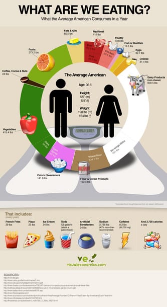
My brief feedback is that water is confounded with these results. They should have subtracted water content from the weight of all dietary items, as it inflates the proportion of milk, vegetable and fruit items that contain more water. They did that for soda (which is represented as sugar/corn syrup), amplifying the inconsistency.
Time Magazine had a beautiful gallery that visualizes diets around the world in a more appealing way.