“Deep Maps model of the labor force: The impact of the current employment crisis on places and people”

Yair Ghitza and Mark Steitz write:

The Deep Maps model of the labor force projects official government labor force statistics down to specific neighborhoods and types of people in those places. In this website, you can create maps that show estimates of unemployment and labor force participation by race, education, age, gender, marital status, and citizenship. You can track labor force data over time and examine estimates of the disparate impact of the crisis on different communities. It is our hope that these estimates will be of help to policy makers, analysts, reporters, and citizens who are trying to understand the fast-changing dynamics of the current economic crisis.

These are modeled inferences, not reported data. They should be seen as suggestive rather than definitive evidence. They have uncertainty around them, especially for the smallest groups. We recommend they be used alongside other sources of data when possible.

This project uses publicly available data sources from the Census, Bureau of Labor Statistics, and other places. A detailed explanation of the methodology can be found here; the code here.

This is worth looking at, and not just if you’re interested in unemployment statistics. There’s this thing in statistics where some people talk about data munging and other people talk about modeling. This project demonstrates how both are important.

“The most discriminatory federal judges” update

Christian Smith writes:

Thanks for your commentary on the white paper about judges, which I wrote earlier this year with some colleagues [Nicholas Goldrosen, Maria-Veronica Ciocanel, Rebecca Santorella, Chad Topaz, and Shilad Sen]. I just wanted to let you know that we substantially altered that paper in light of reasonable feedback, replacing the original OSF entry with a much humbler one. This Twitter thread explains further. If you’re up for clarifying in your blog post that the quoted excerpt is no longer in the white paper, I would appreciate that a lot.

Here’s the new version, which has the following note on page 1:

A previous version of this work included estimates on individually identified judges. Thanks to helpful feedback, we no longer place enough credence in judge-specific estimates to make sufficiently confident statements on any individual judge. We encourage others not to rely upon results from earlier versions of this work.

As I wrote in my earlier post, I don’t have anything to say on the substance of this work, but I’ll again share my methodological comments, generic advice of the sort I’ve given many times before, involving workflow, or the trail of breadcrumbs:

What I want to see is graphs of the data and fitted model. For each judge, make a scatterplot with a dot for each defendant they sentenced. Y-axis is the length of sentence they gave, x-axis is the predicted length based on the regression model excluding judge-specific factors. Use four colors of dots for white, black, hispanic, and other defendants, and then also plot the fitted line. You can make each of these graphs pretty small and still see the details, which allows a single display showing lots of judges. Order them in decreasing order of estimated sentencing bias.

Did this study really identify “the most discriminatory federal judges”?

Christian Smith, Nicholas Goldrosen, Maria-Veronica Ciocanel, Rebecca Santorella, Chad Topaz, and Shilad Sen write:

In the aggregate, racial inequality in criminal sentencing is an empirically well- established social problem. Yet, data limitations have made it impossible to determine and name the most racially discriminatory federal judges. The authors use a new, large-scale database to determine and name the observed federal judges who impose the harshest sentence length penalties on Black and Hispanic defendants. . . . While acknowledging limitations of unobserved cases and variables, the authors find evidence that several judges give Black and Hispanic defendants double the sentences they give observationally equivalent white defendants.

They fit a multilevel model! That makes me happy.

I heard about this from Jeff Lax and David Hogg, who pointed me to a post on twitter by law professor Jonah Gelbach disputing the above claims. Gelbach writes, “the data are incomplete . . . a match rate of less than 50% . . . the match rate varies substantially across districts . . . endogeneity concerns . . . The dependent variable is specified as the log of 1 plus the sentence length . . .” The criticisms are a mixed bag—for example, at one point Gelbach writes, “One concern is that judges w/few defendants will have higher-variance random slope estimates, raising the possibility that the results would be an artifact of estimating lots of effects & then picking largest values, which are more likely to happen w/judges having few cases.”—but he’s actually getting things backward here, for reasons discussed by Phil and me in our 1999 paper, All maps of parameter estimates are misleading.

At this point, I think Jeff was hoping I’d adjudicate and share my own conclusion. But I don’t want to! For two reasons.

1. It takes work. Some things don’t take much work at all. Reading Alexey Guzey’s criticisms of Why We Sleep and then reading the relevant parts of Why We Sleep—it’s pretty clear what’s going on. Reading the overblown claims of John Gottman followed by the breakdown by journalist Laurie Abraham, again, this wasn’t a hard case to judge (although it seems that Abraham has made her own mistakes). Similarly with beauty-and-sex-ratios, ages-ending-in-9, and various other bits of junk science—serious flaws were immediately apparent to me.

2. The “send it to Andy” approach to judging tough statistics questions doesn’t scale.

So instead I’m going to give some generic advice of the sort I’ve given many times before, involving workflow, or the trail of breadcrumbs. What I want to see is graphs of the data and fitted model. For each judge, make a scatterplot with a dot for each defendant they sentenced. Y-axis is the length of sentence they gave, x-axis is the predicted length based on the regression model excluding judge-specific factors. Use four colors of dots for white, black, hispanic, and other defendants, and then also plot the fitted line. You can make each of these graphs pretty small and still see the details, which allows a single display showing lots of judges. Order them in decreasing order of estimated sentencing bias.

This won’t answer all our questions, but it’s a start. With these graphs in hand, you’ll be able to more carefully go through the different concerns with the study.

Also, it’s kinda wack that in their Tables 4 and 5, which cover individual judges, they just give point estimates and no uncertainties. What’s the point of fitting a big-ass model and then not presenting uncertainties??

Separate from all of this is the leap from a statistical pattern to actual discrimination (whatever that means, exactly). I’m not getting into that here.

It seems that Smith et al. are making two claims: first a general statement that blacks and hispanics are given slightly longer sentences than whites and others, on average; second a particular claim about the judges on the top of their list. I’ll just say this: if their general claim of aggregate bias is correct, then of course there will be variation, with some judges more biased than others. As everyone here recognizes, bias (statistical or otherwise) can come from some combination of the judge, the cases he or she sees, and the judge’s institutional setting.

P.S. Update here.

The NFL regression puzzle . . . and my discussion of possible solutions:

Alex Tabarrok writes:

Here’s a regression puzzle courtesy of Advanced NFL Stats from a few years ago and pointed to recently by Holden Karnofsky from his interesting new blog, ColdTakes. The nominal issue is how to figure our whether Aaron Rodgers is underpaid or overpaid given data on salaries and expected points added per game. Assume that these are the right stats and correctly calculated. The real issue is which is the best graph to answer this question:

Brian 1: …just look at this super scatterplot I made of all veteran/free-agent QBs. The chart plots Expected Points Added (EPA) per Game versus adjusted salary cap hit. Both measures are averaged over the veteran periods of each player’s contracts. I added an Ordinary Least Squares (OLS) best-fit regression line to illustrate my point (r=0.46, p=0.002).

Rodgers’ production, measured by his career average Expected Points Added (EPA) per game is far higher than the trend line says would be worth his $21M/yr cost. The vertical distance between his new contract numbers, $21M/yr and about 11 EPA/G illustrates the surplus performance the Packers will likely get from Rodgers.

According to this analysis, Rodgers would be worth something like $25M or more per season. If we extend his 11 EPA/G number horizontally to the right, it would intercept the trend line at $25M. He’s literally off the chart.

Brian 2: Brian, you ignorant slut. Aaron Rodgers can’t possibly be worth that much money….I’ve made my own scatterplot and regression. Using the exact same methodology and exact same data, I’ve plotted average adjusted cap hit versus EPA/G. The only difference from your chart above is that I swapped the vertical and horizontal axes. Even the correlation and significance are exactly the same.

As you can see, you idiot, Rodgers’ new contract is about twice as expensive as it should be. The value of an 11 EPA/yr QB should be about $10M.

Alex concludes with a challenge:

Ok, so which is the best graph for answering this question? Show your work. Bonus points: What is the other graph useful for?

I posted this a few months ago and promised my solution. Here it is:
Continue reading

Interpreting apparently sparse fitted models

Hannes Margraf writes:

I would like your opinion on an emerging practice in machine learning for materials science.

The idea is to find empirical relationships between a complex material property (say the critical temperature of a superconductor) and simple descriptors of the constituent elements (say atomic radii and electronegativities). Typically, a longish list of these ‘primary’ descriptors is collected. Subsequently a much larger number of ‘derived’ features are generated, by combining the primary ones and some non-linear functions. So primary descriptors A,B can be combined to yield exp(A)/B and many other combinations. Finally, lasso or similar techniques are used to find a compact linear regression model for the target property (a*exp(A)/B+b*sin(C) or whatnot).

The main application of this approach is to quite small datasets (e.g. 10-50 datapoints). I’m kind of unsure what to think of this. I would personally just use some type of regularized non-linear regression with the primary features here (e.g. GPR). Supposedly, the lasso approach is more interpretable though because you can see what features get selected (i.e. how the non-linearity is introduced). But it also feels very garden-of-forking-paths-like to me.

I know that you’ve talked positively about lasso before, so I wonder what your take on this is.

It’s hard for me to answer this with any sophistication, as it’s been a long long time since I’ve worked in materials science—my most recent publication in that area appeared 34 years ago—so I’ll stick to generalities. First, lasso (or alternatives such as horseshoe) are fine, but I don’t think they really give you a more interpretable model. Or, I should say, yes, they give you an interpretable model, but the interpretability is kinda fake, because had you seen slightly different data, you’d get a different model. Interpretability is bought at the price of noise—not in the prediction, but in the chosen model. So I’d prefer to think of lasso, horseshoe, etc. as regularizers, not as devices for selecting or finding or discovering a sparse model. To put it another way, I don’t take the shrink-all-the-way-to-zero thing seriously. Rather, I interpret the fitted model as an approximation to a fit with more continuous partial pooling.

Importance of understanding variation when considering how a treatment effect will scale

Art Owen writes:

I saw the essay, “Nothing Scales,” by Jason Kerwin, which might be a good topic for one of your blog posts. Maybe a bunch of other people sent it to you already.

He seems to think we just need more and better data and methods to get things to generalize/scale. It’s not clear to me that we’ll get enormously better data per subject on education or behavior. Maybe we will get better sets of subjects (more coverage) in a more complex and expensive study.

The post in question is by an economist who is emphasizing the importance of varying treatment effects. This is something that people been talking about for awhile, but, as with many things in statistics, this is something that we each have to rediscover on our own. It’s said that the best way to learn something is to teach it, so it’s good to see Kerwin’s discussion, which he develops in the context of a real example. And I appreciate that he refers to 16.

Just a couple minor things. Kerwin writes:

Treatment effect heterogeneity also helps explain why the development literature is littered with failed attempts to scale interventions up or run them in different contexts. Growth mindset did nothing when scaled up in Argentina. Running the “Jamaican Model” of home visits to promote child development at large scale yields far smaller effects than the original study. The list goes on and on; to a first approximation, nothing we try in development scales.

Why not? Scaling up a program requires running it on new people who may have different treatment effects. And the finding, again and again, is that this is really hard to do well. . . .

I’m with him on the importance of varying treatment effects, but, when it comes to explaining why estimated effects don’t replicate at their published magnitudes, I think he’s missing the big point that published estimates tend to be overestimates because of the winner’s curse (selection bias); see for example here. Also he writes, “None of the techniques we use to look at treatment effect variation currently work for non-experimental causal inference techniques.” That’s not true at all! Plain old regression with interactions works just fine, or you can break out the nonparametrics as with Hill (2011).

Again, I like Kerwin’s main point, which is that when considering how a treatment will scale in the real world, it’s important to think about treatment effect variation, not just as a mathematical concept (correcting for “heteroscedasticity” or whatever) but substantively. I also agree with what Caroline Fiennes writes in comments, that it’s important to know what is the cost of an intervention and what exactly the intervention is.

“Have we been thinking about the pandemic wrong? The effect of population structure on transmission”

Philippe Lemoine writes:

I [Lemoine] just published a blog post in which I explore what impact population structure might have on the transmission of an infectious disease such as COVID-19, which I thought might be of interest to you and your readers. It’s admittedly speculative, but I like to think it’s the kind of speculation that might be fruitful. Perhaps of particular interest to you is my discussion of how, if the population has the sort of structure my simulations assume, it would bias the estimates of causal effects of interventions. This illustrates a point I made before, such as in my discussion of Chernozhukov et al. (2021), namely that any study that purports to estimate the causal effect of interventions must — implicitly or explicitly — assume a model of the transmission process, which makes this tricky because I don’t think we understand it very well. My hope is that it will encourage more discussion of the effect population structure might have on transmission, a topic which I think has been under-explored, although other people have mentioned the sort of possibility I explore in my post before. I’m copying the summary of the post below.

– Standard epidemiological models predict that, in the absence of behavioral changes, the epidemic should continue to grow until herd immunity has been reached and the dynamic of the epidemic is determined by people’s behavior.
– However, during the COVID-19 pandemic, there have been plenty of cases where the effective reproduction number of the pandemic underwent large fluctuations that, as far as we can tell, can’t be explained by behavioral changes.
– While everybody admits that other factors, such as meteorological variables, can also affect transmission, it doesn’t look as though they can explain the large fluctuations of the effective reproduction number that often took place in the absence of any behavioral changes.
– I argue that, while standard epidemiological models, which assume a homogeneous or quasi-homogeneous mixing population, can’t make sense of those fluctuations, they can be explained by population structure.
– I show with simulations that, if the population can be divided into networks of quasi-homogeneous mixing populations that are internally well-connected but only loosely connected to each other, the effective reproduction number can undergo large fluctuations even in the absence of behavioral changes.
– I argue that, while there is no evidence that can bear directly on this hypothesis, it could explain several phenomena beyond the cyclical nature of the pandemic and the disconnect between transmission and behavior (why the transmission advantage of variants is so variable, why waves are correlated across regions, why even places with a high prevalence of immunity can experience large waves) that are difficult to explain within the traditional modeling framework.
– If the population has that kind of structure, then some of the quantities we have been obsessing over during the pandemic, such as the effective reproduction number and the herd immunity threshold, are essentially meaningless at the aggregate level.
– Moreover, in the presence of complex population structure, the methods that have been used to estimate the impact of non-pharmaceutical interventions are totally unreliable. Thus, even if this hypothesis turned out to be false, we should regard many widespread claims about the pandemic with the utmost suspicion since we have good reasons to think it might be true.
– I conclude that we should try to find data about the characteristics of the networks on which the virus is spreading and make sure that we have such data when the next pandemic hits so that modeling can properly take population structure into account.

I agree with Lemoine that we don’t understand well what is going on with covid, or with epidemics more generally. I agree, and, as many people have recognized, there are several difficulties here, including data problems (most notably, not knowing who has covid or even the rates of exposure etc. among different groups); gaps in our scientific understanding regarding modes of transmission, mutations, etc.; and, as Trisha Greenhalgh has discussed, a lack of integration of data analysis with substantive theory.

All these are concerns, even without getting to the problems of overconfident public health authorities, turf-protecting academic or quasi-academic organizations, ignorant-but-well-connected pundits, idiotic government officials, covid deniers, and trolls. It’s easy to focus on all the bad guys out there, but even in world where people are acting with intelligence, common sense, and good faith, we’d have big gaps in our understanding.

Lemoine makes the point that the spread of coronavirus along the social network represents another important area of uncertainty in our understanding. That makes sense, and I like that he approaches this problem using simulation. The one thing I don’t really buy—but maybe it doesn’t matter for his simulation—is Lemoine’s statement that fluctuations in the epidemic’s spread “as far as we can tell, can’t be explained by behavioral changes.” I mean, sure, we can’t tell, but behaviors change a lot, and it seems clear that even small changes in behavior can have big effects in transmission. The reason this might not matter so much in the modeling is that it can be hard to distinguish between a person changing his or her behavior over time, or a correlation of different people’s behaviors with their positions in the transmission network. Either way, you have variation in behavior and susceptibility that is interacting with the spread of the disease.

In his post, Lemoine gives several of examples of countries and states where the recorded number of infections went up for no apparent reason, or where you might expect it to have increased exponentially but it didn’t. One way to think about this is to suppose the epidemic is moving through different parts of the network and reaching pockets where it will travel faster or slower. As noted above, this could be explained my some mixture of variation across people and variation over time (that is, changing behaviors). It makes sense that we shouldn’t try to explain this behavior using the crude categories of exponential growth and herd immunity. I’m not sure where this leads us going forward, but in any case I like this approach of looking carefully at data, not just to fit models but to uncover anomalies that aren’t explained by existing models.

Design of Surveys in a Non-Probability Sampling World (my talk this Wed in virtual Sweden)

My talk at this conference in honor of Lars Lyberg on 1 Dec:

There are two steps of sampling: design and analysis. Analysis should respect design (for example, accounting for stratification and clustering) and design should anticipate analysis (for example, collecting relevant background variables to be used in nonresponse adjustment). In recent decades, many techniques have been developed for inference from non-probability samples. We discuss what the existence of these methods implies for design and data collection. What is the role of probability sampling in this world?

P.S. Here’s the youtube of it. I can’t stand seeing myself on video, and I find non-live talks difficult to watch in any case. But here it is in case you want it.

Is There a Replication Crisis in Finance?

Lasse Heje Pedersen writes:

Inspired by in part by your work on hierachical models, we have analyzed the evidence on research in financial economics, overturning the claims in prior papers that this field faces a replication crisis. Indeed, the power of the hierarchical model relative to frequentist multiple-testing adjustment along with simple improvements (e.g., leaving out findings that were never significant in the first place) turns out to make a huge difference here.

We also make simulations that show how the hierachical model reduces the false discovery rate while sacrificing little power. Comments very welcome!

The research article, by Theis Ingerslev Jensen, Bryan Kelly, and Lasse Heje Pedersen, begins:

Several papers argue that financial economics faces a replication crisis because the majority of studies cannot be replicated or are the result of multiple testing of too many factors. We develop and estimate a Bayesian model of factor replication, which leads to different conclusions. The majority of asset pricing factors: (1) can be replicated, (2) can be clustered into 13 themes, the majority of which are significant parts of the tangency portfolio, (3) work out-of-sample in a new large data set covering 93 countries, and (4) have evidence that is strengthened (not weakened) by the large number of observed factors.

I don’t know anything about the topic and I only glanced at the article, but I’m sharing because of our general interest in the topic of reproducibility in research.

Estimating basketball shooting ability while it varies over time

Someone named Brayden writes:

I’m an electrical engineer with interests in statistics, so I read your blog from time to time, and I had a question about interpreting some statistics results relating to basketball free throws.

In basketball, free throw shooting has some variance associated with it. Suppose player A is a career 85% free throw shooter on 2000 attempts and player B is a career 85% free throw shooter on 50 attempts, and suppose that in a new NBA season, both players start out their first 50 free throw attempts shooting 95% from the line. Under ideal circumstances (if it was truly a binomial process), we could say that player A is probably just on a lucky streak, since we have so much past data indicating his “true” FT%. With player B, however, we might update what we believe is his “true” FT% is, and be more hesitant to conclude that he’s just on a hot streak, since we have very little data on past performance.

However, in the real basketball world, we have to account for “improvement” or “decline” of a player. With improvement being a possibility, we might have less reason to believe that player A is on a hot streak, and more reason to believe that they improved their free throw shooting over the off-season. So I guess my question is: when you’re trying to estimate a parameter, is there a formal process defined for how to account for a situation where your parameter *might* be changing over time as you observe it? How would you even begin to mathematically model something like that? It seems like you have a tradeoff between sample size being large enough to account for noise, but not too large such that you’re including possible improvements or declines. But how do you find the “sweet spot”?

My reply:

1. Yes, this all can be done. It should not be difficult to write a model in Stan allowing measurement error, differing player abilities, and time-varying abilities. Accuracy can vary over the career and also during the season and during the game. There’s no real tradeoff here; you just put all the variation in the model, with hyperparameters governing how much variation there is at each level. I haven’t done this with basketball, but we did something similar with time-varying public opinion in our election forecasting model.

2. Even the non-time-varying version of the model is nontrivial! Consider your above example, just changing “50 attempts” to “100 attempts” in each case so that the number of successes becomes an integer; With no correlation and no time variation in ability, you get the following data:
player A: 1795 successes out of 21000 tries, a success rate of 85.5%
player B: 180 successes out of 200 tries, a success rate of 90%.
But then you have to combine this with your priors. Let’s assume for simplicity that our priors for the two players are the same. Depending on your prior, you might conclude that player A is probably better, or you might conclude that player B is probably better. For example, if you start with a uniform (0, 1) prior on true shooting ability, the above data would suggest that player B is probably better than player A. But if you start with a normal prior with mean 0.7 and standard deviation 0.1 then the above data would lead you to conclude that player A is more likely to be the better shooter.

3. Thinking more generally, I agree with you that it represents something of a conceptual leap to think of these parameters varying over time. With the right model, it should be possible to track such variation. Cruder estimation methods that don’t model the variation can have difficulty catching up to the data. We discussed this awhile ago in the context of chess ratings.

P.S. Brayden also shares the above adorable photo of his cat, Fatty.

PhD position at the University of Iceland: Improved 21st century projections of sub-daily extreme precipitation by spatio-temporal recalibration

Birgir Hrafnkelsson writes:

In 2016 you kindly helped me with advertising a PhD position at the University of Iceland. The successful candidate saw the ad on your blog. In 2019, he graduated with his PhD and received the Laplace Prize from ASA SBSS for one of his papers.

I was wondering if you could assist me by putting an ad for another PhD position at the University of Iceland on your blog? The project is entitled: Improved 21st century projections of sub-daily extreme precipitation by spatio-temporal recalibration. This project involves collaboration with the United Kingdom Meteorological Office and a few universities.

The link to the formal ad is here and a project description is here.

That’s so cool that the previous position was filled with the help of our blog, and that his work won a research award! I hope the new project also goes well.

Also, puffins!

Progress! (cross validation for Bayesian multilevel modeling)

I happened to come across this post from 2004 on cross validation for Bayesian multilevel modeling. In it, I list some problems that, in the past 17 years, Aki and others have solved! It’s good to know that we make progress.

Here’s how that earlier post concludes:

Cross-validation is an important technique that should be standard, but there is no standard way of applying it in a Bayesian context. . . . I don’t really know what’s the best next step toward routinizing Bayesian cross-validation.

And now we have a method: Pareto-smoothed importance sampling. Aki assures me that we’ll be solving more problems about temporal, spatial and hierarchical models.

Adjusting for stratification and clustering in coronavirus surveys

Someone who wishes to remain anonymous writes:

I enjoyed your blog posts and eventual paper/demo about adjusting for diagnostic test sensitivity and specificity in estimating seroprevalence last year. I’m wondering if you had any additional ideas about adjustments for sensitivity and specificity in the presence of complex survey designs. In particular, the representative seroprevalence surveys out there tend to employ stratification and clustering, and sometimes they will sample multiple persons per household. It seems natural that at the multilevel regression stage of the Bayesian specification, you can include varying intercepts for the strata, cluster, and household—all features of the survey design that your 2007 survey weights paper would recommend including (from your 2007 paper: “In addition, a full hierarchical modeling approach should be able to handle cluster sampling (which we have not considered in this article) simply as another grouping factor”).

I think I have some fuzziness about how this would be done in practice—or at least, what happens at the post-stratification stage following the multilevel regression fit. Suppose that we adjust for respondent age and sex in the regression model, in addition to varying intercepts for household, cluster, and geographical strata. And suppose that we have Census counts on strata X age X sex. Would posterior predictions be made using age, sex, and strata, while setting the household and cluster varying intercepts to 0? Somehow I feel uncertain that this is the right approach.

The study estimating seroprevalence in Geneva by Stringhini et al. was not a cluster survey (it was SRS), but they did adjust for clustering within households. They integrate out the varying intercept for household (I think?) in their model (see page 2 of the supplement here). I admit I have a bit of trouble following the intuition and math there (I don’t think they made a mistake, I’m just slow). Is this the right approach?

I’m also aware that there are alternative ways of making these adjustments—like using a (average) design effect for individual post-stratification cells to get an effective sample size (e.g., the deep MRP paper by Ghitza and Gelman, 2013), but if we are in a position where we have full access to the cluster, and household variables, it seems we should use it.

There are a few issues here:

1. Combining sensitivity/specificity adjustments with survey analysis. This should not be difficult using Stan, as discussed in my about-linked paper with Bob Carpenter—as long as you have the survey analysis part figured out. That is, the hard part of this problem is the survey analysis, not the corrections for sensitivity/specificity.

2. Problems with real-world covid surveys. Here the big issue we’ve seen is selection bias in who gets tested. I’m not really sure how to handle this given existing data. We’ve been struggling with the selection bias problem and have no great solutions, even though it’s clear there’s some information relevant to the question.

3. Accounting for stratification and clustering in the survey design. I agree that multilevel modeling is the way to go here. I haven’t looked at the linked paper carefully, so I can’t comment on the details, but I think the general approach makes sense to condition on clustering and then average over clusters. It will be important to include cluster-level predictors so that empty clusters are not simply pooled to the global average of the data.

He was fooled by randomness—until he replicated his study and put it in a multilevel framework. Then he saw what was (not) going on.

An anonymous correspondent who happens to be an economist writes:

I contribute to an Atlanta Braves blog and I wanted to do something for Opening Day. Here’s a very surprising regression I just ran. I took the 50 Atlanta Braves full seasons (excluding strike years and last year) and ran the OLS regression: Wins = A + B Opening_Day_Win.

I was expecting to get B fairly close to 1, ie, “it’s only one game”. Instead I got 79.8 + 7.9 Opening_Day_Win. The first day is 8 times as important as a random day! The 95% CI is 0.5-15.2 so while you can’t quite reject B=1 at conventional significance levels, it’s really close. F-test p-value of .066

I have an explanation for this (other than chance) which is that opening day is unique in that you’re just about guaranteed to have a meeting of your best pitcher against the other team’s, which might well give more information than a random game, but I find this really surprising. Thoughts?

Note: If I really wanted to pursue this, I would add other teams, try random games rather than opening day, and maybe look at days two and three.

Before I had a chance to post anything, my correspondent sent an update, subject-line “Never mind”:

I tried every other day: 7.9 is kinda high, but there are plenty of other days that are higher and a bunch of days are negative. It’s just flat-out random…. (There’s a lesson there somewhere about robustness.) Here’s the graph of the day-to-day coefficients:

The lesson here is, as always, to take the problem you’re studying and embed it in a larger hierarchical structure. You don’t always have to go to the trouble of fitting a multilevel model; it can be enough sometimes to just place your finding as part of the larger picture. This might not get you tenure at Duke, a Ted talk, or a publication in Psychological Science circa 2015, but those are not the only goals in life. Sometimes we just want to understand things.

“Tracking excess mortality across countries during the COVID-19 pandemic with the World Mortality Dataset”

A few months ago we posted on Ariel Karlinsky and Dmitry Kobak’s mortality dataset. Karlinsky has an update:

Our paper and dataset was finally published on eLife. Many more countries since the last version, more up to date data, some discussion and decomposition of excess mortality to various factors, etc.

Claim of police shootings causing low birth weights in the neighborhood

Under the subject line, “A potentially dubious study making the rounds, re police shootings,” Gordon Danning links to this article, which begins:

Police use of force is a controversial issue, but the broader consequences and spillover effects are not well understood. This study examines the impact of in utero exposure to police killings of unarmed blacks in the residential environment on black infants’ health. Using a preregistered, quasi-experimental design and data from 3.9 million birth records in California from 2007 to 2016, the findings show that police killings of unarmed blacks substantially decrease the birth weight and gestational age of black infants residing nearby. There is no discernible effect on white and Hispanic infants or for police killings of armed blacks and other race victims, suggesting that the effect reflects stress and anxiety related to perceived injustice and discrimination. Police violence thus has spillover effects on the health of newborn infants that contribute to enduring black-white disparities in infant health and the intergenerational transmission of disadvantage at the earliest stages of life.

My first thought is to be concerned about the use of causal language (“substantially decrease . . . no discernible effect . . . the effect . . . spillover effects . . . contribute to . . .”) from observational data.

On the other hand, I’ve estimated causal effects from observational data, and Jennifer and I have a couple of chapters in our book on estimating causal effects from observational data, so it’s not like I think this can’t be done.

So let’s look more carefully at the research article in question.

Their analysis “compares changes in birth outcomes for black infants in exposed areas born in different time periods before and after police killings of unarmed blacks to changes in birth outcomes for control cases in unaffected areas.” They consider this a natural experiment in the sense that dates of the killings can be considered as random.

Here’s a key result, plotting estimated effect on birth weight of black infants. The x-axis here is distance to the police killing, and the lines represent 95% confidence intervals:

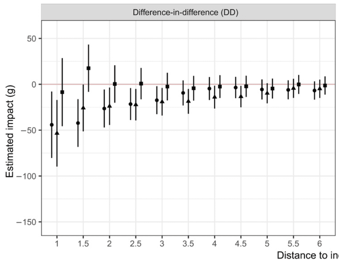
There’s something about this that looks wrong to me. The point estimates seem too smooth and monotonic. How could this be? There’s no way that each point here represents an independent data point.

I read the paper more carefully, and I think what’s happening is that the x-axis actually represents maximum distance to the killing; thus, for example, the points at x=3 represent all births that are up to 3 km from a killing.

Also, the difference between “significant” and “not significant” is not itself statistically significant. Thus, the following statement is misleading: “The size of this effect is substantial for exposure during the first and second trimesters. . . . The effect of exposure during the third trimester, however, is small and statistically insignificant, which is in line with previous research showing reduced effects of stressors at later stages of fetal development.” This would be ok if they were to also point out that their results are consistent with a constant effect over all trimesters.

I have a similar problem with this statement: “The size of the effect is spatially limited and decreases with distance from the event. It is small and statistically insignificant in both model specifications at around 3 km.” Again, if you want to understand how effects vary by distance, you should study that directly, not make conclusions based on statistical significance of various aggregates.

The big question, though, is do we trust the causal attribution: as stated in the article, “the assumption that in the absence of police killings, birth outcomes would have been the same for exposed and unexposed infants.” I don’t really buy this, because it seems that other bad things happen around the same time as police killings. The model includes indicators for census tracts and months, but I’m still concerned.

I recognized that my concerns are kind of open-ended. I don’t see a clear flaw in the main analysis, but I remain skeptical, both of the causal identification and of forking paths. (Yes, the above graphs show statistically-significant results for the first two trimesters for some of the distance thresholds, but had the results gone differently, I suspect it would’ve been possible to find an explanation for why it would’ve been ok to average all three trimesters. Similarly, the distance threshold allows lots of places to find statistically significant results.)

So I could see someone reading this post and reacting with frustration: the paper has no glaring flaws and I still am not convinced by its conclusion! All I can say is, I have no duty to be convinced. The paper makes a strong claim and provides some evidence—I respect that. But a statistical analysis with some statistical significance is just not as strong evidence as people have been trained to believe. We’ve just been burned too many times, and not just by the Diederik Stapels, Brian Wansinks, etc., but also by serious researchers, trying their best.

I have no problem with these findings being published. Let’s just recognize that they are speculative. It’s a report of some associations, which we can interpret in light of whatever theoretical understanding we have of causes of low birth weight. It’s not implausible that mothers behave differently in an environment of stress, whether or not we buy this particular story.

P.S. Awhile after writing this post, I received an update from Danning:
Continue reading

How to reconcile that I hate structural equation models, but I love measurement error models and multilevel regressions, even though these are special cases of structural equation models?

Andy Dorsey writes:

I’m a graduate student in psychology. I’m trying to figure out what seems to me to be a paradox: One issue you’ve talked about in the past is how you don’t like structural equation modeling (e.g., your blog post here). However, you have also talked about the problems with noisy measures and measurement error (e.g., your papers here and here).

Here’s my confusion: Isn’t the whole point of structural equation modeling to have a measurement model that accounts for measurement error? So isn’t structural equation modeling actually addressing the measurement problem you’ve lamented?

The bottom line is that I really want to address measurement error (via a measurement model) because I’m convinced that it will improve my statistical inferences. I just don’t know how to do that if structural equation modeling is a bad idea.

My reply:

I do like latent variables. Indeed, when we work with models that don’t have latent variables, we can interpret these as measurement-error models where the errors have zero variance.

And I have no problem with structural equation modeling in the general sense of modeling observed data conditional on an underlying structure.

My problem with structural equation modeling as it is used in social science is that the connections between the latent variables are just too open-ended. Consider the example on the second page of this article.

So, yes, I like measurement-error models and multilevel regressions, and mathematically these are particular examples of structural equation models. But I think that when researchers talk about structural equation models, they’re usually talking about big multivariate models that purport to untangle all sorts of direct and indirect effects from data alone, and I don’t think this is possible. For further discussion of these issues, see Sections 19.7 and B.9 of Regression and Other Stories.

One other thing: I think they should be called “structural models” or “stochastic structural models.” The word “equation” in the name doesn’t seem quite right to me, because the whole point of these models is that they’re not equating the measurement with the structure. The models allow error, so I don’t think of them as equations.

P.S. Zad’s cat, above, is dreaming of latent variables.

John Cook: “Students are disturbed when they find out that Newtonian mechanics ‘only’ works over a couple dozen orders of magnitude. They’d really freak out if they realized how few theories work well when applied over two orders of magnitude.”

Following up on our post from this morning about scale-free parameterization of statistical models, Cook writes:

The scale issue is important. I know you’ve written about that before, that models are implicitly fit to data over some range, and extrapolation beyond that range is perilous. The world is only locally linear, at best.

Students are disturbed when they find out that Newtonian mechanics “only” works over a couple dozen orders of magnitude. They’d really freak out if they realized how few theories work well when applied over two orders of magnitude.

It’s kind of a problem with mathematical notation. It’s easy to write the equation “y = a + bx + error,” which implies “y is approximately equal to a + bx for all possible values of x.” It’s not so easy using our standard mathematical notation to write, “y = a + bx + error for x in the range (A, B).”

The more general issue is that it takes fewer bits to make a big claim than to make a small claim. It’s easier to say “He never lies” than to say “He lies 5% of the time.” Generics are mathematically simpler and easier to handle, even though they represent stronger statements. That’s kind of a paradox.

From “Mathematical simplicity is not always the same as conceptual simplicity” to scale-free parameterization and its connection to hierarchical models

I sent the following message to John Cook:

This post popped up, and I realized that the point that I make (“Mathematical simplicity is not always the same as conceptual simplicity. A (somewhat) complicated mathematical expression can give some clarity, as the reader can see how each part of the formula corresponds to a different aspect of the problem being modeled.”) is the kind of thing that you might say!

Cook replied:

On a related note, I [Cook] am intrigued by dimensional analysis, type theory, etc. It seems alternately trivial and profound.

Angles in radians are ratios of lengths, so they’re technically dimensionless. And yet arcsin(x) is an angle, and so in some sense it’s a better answer.

I’m interested in sort of artificially injecting dimensions where the math doesn’t require them, e.g. distinguishing probabilities from other dimensionless numbers.

To which I responded:

That’s interesting. It relates to some issues in Bayesian computation. More and more I think that the scale should be an attribute of any parameter. For example, suppose you have a pharma model with a parameter theta that’s in micrograms per liter, with a typical value such as 200. Then I think we should parameterize theta relative to some scale: theta = alpha*phi, where alpha is the scale and phi is the scale-free parameter. This becomes clearer if you think of there being many thetas, thus theta_j = alpha * phi_j, for j=1,…,J. The scale factor alpha could be set a priori (for example, alpha = 200 micrograms/L) or it could itself be estimated from the data. This is redundant parameterization but it can make sense from a scientific perspective.

P.S. More here.

“Sources must lose credibility when it is shown they promote falsehoods, even more when they never take accountability for those falsehoods.”

So says Michigan state senator Ed McBroom, in a quote reminiscent of the famous dictum by Daniel Davies, “Good ideas do not need lots of lies told about them in order to gain public acceptance.” I agree with both quotes.

It’s kind of a Bayesian thing, or a multilevel modeling thing. Lots of people make errors, but when they don’t admit error, or when they attack people who point out their errors, that appropriately makes us less trusting of their other statements.