Like the canary in the coal mine, a canary variable is something with a known distribution that was not adjusted for in your model. Looking at the estimated distribution of the canary variable, and then comparing to external knowledge, is a way of checking your sampling procedure. It’s not an infallible check—your sample, or your adjusted sample, can be representative for one variable but not another—but it’s something you can do.
Sociologist Philip Cohen uses this idea to look at a survey from a few years ago. He starts with a quote from a paper that used the survey:
Appendix A presents a comparison of age-appropriate summary statistics from a variety of socio-demographic variables in the NFSS, alongside the most recent iterations of the Current Population Survey, the National Longitudinal Study of Adolescent Health (Add Health), the National Survey of Family Growth, and the National Study of Youth and Religion—all recent nationally-representative survey efforts. The estimates reported there suggest the NFSS compares very favorably with other nationally-representative datasets.
Sounds good so far, right? Cohen shows the comparison of the New Family Structures Study to the Census Bureau’s Current Population Survey:
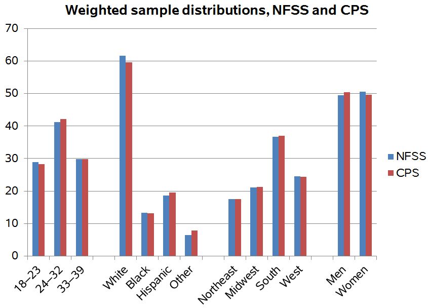
Ugly graph, but in this case it does the job so I won’t complain further in that direction. It’s the graphical equivalent of a bus with lumpy seats that you’re only taking for a few blocks so whatever.
But the lineup in that graph is not as impressive as it might at first seem. Cohen explains:
So, it looks very similar to the national population as counted by the benchmark CPS. But both of these surveys are weighted on these factors. That is, after the sample is drawn, they change the counts of people to make them match what we know from Census data (which are weighted, too, incidentally). So the fact that NFSS matches CPS on this characteristics just means they did the weights right, so far.
Think about it this way. If I collect data on 6 men and 4 women, it’s easy to call my data “representative” if I weight those 6 men by .83 and the 4 women by 1.25. The more variables you try to match on the harder the math gets, but the principle is the same.
So, yeah, it’s good that they’re correctly doing the weights (actually I prefer the more general term, “survey adjustment”) for the four variables shown above. But nonrepresentativeness can show up in other variables that have not yet been considered.
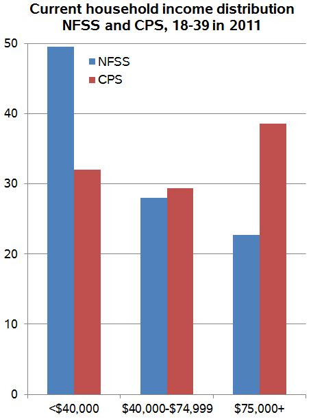
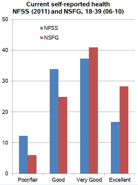
Cohen demonstrates:
I [Cohen] looked further down the table, and Regnerus’s data don’t compare “very favorably” to the national data on some other variables. Here are household income (from CPS) and self-reported health (from the National Survey of Family Growth):
This means that, when you apply the weights to the NFSS data, which produces comparable distributions on age, sex, race/ethnicity and region, you get a sample that is quite a bit poorer and less healthy than the national average as represented by the better surveys.
I was confused by this partly because according to the Knowledge Networks documentation on the NFSS, income was one of the weighting variables.
I don’t know either, and a quick google seems to show that the New Family Structures Study was mostly just used for one article in 2012 (ok, I do see some followups along these lines, but that’s pretty much it), so I doubt anyone really cares about this particular survey anymore, and indeed the above-linked post from Cohen is from 2013, so the interest here is not what happened with this particular survey. Rather, I’m highlighting this canary-variable idea because it comes up a lot, and it might be useful to you.
Surveys are nonrepresentative, even after adjustment
Also, this sort of thing comes up all the time in surveys. I have the impression that just about every political poll oversamples people who are interested in politics and undersamples people living in communal settings such as college dorms. We don’t care so much about these problems because the undersampled groups are less likely to vote, but we should at least be aware of this sort of thing. The point is that the above post is not particularly about this one survey from 2012; it relates to sampling and adjustment more generally.
This post also applies in a different context – to matching studies. I always find it hilarious that we publish a table comparing the matched pairs on the matching variables – which if visualized crudely is exactly what you said, the bus with lumpy seats that you ride just for a short time. What is much more informative is to look at the matched vs non-matched subgroups on the matching variables, or the matched pairs on non-matched (canary) variables.