. . . there’s something really wrong with the analysis that was used to make it.
Elliott Morris writes:
I was reading a paper about polling aggregation in New Zealand and came across this graphic, showing estimated Labour vote share conditional on polls observed intermittently:
I [Morris] do not understand these confidence intervals. Why do they balloon between days with observations? Should that really be happening? Why don’t the confidence intervals look relatively flat from day-to-day, like ours did last year?
I’m surely missing something, but this seems wrong.
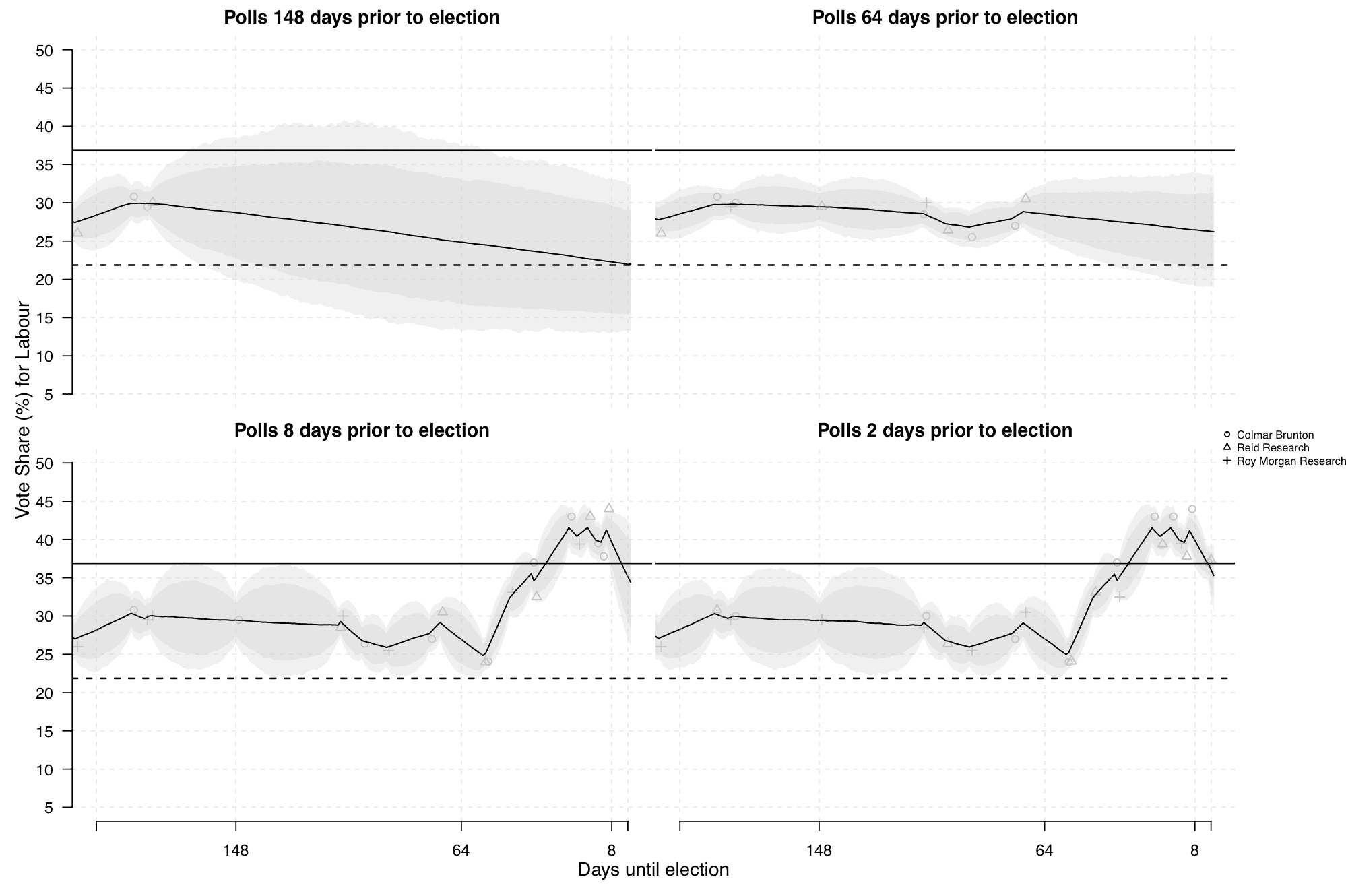
My reply: These are great graphs because they clearly reveal there’s a problem with the model! They’re in a class with this famous graph.
Graphs that reveal problems are underrated. It’s great to have a graph that reveals problems.
The next step is to figure out what went wrong and fix the model.
P.S. This is related to the idea that every graph should contain the seeds of its own destruction.
P.P.S. Marcel Neunhoeffer, one of the authors of the above-linked article, writes:
We are not sure why the graph reveals that something should be wrong with our model. (But we would be interested in learning what went wrong if something went wrong!)
The graph shows the estimated polling average and its associated uncertainty (together with a forecast for election day, but the issue seems to be in the poll aggregation part). The problem in New Zealand is that national polls are only published very rarely (sometimes the interval was more than a month between two polls). For us the resulting balloons made sense in the way that there should be more uncertainty around the estimated polling average when polls are far apart (after all what path did the polls take from poll 1 to poll2?) than when they are closer together.
If anyone is interested in working through the model you can find our code here.
We appreciate any hints to improve the model!
I love when people share their code! Anyway, here’s my response: Yes, there should be more uncertainty when you’re further away from a poll. But not that much more uncertainty! It makes sense for the uncertainty intervals to be slightly wider in the interval between polls, but only slightly wider. The balloon shape in the graphs indicates a problem because it says that the model’s giving too much probability to unlikely scenarios in which there are huge jumps in opinion between polls. Or, to put it another way, if you believe the large uncertainties between the polls, then your model shouldn’t be so certain on the day of each poll. Polls are subject to non-sampling errors, and if there’s that much uncertainty it should be included in the model. So, either the intervals between the polls should not balloon up so much, or the intervals on the days there are polls should be wider. Either way, something went wrong. I appreciate that the code is there, so people can feel free to offer suggestions for improvement to Neunhoeffer et al.
My hypothesis: They fit a Gaussian Process Regression to the observed points and used that to get the confidence bands. If there was no “extra” noise built into the kernel, the GPR would always try to go exactly through every observed point. This would mean it had complete confidence in each individual observation but would “balloon” out between them.
The weird thing is that it looks like they only used the GPR to draw the confidence bands. The dark lines just seem to be segments that connect the observations directly.
> The dark lines just seem to be segments that connect the observations directly.
Not really, in most cases we see that the line doesn’t quite follow the swings in the data. It’s very clear in the far-right part of the two bottom charts.
It’s true that the estimate varies linearly between observation dates but I’m not sure why should we expect otherwise.
On closer inspection the turning points are slightly shifted relative to the apparent locations of the observations so who knows what’s going on.
You say that the graphs reveal a problem with the analysis, but how do you know? Not quite following how we know about an analysis problem based on the graph.
Anon:
The problem is that the confidence intervals balloon between days with observations. They shouldn’t do that; it doesn’t make sense. When things don’t make sense, it could be problem with the data or the model, but since the problem is happening where there are no data points, it seems pretty clear that it’s a problem with the model.
“since the problem is happening where there are no data points”
?? The problem is both the balloon and the constriction at the data points, isn’t it? The election still has substantial uncertainty on the polling days because there is uncertainty in the polls. It looks like the uncertainty constricts too much on polling days and expands to quickly afterward.
Jim:
Yes, exactly. See P.P.S.
> Why don’t the confidence intervals look relatively flat from day-to-day, like ours did last year?
I think that it was actually a problem with your chart when it was showing similar uncertainty at the current date as several months into the future. (I think the model was later improved somewhat, but if I remember correctly I never quite understood the precise meaning of those uncertainty intervals.)
The uncertainty should grow in proportion with the time from a poll and the rate at which public opinion is believed to drift. This graph suggests that the polling uncertainty is dwarfed by the uncertainty due to day-to-day opinion drift, even though the comparing across polled days doesn’t show any evidence of such extreme swings.
The graph looks like an illustration of some thought experiment toward applying quantum physics to political polling. Everyone has every possible opinion until you ask them a survey question, then all those superimposed potential opinions collapse to a point.
> the model’s giving too much probability to unlikely scenarios in which there are huge jumps in opinion between polls
Let’s take for example the 40-days “bubble” that goes from 148 to 108 more or less.
The width of the interval is around +/- 7% in the center (about twice the width at the endpoints where observation are available).
Does it really give too much probability to unlikely scenarios?
In the subsequent 40-day periods some quite remarkable jumps were observed:
3% down and 3% up
4% down and 10% up
4% up and 4% down
( I join the chorus of readers who would love to recover a more readable interface with less wasted space.)
For any individual poll, wouldn’t the poll have taken several days to perform?
If so, the model might be improved by analyzing each poll as providing the average response over the period from the start of the poll to its end. This change would broaden the overly narrow 95% credible intervals on the plotted dates of the polls. It may also lead to a better estimate of the right degree of bubbling (random walk variance) that should be included.
For countries where polls are very frequent, it might be a good-enough approximation to treat each poll as if it is a single point-in-time estimate of public opinion. However, for countries with sparse polls, maybe this approximation is not good enough.
It’s great to see the authors be so responsive and open to input!
Like Carlos Ungil and Anon, I don’t see how the plot reveals something obviously wrong with the authors’ model. Perhaps the bubbling should even be larger than it is now, considering the quick shifts Carlos mentions and the confidence bands that miss the final election outcome (solid line) at day 0 in the top two plots.
Thank you for the comment, Charles. Including the field days of the polls into the model (unfortunately that information is not always reported) would certainly be interesting.
Note that the plotted trend and credible intervals are only for the polling average and not credible intervals for the forecast. You can find those at those time points in Figure 5 of our supplementary material (https://static.cambridge.org/content/id/urn:cambridge.org:id:article:S1047198718000499/resource/name/S1047198718000499sup001.pdf).
Sorry, missed your response earlier.
Too bad the field days are unavailable sometimes. Maybe the confidence intervals wouldn’t get too narrow on the days with poll data if each poll’s result was smeared out over its field days.
Thanks for the link and for correcting me about the plot interpretation.
Carlos, Charles:
That’s fine with me to have wide uncertainties during the periods between the survey data. But then I think we should have much wider uncertainties on those days and on the nearby days. Surveys have lots of non-sampling error, and that’s especially gonna be an issue if there are big opinion shifts during short time periods.
On this note, if you look at the model code the model tries to estimate the covariance matrix from observed data. From my experience, this will tend to overestimate the variance parameters because the model’s preference is to fit every polling result precisely through the random walk alone. This also usually leads to other estimates (e.g. nonsampling error and so forth) being unreliable. You can test this on simulated data with a noise parameter that isn’t captured by the model structure. From what I remember about this paper, they only fit polling house deviations and thus there is probably nonsampling variation etc floating around that the model tries to capture too with the random walk and the variance terms of the covariance matrix. My preferred approach would be estimating the matrix from past data where there is sufficient amount of polling data but that can be tricky too for example with respect to how similar are these covariance matrices across time, what about newly emergent parties like the AfD in Germany, etc.