Elliott Morris points us to this set of estimates by Sondre Solstad of excess deaths during the pandemic.
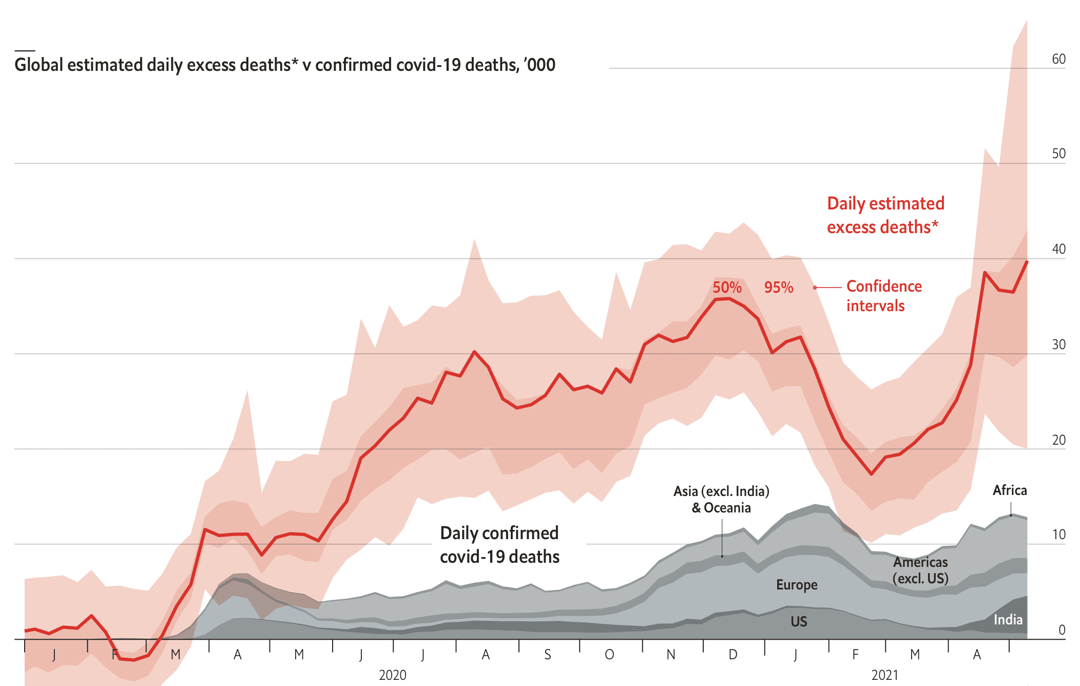
The above graph is for the whole world; they also have separate graphs by continent and by country. From the description:
The Economist’s global excess-death-toll estimates are, as far as we know, the first of their kind. They are not the only way to infer the total number of deaths due to covid-19. On May 6th the Institute for Health Metrics and Evaluation (ihme) at the University of Washington published the results of a simpler model which applies fixed multipliers, mostly based on test-positivity rates, to official covid-19 death tolls in different countries and territories. This methodology often provides numbers which fail to match reported excess deaths. For example, ihme estimates that there have been 100,000 covid-19 deaths in Japan, far more than have been reported, but the excess-death figure for the year to March 2021 was -11,000.
However they are made, estimates are no substitute for data, notes Ariel Karlinsky, a statistician at the Kohelet Economic Forum, an Israeli think-tank, who as leader of the World Mortality Dataset project has collected many of the excess-mortality data on which The Economist’s model relies. Only by better tracking of mortality in poor countries can estimates of the death rate be improved.
We discussed Karlinsky’s data and problems with the much-publicized but problematic IHME numbers a couple weeks ago.
I’ll copy again this graph from Karlinsky because I like how it displays the raw data in a clean and effective way that would make Bill Cleveland very happy:

I replied to Elliott and Sondre as follows:
1. Something wrong with your confidence intervals. I’m not sure what, but they look weird in many places.
2. How do your estimates compare to those here? In particular, I think that graph of weekly deaths is a super-clean way of showing things.
3. You’re doing much better than the former chairman of the US Council of Economic Advisers. Jeez, was our government mismanaged or what??
Sondre replied:
1. I think Elliott is right that it’s because of the limited number of bootstrap iterations—they are probably irregular simply because I ran into computational constraints. With higher B and even lower learning rate, they probably would’ve been smoother, but as I wanted to do hyperparameter tuning for each separately to avoid a common set making them artificially narrow, things got computationally costly really fast. I think their frequent asymmetry is correct generally, due to some natural floors/ceiling on deficit/excess deaths.
2. I haven’t looked at theirs in detail or tried many country-to-country comparisons, but judging by their maps, I believe the main differences are a) that we have lower estimates for rich countries, and higher estimates for developing countries. b) we give confidence intervals, c) we do not constrain our model of excess deaths to be a static multiplier of covid deaths, and d) we give confidence intervals (that are often, rightly, very wide), and provide these explicitly when possible on our charts and in text. Thank you, I was really happy we got those into the interactive. We also use it in the methodology writeup (using Egypt as an example) to show how we combine modeled and measured excess deaths (when available).
3. Thanks, we certainly hoped we would.
Generally, my approach was to optimize so that the risk of inaccurately small CIs was minimized, even if that sometimes led to risk of them being a bit larger than they could be. For instance, I did full hyperparameter tuning for each bootstrap iteration, but to do so had to tolerate a lower learning rate for it to complete with the latest excess deaths data in time for publication. With more computational resources, I would’ve decreased learning rates across the board, as well as increased the number of bootstrap iterations for more accurate (and probably a bit narrower) CIs.
Sondre had some more comments about IHME, but at this point I guess nobody’s taking IHME seriously anymore. They’re not quite the Cornell Food and Brand Lab, the Berkeley Sleep Lab, or the Ohio State Voodoo Lab, but they’re getting there.
I’m not a big fan of all this bootstrapping. I mean, sure, it’s fine, but at some point I think it’s simpler to just get to it and throw down a posterior distribution. Especially if you want to quantify uncertainty. But let a thousand flowers bloom.
Preamble for relevance: I basically assume we won’t know much about actual mortality until we start doing lots of household surveys in the next couple years and ask how many family members died recently. But maybe I’m under-estimating the existing structure in place to deal with the fact that many deaths in poor countries aren’t ever recorded in a central statistical office. Technical note: the nature of pandemic spatial serial-correlation also makes me wonder if cluster-sampled demographic surveys (most of them) are going to be an adequate tool.
Real reason I’m here – I Got Jokes:
1. I thought this was going to be another job listing like the last post – I’ve been applying for gigs as “economist turned political hack” ever since but it isn’t panning out and I was hoping for a new idea.
https://statmodeling.stat.columbia.edu/2020/05/14/so-much-of-academia-is-about-connections-and-reputation-laundering/
2. If I had known economics was this depressing, I would’ve become an Actuary.
3. You should really get some population mortality estimates from The Demographer.
Evergreen joke: What’s the difference between an economist an actuary?
The economist is much more outgoing. He looks at *your* shoes when he talks to you.
So this hypothesis that in poor countries death does not get reported, do we have any estimates on this?
For example in India, which could be an archetype of a poor country, there are a lot of benefits for the family tied to death. Even for a poor person.
So the incentives for reporting death formally are significant. In many places the cremation ground itself will issue you a certificate or at least refuse cremation unless the certificate is presented.
So I wonder what percent of deaths are unreported even in non covid times.
Hard to know. But here’s one educated guess about India:
“Close to six million deaths – i.e. more than two-thirds of the 8,503,372 deaths estimated to occur annually – were registered in India’s vital statistics system during 2011.”
I think that’s the right pull-quote number but I was skimming a bit. Their short Findings summary:
“Although we found the legal framework and system design to be appropriate, data collection was based on complex intersectoral collaborations at state and local level and the collected data were found to be of poor quality. The registration data were inadequate for a robust estimate of mortality at national level. A medically certified cause of death was only recorded for 965,992 (16.8 percent) of the 5,735,082 deaths registered.”
https://www.ncbi.nlm.nih.gov/pmc/articles/PMC4709797/
I think that coordination issue is a big part of it. Just because deaths are reported somewhere doesn’t mean they all get added up somewhere else.
Globally there is also this one (shhhh – I got it from the bibliography of the other one, don’t tell anyone):
“FINDINGS: At the end of 2003 data on death registration were available from 115 countries, although they were essentially complete for only 64 countries. Coverage of death registration varies from close to 100% in the WHO European Region to less than 10% in the African Region. Only 23 countries have data that are more than 90% complete, where ill-defined causes account for less than 10% of total of causes of death, and where ICD-9 or ICD-10 codes are used. There are 28 countries where less than 70% of the data are complete or where ill-defined codes are assigned to more than 20% of deaths. Twelve high-income countries in western Europe are included among the 55 countries with intermediate-quality data.”
https://www.ncbi.nlm.nih.gov/pmc/articles/PMC2624200/
I think a lot of what we think we know about deaths in developing countries come from retrospective surveys and certain kinds of focused surveillance on some groups/regions (and including official deaths), but not really from a central office that counted up all the dead. I’m sure the internet is making it easier, and things like formal banking and deeded property rights are changing the incentives to report deaths; I just think it’s a really hard problem, and it’s really hard to report it quickly even if someone is writing everything down somewhere.
n.b.: I’m just an economist seeking employment as a “former economist turned political hack”; I am not an actual demographer. So I don’t know a ton about how much has changed in terms of dead people counting in the last 20 years or so.
Much more informative than the IHME. For instance, they use cutting edge technologies like “confidence intervals.”
As far as the G20 nations goes, viewing deaths as a time series view makes it pretty apparent that the excess deaths are all about COVID, contra IHME. One could possibly stretch to imagine a broken health care system at COVID peaks, as opposed to undercounting at those peaks. Belgium and France graphs seems to argue against that idea.
Sweden/Norway/Denmark graphs suggest the degree that anti-COVID efforts could possibly be preventing deaths from other causes. (By “preventing” I mean “delaying;” this is Scandanavia. I’m on an Ingmar Bergman kick.)
Russia is informative for contrast.
Dzhaughn:
Don’t even talk about IHME. It’s out of the picture now.