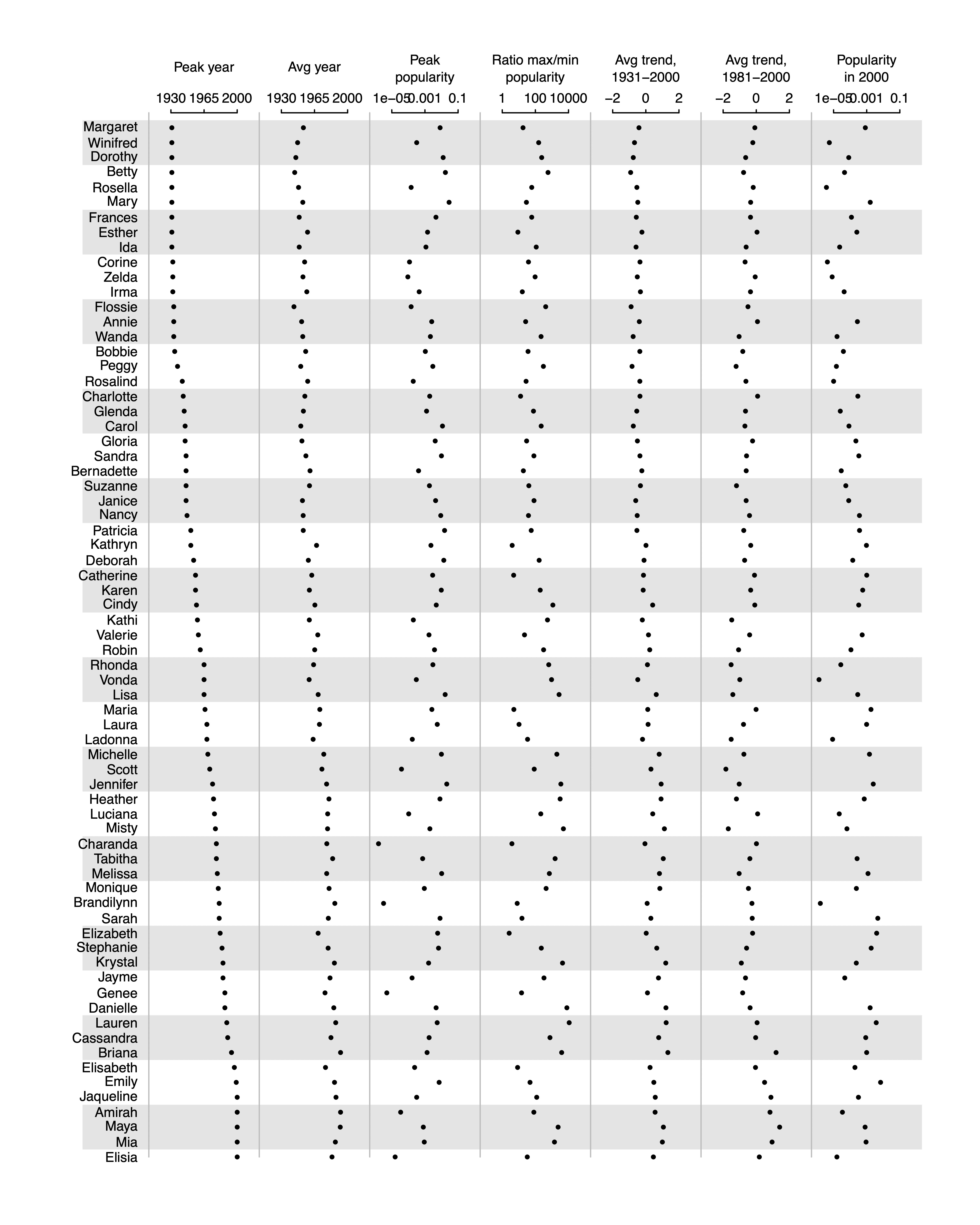
I often see articles that are full of long tables of numbers and it’s hard to see what’s going on, so then I’ll suggest parallel dot plots. But people don’t always know what I’m talking about, so here I’m sharing an example.
Next time when I suggest a parallel dot plot, I can point people to this post.
Also I thought Margaret would appreciate this one since her name is the oldest on the list. Well, not the oldest in average—Dorothy and Winifred and a few others have her beat—but one of the earliest peak years, and somehow she ended up on top of the graph.
Seems very similar to sparklines. The differences concern whether the entire time trend is of most interest, or whether the highlighted features you have (peak, min, max, etc.) are of more interest. You can still annotate sparklines with some of these features, but not all of them.
Dale:
Just to be clear: I’m not claiming any novelty with this sort of plot. Parallel dotplots are an old idea. I’m just sharing this particular example so that I can have something specific to refer people to when I make the suggestion.
There’s some confounding here: Margarets are often called Peggy.
Martha:
The data are from the Social Security database, so they’re people’s official names. Even the nicknames, I think, were people whose given names were Annie or Maggy or whatever.
Vaguely disappointed not to find ‘Dotty’ on the list.
Not bad! Wish I’d thought of it myself. ; ~)
Well, I for one really like this plot (which indeed is pretty unusual), but in a case like this one, where there are a lot of observations, I would strongly consider displaying/mirroring the “x axis” also at the end of the plot, because you kind of lose track of the context of the dots for the last observations.
Andrew, I can’t believe you would post a table without a descriptive title. What’s next, a graph that doesn’t start at zero?
Sorry, that last shot went too far. Sometimes I can be abcissa-compulsive.
Groan!
This would be great as an interactive graph where you could change the column you sort by
This is the same concept as a table lens, just a slightly different representation.
“Scott”?
“Genee”?
Phil:
We chose the names randomly from the Social Security database with probability proportional to the name frequency (weighting the probabilities to get names distributed uniformly across the time period under study). I don’t know about Scott but it could be a misclassification.
Peak popularity is low, it’s plausible that there were a few dozens sometimes in the seventies. These is not a top #70
I like it, but suggest this tweak:
Instead of lines separating columns with dots, make individual vertical graphs. So ditch the light brown lines between columns and apply similarly-weighted lines to each tick on the scale for each column. I guess if you do that it’s basically a row of small multiples.
This occurred to me because on the average trend you can’t distinguish positive from negative for most of the chart.
Or retain the cleanness of the plot by only having a vertical line at the center of each scale, which conveniently corresponds to a tick mark in every instance.
Perfect! That’s all you need.
Is this a ggplot? If so, can you share the code?
+1
Or at least a hint!
Interesting, but I would still prefer a heatmap.
This looks promising! I wonder how it can be extended to “parallel histograms” or “parallel density plot.”
Great. The code please?!
James:
I’m warning you, the code is ugly, and it’s many years old:
namesplot <- function (a){ labels <- c ("Peak year", "Avg year", "Peak\npopularity", "Ratio max/min\npopularity", "Avg trend,\n1931-2000", "Avg trend,\n1981-2000", "Popularity\nin 2000") digits <- rep (0, 5) is.log <- c (FALSE, FALSE, TRUE, TRUE, FALSE, FALSE, TRUE) lo <- c (1930, 1930, -5, 0, -2, -2, -5) hi <- c (2000, 2000, -1, 4, 2, 2, -1) J <- ncol (a) n <- nrow (a) plot (c(-.6,J), c(-n,3), xlab="", ylab="", xaxt="n", yaxt="n", type="n", bty="n") for (i in seq(0,-n,-6)){ polygon (c(-.6,J,J,-.6), rep (c(i-.5, max(i-3,-n)-.5), c(2,2)), col="gray90", border=NA) } text (-.1, -(1:n), dimnames(a)[[1]], adj=1, cex=.7) for (j in 1:J){ if (is.log[j]){ x <- log10 (a[,j]) text (c(j-.8,j-.5,j-.2), c(1,1,1), 10^seq(lo[j],hi[j],length=3), cex=.7) } else { x <- a[,j] text (c(j-.8,j-.5,j-.2), c(1,1,1), seq(lo[j],hi[j],length=3), cex=.7) } lines (c(j-.8,j-.2), c(0,0)) segments (c(j-.8,j-.5,j-.2), c(0,0,0), c(j-.8,j-.5,j-.2), c(.2,.2,.2)) lines (c(j-1,j-1), c(0,-n), col="gray") text (j-.5, 3, labels[j], cex=.7) points (j-.8 + .6*(x-lo[j])/(hi[j]-lo[j]), -(1:n), pch=20, cex=.6) } }I took a quick attempt with similar data using ggplot2. I also don’t want to be made fun of for my code lol. I now see this needs a title too, but you get the idea
library(ggplot2)
library(patchwork)
mtcars$car_name <- rownames(mtcars) # create new column for car names
# arrange data set in order of mpg
mtcars$car_name <- factor(mtcars$car_name, levels = mtcars$car_name[order(mtcars$mpg)])
mtcars$car_name
p1 <- ggplot(mtcars, aes(x=car_name, y=mpg)) +
geom_point(stat='identity', fill="black", size=2) +
scale_y_continuous(position = "right") +
theme(plot.margin = unit(c(0.2,0,0.2,0), "cm"),
axis.line.y = element_line("black", size= 1),
axis.line.x = element_line("black", size= 1)) +
labs(title="Car mpg") +
coord_flip()
p2 <- ggplot(mtcars, aes(x=car_name, y=hp)) +
geom_point(stat='identity', fill="black", size=2) +
scale_y_continuous(position = "right") +
theme(axis.text.y = element_blank(),
axis.ticks.y = element_blank(),
axis.title.y = element_blank(),
axis.line.y = element_line("black", size= 1),
axis.line.x = element_line("black", size= 1),
plot.margin = unit(c(0.2,0,0.2,0), "cm")) +
labs(title="Car hp") +
coord_flip()
p3 <- ggplot(mtcars, aes(x=car_name, y=wt)) +
geom_point(stat='identity', fill="black", size=2) +
scale_y_continuous(position = "right") +
theme(axis.text.y = element_blank(),
axis.ticks.y = element_blank(),
axis.title.y = element_blank(),
axis.line.y = element_line("black", size= 1),
axis.line.x = element_line("black", size= 1),
plot.margin = unit(c(0.2,0,0.2,0), "cm")) +
labs(title="Car weight") +
coord_flip()
p1 + p2 + p3
I was looking for something like this. I liked the the plot when Andrew presented it the other day and actually found someone who needs something like a parallel dot plot this morning. Serendipity.
I have not used base graphics in years so it may be easier for me to tackle this than Andrew’s function.
Many thanks to you and Andrew.
Thank you Andrew and Warren,
Saved me an hour of coading.
Very nice. I’m writing a book on How to Write for economists, and I might put this example in.
You omitted something crucial, though: a title to say what it’s about!
https://www.rasmusen.org/blog1/wp-admin/post.php?post=657&action=edit&classic-editor
Eric:
Oh yeah, graphs should always have titles or captions, or both. In this case, it’s a graph I prepared for a research project we never finished. This graph has never been published anywhere (except just now on this blog)!