Last week we discussed an article in the British Medical Journal that seemed seriously flawed to me, based on evidence such as the above graph.
At the suggestion of Elizabeth Loder, I submitted a comment to the paper on the BMJ website. Here’s what I wrote:
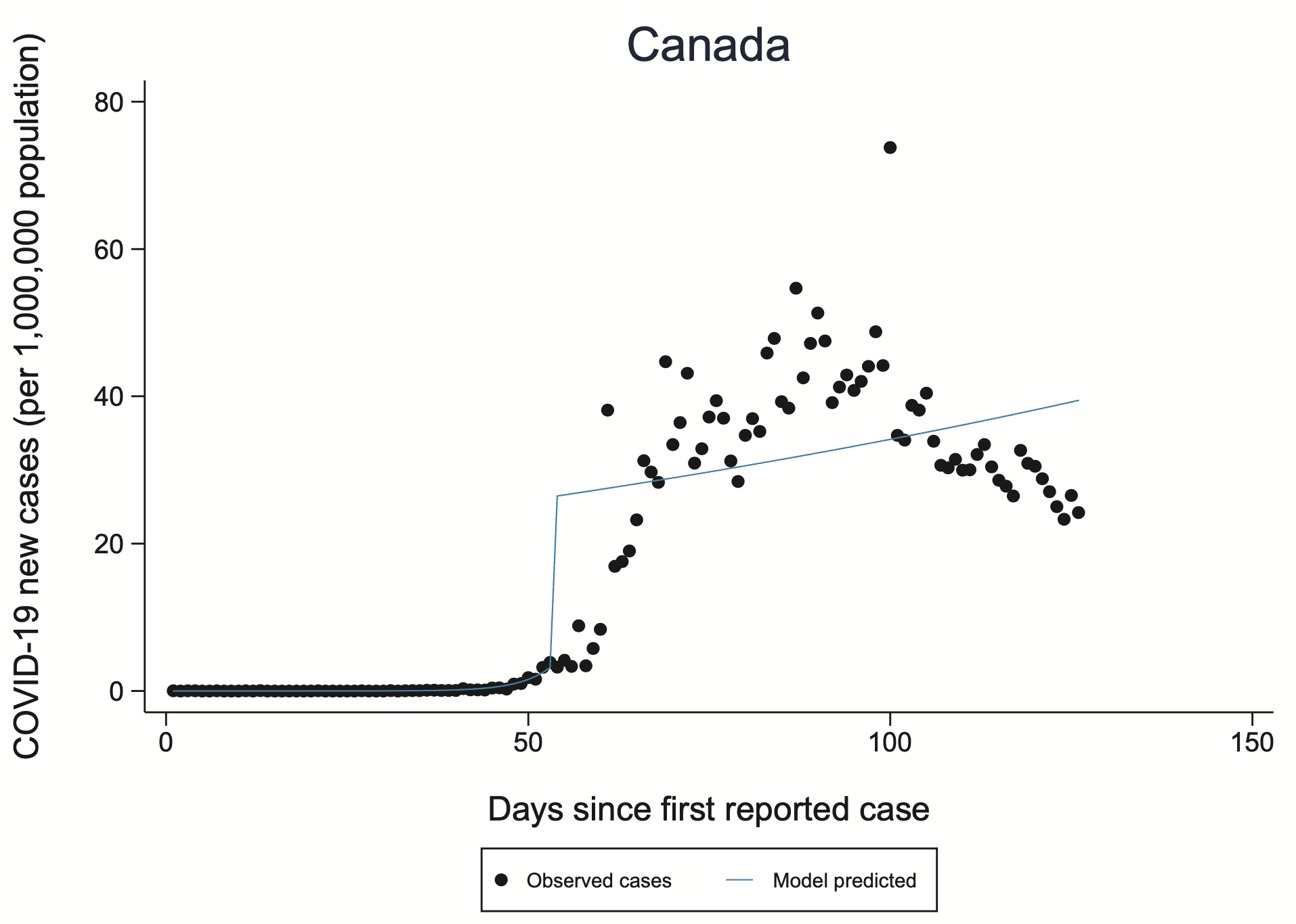
I am concerned that the model does not fit the data and also that the jumps in the fitted model do not make sense, considering the blurring in the underlying process. I was alerted to this by someone who pointed out the graph for Canada on page 84 of the supplementary material. The disconnect between the fit and the data gives me skepticism about the larger claims in the article.
I also have concerns about the data, similar to those raised by the peer reviewers regarding selection effects in who gets tested.
There were a couple other comments, and the authors of the article wrote a response. Here’s the part where they reply to my comment:
Zadey and Gelman also raised concerns about the model fit and model parameters. Our interrupted time series model allows for both a change in slope (incidence rate) and a change in level at the time of intervention, the latter of which can therefore look like a “jump” in the fitted line on the incidence graphs (supplementary appendix). We agree with Zadey that change in level may also be relevant in other contexts, but here we chose to focus on change in the slope because we were most interested in the effect over the full post-intervention period examined, and did not anticipate that the intervention would have an immediate effect (i.e. a sudden jump in level) in most countries.
We are of course well aware that the model fits better in some countries than others. A different model may have fit the data better in Canada, for example, but not necessarily in other countries. Using different models in different countries would have precluded the ability to perform a meta-analysis of results across countries.
I’m not convinced by this response. The model fits terribly for Canada. It makes no sense for Canada. Why should I believe it for other countries? And why should I believe any aggregate results that include Canada? If constructing models that made sense and fit the data would’ve precluded the ability to perform a meta-analysis, then maybe the meta-analysis wasn’t such a good idea!
The idea of taking a hundred analyses of uncertain quality and then throwing them together into a meta-analysis . . . I don’t think that makes sense.
In any case, the links are above so you can read the article, the referee reports (which I think missed some key issues, in keeping with our theme about the problems with peer reviews), and all the external comments.
P.S. To elaborate: If the authors had responded to my comment with, “Oh, damn! Yeah, Canada’s different because of XYZ, we really shouldn’t’ve included Canada in our analysis, but here’s why it makes sense for other countries,” then, sure, maybe they have a point. Or maybe not, but they’re at least thinking about it.
But, no, they didn’t do that, they just brushed aside the entire issue with, “the model fits better in some countries than others.”
That’s not an answer at all! It’s like they don’t care if the model makes sense at all. I had the same reaction several years ago to those ovulation-and-clothing researchers. When I pointed out to them that they got the days of peak fertility wrong, they just didn’t care. They had their result, and they had their publication, and they had their line of research, and they didn’t want to hear about anything that could be wrong with their plan.
> throwing them together into a meta-analysis . . . I don’t think that makes sense.
Agree, meta-analysis only makes sense if something in the model is credibly common among the studies and the data don’t scream otherwise.
But it is a common and hard to dispel mistake of for some reason thinking “we have to do a meta-analysis if there are multiple studies”.
I once tried to argue in some paper once that something is a meat-analysis even when the contrast of study results is problematic and leads to the conclusion that nothing is well enough understood to make sense of any of the studies.
Combination is something to always carefully consider doing – not some to always do.
For those who may be interest there is further elaboration here http://www.stat.columbia.edu/~gelman/research/unpublished/Amalgamating6.pdf
I will open myself to all kinds of criticism by writing this, but whatever, and be it just for the sake of having an argument… I didn’t read the paper, so I have no business in defending what exactly they did. However, in principle, I think it is legitimate to fit the same kind of model to all countries to be able to compare and summarise them using estimates from that model even if this model isn’t very good for a small number of countries. Whether this makes sense depends on whether the estimators for Canada and maybe other countries represent what went on in these countries in a grossly misleading way, and even that can be tolerated if the estimates are aggregated in a robust way that allows for a few outliers. The estimators may not actually be outliers compared to the other countries, but still misleading, but such numbers then normally have little influence on the overall analysis.
This all relies on the model being good for the vast majority of countries, which of course I don’t know, and also on how exactly the fits are used. On top of that it depends on the availability of better alternatives. So I ultimately may be convinced, looking at the whole paper and particularly fits in other countries, that this is bad, but based on looking at Canada alone I’m not, and the authors’ response makes some sense. Models don’t need to be true and can even clearly visibly be wrong as long as this is handled in such a way that it doesn’t make the overall analysis misleading. Certainly this would need to be investigated in this case, that far I agree. (Some application of the thinking of “frequentism-as-model” here ;-)
I remember scrolling through the graphs at the end of the paper and thinking that the Canada example was maybe one of the worst, but there were plenty of bad ones. In principle I agree that when you’re dealing with a large number of examples, you don’t need to fit all of them, you just need to capture important aspects of enough of them to matter… But I honestly think this paper doesn’t stand up to that requirement. It’s very hacky, what you want is something thoughtful about dynamics, and I don’t think this is it.
https://www.bmj.com/content/bmj/suppl/2020/07/15/bmj.m2743.DC1/isln059328.ww.pdf
That’s the supplement with all the graphs… Take a look at the abysmal graphs for:
United States
UK
Turkey
Switzerland
South Korea
Singapore
Serbia
Russia
Romania
…
as you can probably tell, I’m just scrolling backwards through the document… basically at least 1/3 of these graphs are terrible, and they correspond to highly populated countries, so I’d say the vast majority of the worlds population corresponds to terrible fits
There are some situations that fit well.. Take New Zealand for example… But the concept that there’s kind of a switch you flip and then you go from exponential with one growth rate to some other initial condition followed by exponential with another growth/decay rate is pretty stupid simple, and I think it only really applies to countries like New Zealand where it’s capable of shutting down all international travel, and there is low density, and high resources… And yet, you’d think South Korea would fit, but the model fits South Korea in a terrible way. One suspects it needed many many more iterations of some iterative optimization algorithm.
This just feels like throwing alphabet soup at the wall and hoping to read off messages from the great beyond.
Yes, I agree. The regression discontinuity doesn’t fit well even in a majority of these as far as I can see; changes look much smoother in almost all graphs, but the location of the artificial discontinuity seems to have a strong impact on what they do and conclude, so this won’t be reliable. OK, as I wrote, I have no business defending the paper.
I was referring to criticising the Canada fit in an isolated manner, and the response of the authors saying that if this kind of thing is done for aggregating countries, it can be accepted that the odd country isn’t fitted well. This I still think is fair enough. That the model is hardly ever convincing is a different story.
Christian:
Canada’s an example. If the authors replied, “Oh, damn! Yeah, Canada’s different because of XYZ, we really shouldn’t’ve included Canada in our analysis, but here’s why it makes sense for other countries,” then, sure, maybe they have a point. Or maybe not, but they’re at least thinking about it. But, no, they don’t do that, they just brush aside the entire issue with, “the model fits better in some countries than others.” That’s not an answer at all! It’s like they don’t care if the model makes sense at all. I had the same reaction several years ago to those ovulation-and-clothing researchers. When I pointed out to them that they got the days of peak fertility wrong, they just didn’t care. They had their result, and they had their publication, and they had their line of research, and they didn’t want to hear about anything that could be wrong with their plan.
“Oh, damn! Yeah, Canada’s different because of XYZ, we really shouldn’t’ve included Canada in our analysis, but here’s why it makes sense for other countries” – my point is, they actually could have included Canada (under certain conditions, see above) if the vast majority of fits would have been OK but not Canada.
We don’t have to discuss that the vast majority of fits actually isn’t OK.
Surely leaving out an obviously nonsensical data point is better than including it in some kind of “robust” model? (It’s hard to imagine what kind of robustness a model would need to be able to automatically identify and exclude nonsensical data.)
“The idea of taking a hundred analyses of uncertain quality and then throwing them together into a meta-analysis . . . I don’t think that makes sense.“
Andrew,
You obviously don’t understand how these things work. When subprime mortgages were bundled into mortgage backed securities, Moody’s rated this junk AAA, and everything worked out just fine.
Digressive, but that wasn’t the bond problem. The packaging really *could have* resulted in AAA quality. The idea was that you bundle together all the junk bonds and then create a new security that pays the bearer the first $10,000 of interest payments each year of the $80,000 that are supposed to come in. This new security really is safe, so long as not more than 7/8 of the mortgages go into default.
The problem is that the investment banker has an incentive to make it the first $75,000, not the first $10,000, and then it’s not safe, and Moody colluded or was fooled by the investment bankers.
This discussion of meta-analysis is actually a reprise of our recent go-round with average effects, no? Meta-analysis is based on the idea that the studies under analysis are all trying to estimate the same thing whose true value is estimated with error in each individual case. Sometimes that’s right. I’ll bet there are many examples in physics and chemistry where different samples and perhaps measurement strategies are going after the same constant. The recent publicity about a new study of climate sensitivity to increases in atmospheric CO2 points to a similar situation: there’s just one climate sensitivity, at least at one point in time.
In most contexts we’re concerned with though, the object of study is variable, its relationship to possible causal factors is variable, and these variations across samples and methods is of high interest. That has to be true for the epidemiological effects of policies taken in response to the pandemic. Some countries’ data seem to suggest one sort of model, others another. Yes, let’s look into that.
Can you link to this? I think CO2 climate sensitivity is not constant at all, and the goal of getting a more precise value doesn’t even make sense. The uncertainty is like a standard deviation, but people talk about it like it is a standard error that gets smaller as more data is collected.
This I guess: https://agupubs.onlinelibrary.wiley.com/doi/epdf/10.1029/2019RG000678
Wow 184 pages. They need to share the code and data rather than attempt to describe what they did in 100 pages of prose. But from reading it my takeaway is they still think the climate sensitivity is the same during a glacial as during an interglacial, etc.
As a thought experiment, say all the water on earth is frozen and you start adding CO2. Is the climate sensitivity going to be the same as with 70% of the surface covered by liquid water that can evaporate? No, it is going to be totally different.
The climate sensitivity that matters currently is, what is the increase in average global temperatures of a given increase in (e.g. doubling of preindustrial) CO2 concentrations. Since this is about the equilibrium across carbon sinks, cloud dynamics, albedo, etc., it would obviously be different now from other geological eras. But it is still effectively a constant over the century or so time horizon of climate policy, so I think it serves the purpose I enlisted it for.
They use paleoclimate data to estimate it.
It varies from year to year (actually moment to moment), there is no “true value”. I don’t know what exactly they did in this case to get a narrower range (even after spending like 1 hr looking through that paper) but it must have amounted to essentially plugging in different data than previously.
From the paper:
This endeavor is based on the fallacy there is some constant value of S independent of the state of the climate. Instead it varies usually between 1.5-4 K (or whatever the real values are).
Say you want to predict the eventual adult height of a baby. So you look at a histogram of previous adult heights and see whatever average +/- sd. No matter how much data you collect it is not going to lessen that uncertainty.
Now, you can lessen it by looking at subgroups, etc or perhaps over time human height can become less variable. But that is not what was done here.
@Anoneuoid: “Wow 184 pages. They need to share the code and data rather than attempt to describe what they did in 100 pages of prose.”
You mean like this? https://zenodo.org/record/3945276#.Xx5RvC05Q8Y
@Anoneuoid: “I think CO2 climate sensitivity is not constant at all, and the goal of getting a more precise value doesn’t even make sense. The uncertainty is like a standard deviation, but people talk about it like it is a standard error that gets smaller as more data is collected.”
The concept of non-constant climate sensitivity is called “state dependence”, and it’s included as an uncertain parameter in their statistical model such that climate sensitivity is assumed to be a linear function of temperature. Their Bayesian prior implies a likelihood of greater climate sensitivity in colder climate states when there’s more snow and ice to provide feedback.
“The model fits terribly for Canada. It makes no sense for Canada. Why should I believe it for other countries?”
If it works well for everywhere else, I think it would probably be an OK model. Maybe there is something wrong with the Canada data, or the data is correct, but Canada had a peculiarity that makes it different from everywhere else. But if the model works fine for 199 other countries, I’d say that’s a good model, and just caveat that you need to look at Canada separately.
That’s the general case. For this model specifically, just skimming the supplementary material, the model seems kind of hit-or-miss. So, I’d definitely believe it over the infamous cubic extrapolation model from the White House, but I’d also be somewhat tentative of its validity.
Adede:
See my comment here.
“We agree with Zadey that change in level may also be relevant in other contexts, but here we chose to focus on change in the slope because we were most interested in the effect over the full post-intervention period examined, and did not anticipate that the intervention would have an immediate effect (i.e. a sudden jump in level) in most countries.”
The slope is tied to the the intercept. If they did not anticipate a sudden jump then they should not have used a model a continuity break. The slope is invalid because the jump is invalid, and so the their analysis is invalid.
That’s a good way of putting it. And actually the jump is invalid for a great number of countries, which in my view is the biggest issue with the paper.
I don’t think I’d trust any of the quantitative results from this paper but…how to put this…this is a fine start. They came up with a model they thought should fit the data adequately without having too many degrees of freedom, they fit it to data from a lot of countries, they generated all the results and relevant plots. Unfortunately they they decided they had a finished piece of work. And hey, there are lots of countries where the fit looks good, at least to the eye. I think their general approach is promising.
I just wish they had taken a critical look at the substantial number of countries where the fit is poor, tried to figure out what is going on there, and then done another round of model revision. It’s not too late! I hope they will do that and publish the results. Ideally they would figure out the substantive reasons for the poor fit, and work from there, but even an empirical modification might be OK. Here’s hoping they do an iteration or two, rather than just digging their heels in about this one.
Phil:
Wow—you’re so generous!
Maybe it’s too bad journals can’t let people publish analyses that are more frankly speculative, along the lines of, “We put together this dataset and had some ideas that didn’t quite work. We didn’t know what to do next, but here’s what we have so far. Take it from here!”
We can do this here on the blog. But not everyone has a blog. For journal articles, you need to project an air of certainty or your work will not get published. There are some exceptions—for example, my paper on Struggles with survey weighting and regression modeling—but these exceptions are rare.
I think publishing this in its current form was an error in judgment, not a moral/ethical failure. There’s no point beating people up over an error in judgment.
And I wish it were easier, not harder, to publish incomplete work. I’ve sometimes had an idea I thought was worth sharing, but couldn’t figure things out to a degree I thought would make it to publication, and that’s a frustrating place to be: OK, I can’t figure out how to move forward with this, but maybe somebody else could. Andrew, maybe our morphing stuff is like that.
I’ve got no problem with these people publishing partially finished work. They could ask people how they might modify the model, or whether anyone knows what makes some of these countries look so different. That would be good. My complaint with this paper isn’t the lack of model fit in a lot of cases, it’s the lack of acknowledgement of the lack of model fit and of the implications for their quantitative estimates.
Phil:
Yes, as usual, the ethical failure is the unwillingness to face up to the possibility of serious error.
+1 (as painful as it is for anyone to keep that in mind).
I agree with Phil here in principle, but I think publishing some half baked stuff needs to be done in such a way that you explicitly say “here’s some half baked stuff”. Instead they have the following conclusions (taken from their full article here https://www.bmj.com/content/370/bmj.m2743 ):
And that’s just irresponsible in my opinion. The conclusions may or may not be true, but the data and analysis methodology do NOT provide good evidence of anything except that these people didn’t know how to build a model that could fit the data in any reasonable way.
To understand just how bad this model is, look again at the comment I posted above https://statmodeling.stat.columbia.edu/2020/07/25/bmj-update-authors-reply-to-our-concerns-but-im-not-persuaded/#comment-1390841 and click through and scan the graphs
Daniel:
I agree with you that the statement in that article is irresponsbile, but I think the problem is more of overconfidence than immorality. These people are experts on the statistical analysis of medical data, so they think they’re doing things right. The trouble is, everybody makes mistakes. I’m an expert on the statistical analysis of political data, but I make mistakes, even when analyzing political data. It doesn’t matter how good you are; if you lose focus, you can mess up. But people don’t always realize this. They get overconfident in their own abilities, and when a top journal publishes their paper, that’s just one more reason they think they must be right. Then when criticism does come, the researchers are coming to the problem already thinking that what they’ve done is basically correct, and they go from there.
I do think there’s a moral component to “irresponsibility”. I mean, it’s irresponsible to drive through red lights, it’s irresponsible to drink and drive, it’s irresponsible to give people overconfident investment advice, I think we both agree that it’s irresponsible to tell people that they can base their policy decisions on the results of these fits.
But all of those have a morality component, because downstream of the decisions, are some consequences. In this case for example perhaps people would decide to leave the NYC subways open because “No evidence was found of an additional effect of public transport closure when the other four physical distancing measures were in place.”
And yet, that could cause very bad consequences, and this analysis doesn’t really provide *any* information to “support policy decisions as countries prepare to impose or lift physical distancing measures”
So irresponsibility *is* a morality issue. It’s not the same kind of morality issue as intentionally infecting people to make them sick because you hate them or something like that, but it’s still morality involved.
+1
But interestingly, my 1947 edition of Funk and Wagnalls Standard Handbook of Synonyms, Antonyms, and Prepositions lists “irresponsible” as a synonym of “absolute” (other synonyms include arbitrary, arrogant, controlling, despotic, dogmatic, peremptory, tyranical, unconditional)
Martha, that’s in the “not answerable to higher authority” sense, fourth definition in https://www.merriam-webster.com/dictionary/irresponsible
Carlos said,
“Martha, that’s in the “not answerable to higher authority” sense, fourth definition in …”
Yes — and in the current context , I see “morality” as the “higher authority.”
Two two symptoms of the problem with this calibre of work are on display in that quote. [1] “no evidence was found” and “might support policy”.
The first turns a non-conclusion into a quasi-affirmation.
The second pretends to elevate the affirmation into a recommendation — but weak enough so no one involved can be accused of having taken any real position at all.
Great points in this post and the comments. A good example of post-publication peer review working well.
Some commenters (Christian Hennig and Phil, also maybe Adede, Daniel, and Luke) seem to be curious about how the model fits ended being as bad as they are. Here are some thoughts on that, which may be of interest.
The authors compare pre- and post-intervention slope of COVID-19 incidence, as an approach to estimating the interventions’ effectiveness. Some requirements for this approach to be valid are:
(1) The slope in the pre-intervention period needs to be estimated decently well.
(2) The slope in the post-intervention period needs to be estimated decently well.
(3) It needs to be reasonable to assume that the pre-intervention slope would have continued if the intervention had not been applied.
As terrible as the model fits are for Canada and other nations, the model is actually a lot closer to meeting these requirements than initially meets the eye.
Regarding requirement 1, the model supposes exponential growth of incidence in the pre-intervention period. Intuition suggests this assumption is likely reasonable because, when epidemics take off, early growth is usually exponential. However, the authors provide no evidence that they tested the reasonableness of the assumption.
Regarding requirement 2, the quantity of interest here is an averaged slope over the post-intervention period. That could be estimated by fitting a smoothly varying curve to the data and then computing an averaged slope… or it could be obtained by fitting an intercept and a linear term, and then using the coefficient of the linear term for the averaged slope estimate. In fact, this is what the authors did! For example in the Canada plot, that weird jump is the intercept term and the linear term is the descending line.*
And yet, the authors discuss none of this in their paper! Did the authors not know what they were doing, and it’s simply a weird coincidence that their bad model fits have a reasonable interpretation? Did one author design the analysis like this intentionally, but not participate in paper writing? I have no idea. It’s odd. Also, and importantly, I’m not sure if the authors evaluated the uncertainty of the estimated slopes correctly.
Regarding requirement 3, this may or may not be reasonable. Eventually all epidemic growth stops being exponential, so I’m not sure its reasonable to assume the pre-intervention growth would continue unabated in the absence of the interventions. Moreover, the authors essentially ignore the major changes in SARS-CoV-2 test availability over the studied periods, which I think makes requirement 3 unsatisfiable by their research.
The most surprising part to me is that none of this is mentioned in the paper, the supplement, the journal reviews, the journal commentary, or the authors’ disappointing response to Andrew’s comment. In the absence of explanation from the authors, one can’t take it on trust that they actually thought through these kinds of issues correctly. So really, this paper should not have been accepted and published.
*I should be clearer here — the linearity is on a log scale, so the linear terms curve on the plot. Similarly, when I talk about slope I’m referring to slope on a log scale.
Nice comment. Going through the scatterplots again, what strikes me most is that many of these estimate a strong discontinuity but the data don’t indicate that there is one. The curve after the discontinuity, which is apparently of key relevance for what the authors state, depends strongly on where the discontinuity is estimated and at what height. In Canada (and several others) the discontinuity is estimated earlier, sometimes far earlier than the actual peak of cases, meaning that the curve after intervention is based on a mix of time points before and after the peak. In Canada this curve increases, despite a clear decrease of cases after the peak, which is due to the wrong location of the discontinuity, which in turn comes from the fact that actually there isn’t any discontinuity visible but the model must locate it somewhere. In that case, on top of getting the location wrong, the discontinuity height seems to somehow average the level at the time where the discontinuity is located and the height of the peak, but actually all that leads up to the peak should be in the before-discontinuity time phase, so that the upper discontinuity level is too low, contributing to the mis-estimated post-discontinuity increase of the curve. Actually only a handful of plots get clearly wrong whether the post-discontinuity curve increases or decreases, but quite a bit more locate a strong discontinuity where quite obviously there isn’t any, and in some cases this leads to very dodgy if not quite that clearly wrong curves.
Now having written all this, all kinds of ideas how to improve the model come to mind… there are some countries that have more than one peak, and they will be hard to handle, but it’s only very few.
I had to go back and look: https://www.bmj.com/content/370/bmj.m2743
It seems to me that the location of the discontinuity is not *estimated* but rather is a covariate, basically the date on which some intervention was publicly put in place (like a stay at home order, or the closure of schools etc)
This is probably why the model fits horribly to many places. Anyone who acted “early” would have the discontinuity occur before there were many cases at all for example, so everything up to and after the peak was post-discontinuity. Singapore is an example of this. So is the US, Serbia, Morocco…
The model simply fails to understand the underlying dynamics in any way. A better model might be to look at the time from intervention to the peak per day cases according to a 7 day moving average, and then the exponential decay rate post peak… but you also have to acknowledge that “official pronouncements” are not the same thing as a response… MANY people respond earlier than official pronouncements, and there is also the issue of relaxation of measures, which for people who responded early, might come before or soon after official pronouncements, etc.
The model is seriously lacking, very very seriously.
Yeah, stupid me. I had understood this at some point but forgotten again when I wrote the above posting. So what happens is that the fix the discontinuity time, and lack of fit of the simple parametric continuous curves before and after is partly compensated by the height of the artificial jump at that point. Which is bad, because this has a major effect on exactly the things that they are interpreting.
Christian and Daniel,
The discontinuity is located at the date of the intervention* (stay at home, school closure, etc.), as Daniel says.
Don’t think of the fits as an attempt to model the daily incidence itself. Instead, think of the fits as a reduced-form model that estimates averaged exponential growth rates for the pre-intervention period and the post-intervention period.
If I had made the plots, I would have shown the fit as two separate lines, one for the pre-intervention period and one for the post-intervention period. Then again, I would have used a different analysis design overall, so I wouldn’t have made these kinds of plots in the first place…
* Well, technically it is located 7 days after the intervention, though I doubt the authors results are sensitive to this choice.
You can think of it as a reduced form model if you like, but it’s a terrible one.
One of the big questions is why would the date of the intervention, or 7 days after, or whatever, necessarily be of interest. Suppose flood is coming down a canyon. In town A they know this, and tell everyone to climb up on their roof a day early. In town B people don’t know until the water arrives, and people climb up on their roof on their own.
In town A we average over the flooding period and the receding period… in town B because the flood is upon them before they climb to the roof, we average over the receding period only.
in town A the number of people drowning first increases, and then decreases… to fit this, we need a big jump followed by a flat line… Obviously we can infer that sending the message “climb up onto your roof” immediately killed a bunch of people, and had no effect on the outcome of the flood.
In town B on the other hand, all the drowning started well before the sirens went off. Once the sirens went off people climbed up on their roof, but by this point in time no large jump is required, and the period post-siren is entirely reducing rate of drowning. Obviously the best thing to do is wait for most people to die, and then tell everyone to climb on their roof…
It’s asinine.
“You can think of it as a reduced form model if you like, but it’s a terrible one.”
Great line.
Daniel, If the model is viewed as a shortcut for computing period-averaged exponential growth rates for (a) the pre-intervention period and (b) the post-intervention period, then the jump has no mechanistic interpretation. If one gives the jump a mechanistic interpretation I agree it is ridiculous (In Canada, lockdowns caused a jump in COVID-19 cases! :O ).
Your example violates requirement 3 of the list above for the approach to work. I agree the authors provide no good evidence of requirement 3 being satisfied, which is part of the reason I think their paper should not have been accepted.
I probably should avoid using the term “reduced form”, because I’m not using it right in its technical sense, and because there seem to be a variety of other meanings attached to it that may not be shared. Read “shortcut” instead of “reduced form”.
As far as I can tell, the only reason this whole thing was done was to give mechanistic interpretations of intervention effectiveness and thereby to make statements like the one I quoted above:
“Earlier implementation of lockdown was associated with a larger reduction in the incidence of covid-19. These findings might support policy decisions as countries prepare to impose or lift physical distancing measures in current or future epidemic waves.”
This paper should NEVER EVER be taken as support of any mechanistic/causal relationship.
We agree the paper does not provide the evidence needed to support its conclusions, but disagree on why.
A causal interpretation for 1 coefficient of a regression doesn’t require causal interpretations for others. For example, the “Table 2 fallacy” or when including a propensity score as a covariate.
More fun mathematical facts:
If you start early enough in the pandemic, then the number of infections per day is within epsilon of 0… And for the long time asymptotic limit either everyone will have had the disease, or there’s a vaccine, or the disease mutates to a different disease, so infections with the current disease go to within epsilon of zero.
If we take the slope between adjacent days, then the infections per day far in the future is the current infections per day, plus the sum of all the daily slopes… (this is just the “fundamental theorem of calculus”). because the pandemic starts and ends at the same point (within epsilon of 0) the long term average daily change will of necessity be zero.
Therefore if we get any other result than a jump plus a flat line, it’s because we either *acted later than when infections were near zero* or *didn’t go out long enough in time for the pandemic to have subsided completely*.
This means the behavior of the function is largely dependent on two numbers: time at which the intervention was put in place relative to the onset of the disease, and time at which we stopped collecting data.
Obviously us stopping collecting data has no effect on the pandemic itself. The fact that this is a key component of the behavior of the fit is therefore a big problem.
Also, obviously, we do expect the timing of an intervention to have some effect on the overall behavior of the pandemic, provided that the intervention has some effect. So let’s look instead at what the behavior is if the intervention is “Daniel Lakeland stubbed his toe” which obviously has no effect on the global pandemic… Depending on which day I stub my toe, the intervention has wildly different “effectiveness” as measured by this metric. If I happen to stub my toe near the peak of the pandemic, and I collect enough data past the peak, then the “effect” of stubbing my toe will be a massive decline in daily infections. If on the other hand I stub my toe back in february before the pandemic hits, the effect will be to immediately cause a jump in estimated infections (that isn’t in the data) and then a long flat curve saying that the pandemic stays at its averaged value essentially forever. I’m sure we all hope I didn’t stub my toe in February… luckily for us, I didn’t.
Yes, see requirement 3 above — for the authors’ analysis to be reasonable, exponential growth in the pre-intervention period would have had to continue unabated in the post-intervention period if the intervention had not been implemented. This is not as unreasonable as your comment suggests, since the authors’ limit their analysis to the first 30 days of the post-intervention period. But it still may be unreasonable.
This (Daniel’s post) is almost as good as a comedy routine.
Wait… they say they limit the analysis to at most 30 days of the post-intervention period, but from that Canada plot it sure looks like they didn’t do that!
They say, “We therefore restricted the post-intervention follow-up time to 30 days since the implementation of a policy, or 30 May 2020, whichever occurred first.”
But the fit to Canada shows maybe 70 post-intervention days, and the line would have a sharper upward slope if it were only fit to the first 30.
“Obviously us stopping collecting data has no effect on the pandemic itself.”
Apparently that is not obvious to certain entities making government policy in various U. S. states.
Here’s R code showing how the terrible model fits, such as seen for Canada, produce the same effect (point) estimates as good fits to the data.
Note that the code may display incorrectly below, depending on how the blog interprets html.
library(splines)
set.seed(444)
# Simple simulation with intervention reducing exponential growth rate
# starting at time 100.
# The number of new cases is Poisson distributed with rate parameter
# lambda = exp(g*time), where g is the exponential growth rate
# that reduces post intervention.
time = 1:200
g = 1/15 * c(rep(1, 100), exp(-1/140 * 1:100))
lambda = exp(g * time)
cases = rpois(200, lambda)
plot(g, type = ‘l’, xlab = ‘Time’, ylab = ‘Exponential growth rate’)
# Jumpy fit has similar specification to BMJ paper. Smooth fit is spline.
jumpy = glm(cases ~ time + I(time > 100) + I(time > 100) * time, poisson())
smooth = glm(cases ~ ns(time, 6), poisson())
# Jumpy fit is bad, smooth fit is good.
plot(cases, xlab = ‘Time’, ylab = ‘Incidence’)
points(predict(jumpy, type = ‘response’), type = ‘l’, col = 4, lwd = 2)
points(predict(smooth, type = ‘response’), type = ‘l’, col = 2, lwd = 2)
# But both fits give same estimate of quantity of interest:
# Actual value = 0.934
r = diff(g*time)
exp(mean(r[101:199]) – mean(r[1:99]))
# Jumpy estimate = 0.933
exp(coef(jumpy)[[4]])
# Smooth estimate = 0.933
rest = diff(predict(smooth))
exp(mean(rest[101:199]) – mean(rest[1:99]))
Thanks for this code. I agree that when your quantity of interest is a summary of a set of data, that there’s no need for a model to fit each individual data point particularly well, but there is a need to check whether the simple fit corresponds to the correct answer, as you did here.
The problem here is that the quantity of interest is really “the causal effect of intervention on the underlying spreading rate” and the intervention takes time to take hold, ie. it’s known not to be an instantaneous change, and the infections per day are not just a direct function of the spreading rate, they’re determined also by the non-instantaneous time-course of the disease and the other interventions that are going on, and a variety of other things.
When we have a reasonable model of the underlying dynamics, if you’re to use some shortcut, you need to show that the shortcut gives the same answer as the full underlying dynamics imho. In this case SEIR models are reasonably capable of reproducing the dynamics, and so at least a sample of some of the countries should be fit to SEIR and then this particular “shortcut” examined to see if it produces the same answers about the effectiveness of interventions. It’s possible that it would, but I doubt it because it violates several underlying facts, such as that adoption of the actual intervention in numbers could easily take a couple weeks, and that multiple interventions are being used. Also that in places like the US, there are 50 states which each had different initial conditions and different adoption times etc.
Thanks for your continued thoughtfulness about this.
I think most clinical studies would not meet your standards here. For example, models of the dynamics are rarely included in statistical analyses used to evaluate medication effectiveness from patient data. Instead, the evaluations are commonly of the type “compare event rates between medication receivers and non-receivers during a reasonably long period, after randomizing or statistical controlling.” Then meta-analyses go ahead and combine studies despite differences in durations, intervention regimens, demographics, etc — which is analogous to what was done in the BMJ paper’s cross-country meta-analyses, too.
Don’t get me wrong, dynamics are great to know! But leaving them out of a statistical model does not itself make a study bad.
From my perspective, the BMJ authors made an excellent choice by avoiding SEIR and other mechanistic epidemic models. That’s because we already have evidence of the same interventions’ effectiveness from studies with mechanistic epidemic models, such as the Bayesian Imperial College of London studies.
The Imperial College of London studies are very good in my opinion, but using mechanistic epidemic models requires many additional assumptions (generation interval, infection fatality rate, case seeding in new regions, case transportation between regions, population structure…). Moreover, there are too many assumptions to explore all consequences for study results in sensitivity analyses.
The alternative is to have another study that drops the mechanistic epidemic model, and see if results still suggests the interventions are effective. This is what I hoped to get from the BMJ paper. However, their work is unfortunately undermined by lack of communication about their methods, their reliance on case counts instead of deaths (cases counts are unreliable due to test shortages), potential mis-estimation of uncertainties, their sidestepping of Andrew’s fair criticism, and other problems discussed elsewhere.
When you don’t have a very good idea of the mechanism, then it’s not a fault that you didn’t include the mechanism. I think this is where many “standard” clinical studies fall… Of course I think many standard clinical studies are kind of lazy. For example they don’t even do something as simple as express the dosage as dose/kg of body weight, or sometimes what might matter is a dimensionless ratio of dose/day to some dose filtration by the kidneys / day or similar.
In other words, even basic mechanistic ideas that are well known and right there in the pharma textbooks don’t get included. So, yeah, I have problems with lots of medical research.
Here’s what I think they would need to show me, which is, not that they can fit SEIR models to real data… but that if they generate data with SEIR models in which the effectiveness of the intervention is a known chosen simulated thing… can they recover that effectiveness estimate using their analysis shortcut, and can they do it over the full range of various types of confounding factors, such as different transient times from intervention to full effectiveness etc.
This is the “Fake data simulation” that Andrew often discusses… and I think it’s absolutely necessary to justify why we would care about these fits at all.
Ignoring the poor model, I have a general question about meta-analysis – assuming that you actually wanted to fit the type of model they did here, could you use a multi-level model and put all the data in, rather than treat each country as a separate study and do meta-analysis? What is the advantage of doing the meta-analysis? I am not super familiar with meta-analysis.
Assuming that you wanted to fit their ITS Poisson model, could you do something like: cases ~ 1 + log(offset(pop)) + time + intervention + time*intervention + (1 + time + intervention + time*intervention|country) instead of meta-analysis?