See footnote 10 on page 5 of this GAO report.
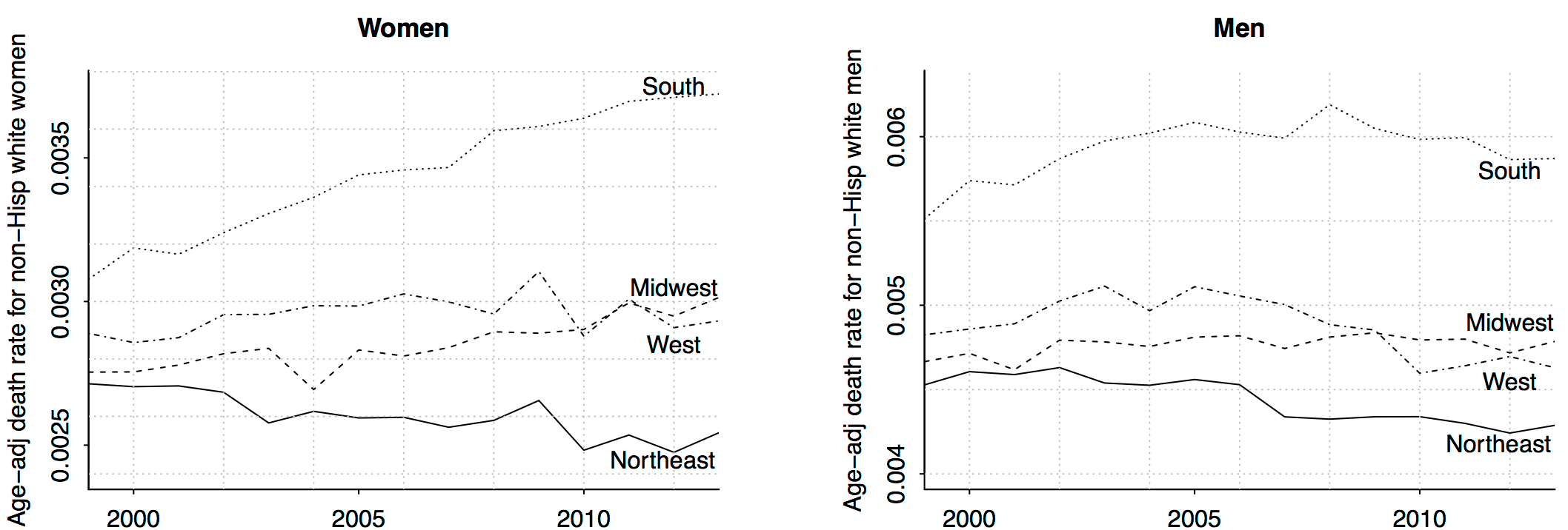
(The above graphs are just for age 45-54, which demonstrates an important thing about statistical graphics: They should be as self-contained as possible. Otherwise when the graph is separated from its caption, it requires additional words of explanation, as you are seeing here.)
One problem tends to be that text fonts in images render horribly on scale-up / down. And hence the temptation to keep as much text separate from the image file as possible.
I see white space in the middle of that page. Is the graph not rendering on my computer, or did they just leave a bunch of white space on the page? (I think it’s the latter, because the white space is actually in the next subsection.)
This is misleading because it makes it sound like the deaths are primarily due to recreational drug use:
“there was a marked increase in the all-cause mortality of middle-aged white non-Hispanic men and women in the United States, largely due to increasing death rates from drug and alcohol poisonings, suicide, and chronic liver diseases and cirrhosis”
Of the categories looked at by Case and Deaton only Y12 really fits that description:
“poisonings (X40-45, Y10-15, Y45, 47, 49). Poisonings are accidental and intent-undetermined deaths from alcohol poisoning and overdoses of prescription and illegal drugs.”
http://apps.who.int/classifications/apps/icd/icd10online2004/gx40.htm
http://apps.who.int/classifications/apps/icd/icd10online2004/gy10.htm
http://apps.who.int/classifications/apps/icd/icd10online2007/gy40.htm
making the two y-axis the same scale for easy comparison?
If you’re publishing adjacent graphs for comparison using the same x-axis and style, shouldn’t the y-axis be the same?
Phil:
We’re interested in relative trends so I don’t think the absolute scales need to be the same. Best, I think, would be for y-axes for both graphs to be on log scale and for the y-axes to not be the same but to be on the same scale (so that a factor of 1.1 on the left graph is the same as a factor of 1.1 on the right graph). I was worried that the log scale would be too mysterious to many readers, but maybe I should’ve done it that way. I guess I could just make the two graphs with identical y-axes; this would readable if the graphs are taller. For the published journal I don’t know if we could’ve gotten away with all the extra white space but certainly for the blog it’s no problem!