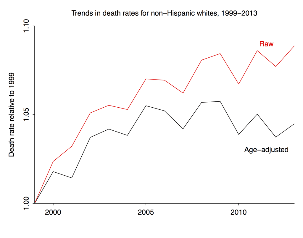
The raw death rates for the group (which appeared in the Case-Deaton paper) are in red, and the age-adjusted death rates (weighting each year of age equally) are in black.
So . . . the age-adjusted mortality in this group increased by 5% from 1999 to 2005 and has held steady thereafter. But if you look at the raw data you’d be misled into thinking there was a steady increase. That’s the aggregation bias I’ve been talking about here and here.
For some reason it’s not so easy to get the numbers before 1999. But, following Deaton’s tip, I grabbed the 1999-2013 data and made some plots. All are renormalized to be relative to 1999.
Based on my earlier analysis, I’m guessing that age-adjusted mortality in this group dropped pretty dramatically from 1989 to 1999. Hence the title of this post.
The natural next step is to break this one up by men and women, and by ethnic group. And someone should do this. But not me. I got a job, and this ain’t it.
P.S. In the original version of this post I referred to “non-Hispanic white men.” I don’t know why I wrote that. All these graphs are for non-Hispanic whites, both sexes. As noted above, it would be easy enough to do separate calculations for men and women, but I didn’t do that.
Excellent. What is the source for the age/race-specific death rates for single years? Woulda made my post a lot better.
CDC Wonder. Link in previous post. Unfortunately can’t find data before 1999. It’s too bad the press on Case-Deaton focused so much on the purported increase. More and more I’m thinking that from 1989 to 2013 it was a slight decrease, but the main story still holds.
Agree. Thanks.
I’m not sure if this tool gives the fine-grained data need, but this has earlier WONDER numbers: http://wonder.cdc.gov/cmf-icd9.html
I did try looking at the same cohort 10 years earlier (not age-adjusting, just looking to see if death rates went up as the years went on), though it looks like it’s missing the ability to screen out Hispanics. https://twitter.com/RAVerBruggen/status/662738194413170688
Update: This tool, unlike the one for the newer data, doesn’t just let you select single-age numbers. If you’re feeling really ambitious you can download the raw data here though: http://www.cdc.gov/nchs/data_access/VitalStatsOnline.htm#Mortality_Multiple
Thanks.
The worst years for middle-aged whites were a decade or more ago, but nobody much noticed until now.
I wonder if we’re really seeing the interaction of three processes- the decline of smoking two decades previously, the rise of obesity following it, and chronic pain amplified psychologically by non working disability status. I mean, all the stories about social changes are interesting and important in their own right, but it may also be that American whites are more succeptible to chronic pain than Europeans (due to obesity) or American Hispanics (due to different ancestry), and more liable to end their troubles with a gun (because they have one in the house) or liquor (because they live alone) or pills (because American doctors were giving those out a decade ago like Halloween candy.)
Having known people who came quite close to drinking themselves to death in a fairly short time, without any family history of alcoholism: my sense was that living alone, with just a little bit of money and absolutely nothing to do is pretty much all you need.
Gender-disaggregated graphs would tell us a lot more. I also wonder if one could create similar graphs for comparison populations (American Hispanics or Europeans)- do they have very different age structure or Baby Book timing?- or project how age structure would affect the particular causes of death singled out by Deaton and Case- if they aren’t particularly increasing by age under most circumstances, this line of criticism feels less damaging.
Also, it’s worth pointing out that whenever you have a spike in mortality for a given population, you’re likely to have a decline afterwards, because the individuals most succeptible to that cause of death are gone.
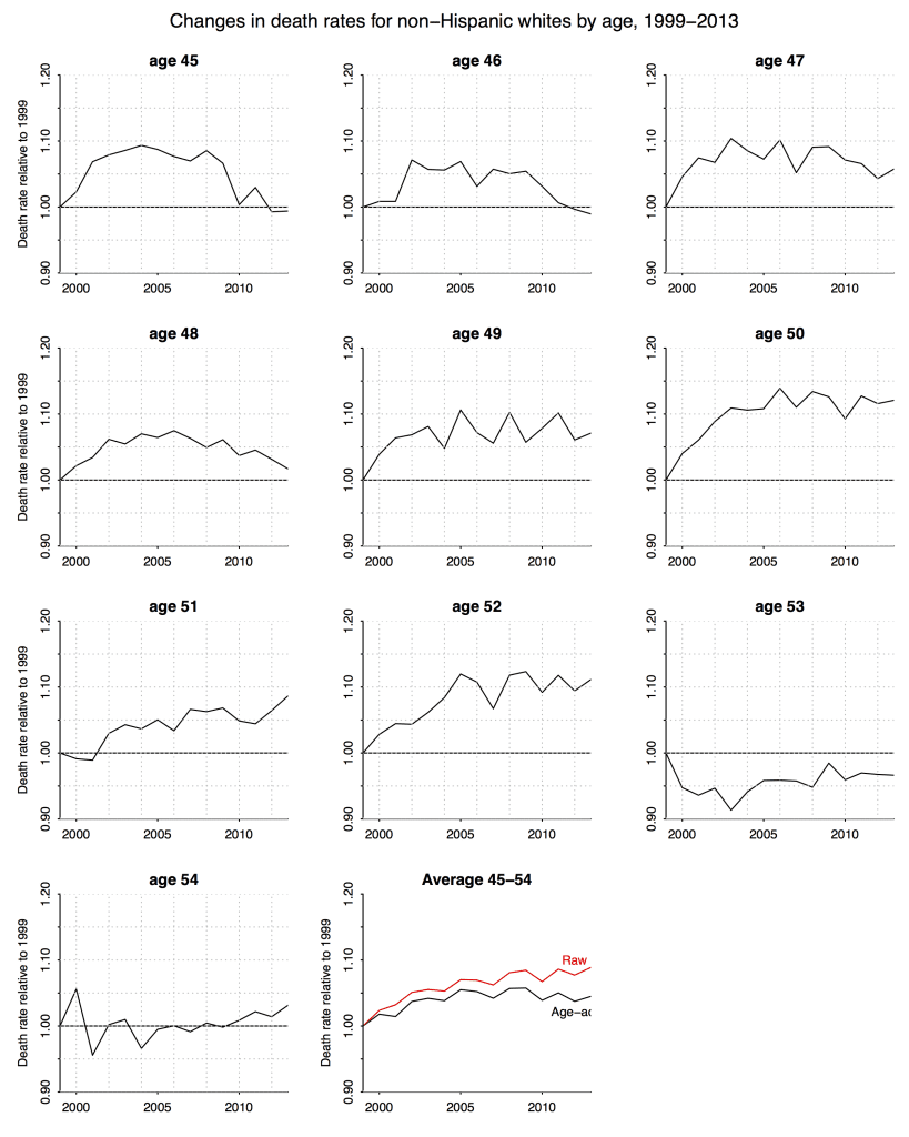
I can’t help but wonder if there is a reason why the pattern for the 53-year-olds might be so different from the pattern for the younger ages. Anyone care to speculate? Also makes me curious what the graphs for the 55, 56, 57-year-olds look like.
I’m with Martha on wondering why the 53 and 54 year olds are so different in having lower mortality. I wonder if there is some kind of data collection anomaly there, because why would there be such a consistent contrast between 52 and 53? Even my best story telling instinct doesn’t come up with anything about that age that should make you less likely to die post 1999 that applies across the whole time span. What I want to see, of course, is the cohort display. But maybe 1999 was an anomaly for those ages?
Elin:
I don’t see anything so special about the 53 and 54 year olds in this story. What I see is a fairly consistent trend by birth year (not age). Much of the confusion, I think, comes from the comparison to a single baseline. I think Deaton unintentionally muddied the waters by focusing on the 2013-1993 difference rather than considering the shape of the curve. This is how he ended up saying, “If we want to be more precise about the age range involved, we could say that for all single years of age from 47 to 52, mortality rates are increasing.” Which, from the above graph, is clearly not the case at all. It makes no sense at all to describe mortality rates for 48-year-olds in the above graph as “increasing.”
What are you looking at to see the trend by birth year? The graphs you have here are by age so I’m just commenting on them. The 53 year olds are the only ones for whom mortality was lower than the 1999 base over the time period. the 54 year olds are the only ones that are pretty consistent, staying within the .95 to 1.05 range. So thinking about what’s the simplest explanation for this it makes sense to me that this might be something of an age adjustment effect as well since the 1999 53 and 54 year olds were born in relative peaks and we assume that within a year there will be the same general pattern as in the neighborhood around that year, meaning that in 1946 things still may be rising so we’d expect the end of year months to be relatively higher than early in the year months (controlling from normal seasonal variations) making them relatively young. In the later cohorts when the births are declining we’d expect the beginning of the year months to be higher than the later months. So they’d be a few months younger. Of course once you start actually looking at the cohort sizes you see that within the baby boom (which includes everyone in this data) there are a lot of ups and downs in number of births year to year. To me if nothing else that indicates that the age distribution (say at years and weeks or median year +weeks) within those years is also probably bouncing around a lot. And even little changes in age mixture can have big impacts, as your graphs demonstrate. I agree that his use of the term “increasing” is problematic.
I’m just waiting for people to start (a) suggesting that their graphs show that getting people to stop smoking just displaced them to the more harmful drug and alcohol use and (b) that it’s all due to middle aged people migrating to the sun belt.
https://upload.wikimedia.org/wikipedia/commons/6/66/US_Birth_Rates.svg
https://www.census.gov/prod/2014pubs/p25-1141.pdf
If you really want mortality data, run this in R. The files are huge (75 Mb/year) and you will need to curate. They may throttle you for too many in a row as well:
yrs=1959:2012
for(i in 1:length(yrs)){
yr=yrs[i]
downdir=paste0(“http://www.nber.org/mortality/”,yr,”/mort”,yr,”.csv.zip”)
datname=paste0(“mort”,yr,”.csv”)
download.file(downdir,paste(yr))
}
http://www.nber.org/data/vital-statistics-mortality-data-multiple-cause-of-death.html
https://docs.google.com/spreadsheets/d/1gYAjZr0HjPwvdycbvy0v4Ir1IhSp1QVMwgyN2qBjfoI/pubhtml
This is not gender or race specific but it definitely shows that there is a steady shift in the older direction within the age distribution within the US population over that time period. This is using the total population data from mortality.org, just selecting the 45-54 year olds for those years and using HMisc to calculate the weighted quartiles with i/n. Of course that is simplifying because it assumes even distribution across the one year bin.
Elin:
Yes, this is the calculation I did for my first post.
Yes but with quartiles! And pictures!
It would seem difficult to determine why there’s a steady increase from 1999 to 2005, and then it goes flat.
This is particularly problemmatic since the rates in other countries (and in the US previously) were declining.
If this was 2008-2013 instead of 1999 to 2005, we’d be assigning it (artifactually, in our infinite wisdom as blog commenters) to the recession, but that doesn’t work here.
It’s also a bit suspicious that the 1999 forward data was easy to get, but the data just before that is hard to obtain. I’m a data guy, and a pattern like this makes me suspect methodological changes. BUT this data is outside my domain of expertise.
I see Robert VerBruggen noted upthread that the earlier pre-1999 data doesn’t allow one to separate out Hispanics. And, if I remember correctly, Hispanics in this age group had lower death rates than non-Hispanic whites. Is it possible that the ability to separate out Hispanic and non-Hispanic whites was somehow phased-in, or incompletely separable, in 1999-2005, so we’ve mixed in a lot of lower mortality Hispanics in 1999, and successively fewer every year until 2005?
This sounds farfetched, I know, but would provide a plausible mechanism for the increase 1999-2005 and then the subsequent flattening.
“Is it possible that the ability to separate out Hispanic and non-Hispanic whites was somehow phased-in, or incompletely separable, in 1999-2005, so we’ve mixed in a lot of lower mortality Hispanics in 1999, and successively fewer every year until 2005?”
That sounds possible due to the state-by-state nature of vital statistics data collection.
I’ve never looked at the CDC’s “Deaths” reports before, but I’ve looked at their “Births” reports a lot and they are dependent upon state reporting. The states take leadership from the feds on methodology, but don’t necessarily follow the feds guidelines right away.
When and what were changes in painkiller policies?
Some reporting here:
http://www.cdc.gov/nchs/data/databriefs/db22.htm
http://www.cdc.gov/nchs/data/databriefs/db166.htm
http://www.cdc.gov/nchs/data/databriefs/db189.htm
Nice links, Jose!
This is from the second link:
“Although the opioid-analgesic poisoning death rates increased each year from 1999 through 2011, the rate of increase has slowed since 2006.
….
During the past decade, adults aged 55–64 and non-Hispanic white persons experienced the greatest increase in the rates of opioid-analgesic poisoning deaths.”
> ” I wonder if there is some kind of data collection anomaly…”
Surprising how readily all this government mortality data is accepted as absolute error-free gospel.
This is a huge amount of data collected over decades from thousands of independent & variable local American counties, clerks, and doctors/funeral-directors/police filling out (maybe) various types of death certificates. There must be at least some margin of error in the data collection & consolidation — what might it be? Note there is no objective definition of “Hispanic” that is uniformly applied in collecting this mortality.
The National Center for Health Statistics (NCHS at CDC) does not mention any margins of error in their data. But does offer brief discussions of methodology– for example:
“Mortality Data File Description
Mortality data on the CMF are based on the NCHS annual detailed mortality files that include a record for every death of a U.S. resident recorded in the United States (except 1972, for which year the data are based on a 50 percent sample of deaths and weighted by a factor of 2). The annual detailed mortality files contain an extensive set of variables derived from the death certificates. For the CMF, the source data records were condensed by retaining only a select set of variables: (1) State and county of residence, (2) year of death (rather than the full date of death), (3) race (1968-98: recoded to white, black, other; 1999-present: recoded to white, black, American Indian or Alaska Native, Asian or Pacific Islander), (4) sex, (5) for 1999-present: Hispanic origin (not Hispanic or Latino, Hispanic or Latino) (6) age group at death (specific age recoded to 16 age groups), (7) underlying cause of death (4-digit ICD code), and (8) 69 ICD-8, 72 ICD-9, 113 ICD-10 cause-of-death recode (depending on the data year). The number of records was reduced by aggregating records with identical values for these seven variables and adding a count variable to the aggregate record…”
__
So the big change was that instead of there being an other category after 1999 everyone had to be assigned one of those groups?
http://www.cdc.gov/nchs/data/nvsr/nvsr61/nvsr61_06.pdf
Has some information on errors. There’s also a switch to multi race reporting which impacts .4% of death certificates in 2010. Wow such an interesting history of racial categorization. In fact starting in 2011 there are actually a minimum of 5 groups (white, black or African American, American Indian or Alaska Native (AIAN), Asian, and Native Hawaiian or Other Pacific Islander (NHOPI)), but in all cases states can add more.
http://www.cdc.gov/mmwr/preview/mmwrhtml/00001356.htm
Quality assurance of NCHS mortality data is promoted during each phase of data collection and data processing. During data collection, states are encouraged to scrutinize records with questionable entries, using guidelines specified in instruction manuals for demographic (23) and medical (24) items. During processing, quality is maintained through:
follow-up to the states to verify those records of deaths, including reported diseases of public health concern (e.g., cholera) (25), 2) computer edits to ensure consistency between demographic characteristics–such as age and sex–and reported causes of death (26), and 3) independent coding and verification by NCHS of a monthly sample of state records. For 1986, the estimated average error rates for coding the demographic and medical items were 0.3% and 3%-4%, respectively (9).
I am becoming increasingly convinced the entire increase/lack of decrease is a combination of a) changes in reporting/coding b) binning of ages and c) cohort issues. The inclusion of *underdosing* for things like diabetes, cardiovascular and psychiatric conditions as ‘Poisoning’ in ICD10 simply has to have an impact, especially in this population.
http://www.icd10data.com/ICD10CM/Codes/S00-T88/T36-T50
Are the exact classes of ICD10 codes captured in the analysis in any supp info?
Reporting causes of death are likely changing over time, but the sheer fact of death doesn’t sound like something that could all that easily be lost due to minor methodological matters. Attention must be paid to dead bodies.
“The last example suggests that it’s possible to make any variable dataset say almost anything by being creating about the way it’s binned.”
http://statmodeling.stat.columbia.edu/2008/08/22/bad_binning_can/
Dead is dead. But non-Hispanic white is not so unambiguous — particularly over time.
>”a) changes in reporting/coding b) binning of ages and c) cohort issues.”
At the very least some effort needs to be made to estimate the plausible range of these effects. Also, do not forget the denominator. Everyone always forgets the denominator. The population data is not 100% reliable either.
Good points.
No indication of what ICD10 codes got pulled in under “Poisoning” in the SI:
http://www.pnas.org/content/suppl/2015/10/29/1518393112.DCSupplemental/pnas.201518393SI.pdf
Also, what exactly are they regressing here (from the SI):
“The temporal associations between suicide and poisoning mortality and morbidity are established for each of our morbidity
markers using least squares regressions with census region fixed effects.”
Are those counts or rates? And why least squares and not Poisson etc.?
“..but the sheer fact of death doesn’t sound like something that could all that easily be lost due to minor methodological matters.”
The New York City Board of Elections “lost” over 200,000 legally cast votes in the November 2010 election (almost 20% the total vote. The lost ballots were discovered a month after the election. How could that happen in a major, modern US city ? Aren’t formal votes more important and much more closely tracked than bean-counting miscellaneous deaths ? Such balloting errors are common across the US, but rarely as large. Who verifies/validates mortality statistics? Nobody
Counting stuff reliably on a large scale is much harder than it looks. There are many sources of mundane error.
“Government is very keen on amassing statistics. They collect them, add
them, raise them to the nth power, take the cube root and preen
wonderful diagrams. But what you must never forget is that every one of
these figures comes in the first instance from the village clerk, who
just puts down what he damn pleases.”
– (1929) English economist Josiah– Stamp