
Bob writes:
You must have seen this. I like it. But not enough to spend time blogging about it.
I’ll try blogging it myself . . . OK, yeah, this interactive graph is great. It reminds me of “scatterplot charades” exercises we do in class from time to time. Somebody should write a program so that this can be done with any data. It’s awesome.
OK, that wasn’t so hard.
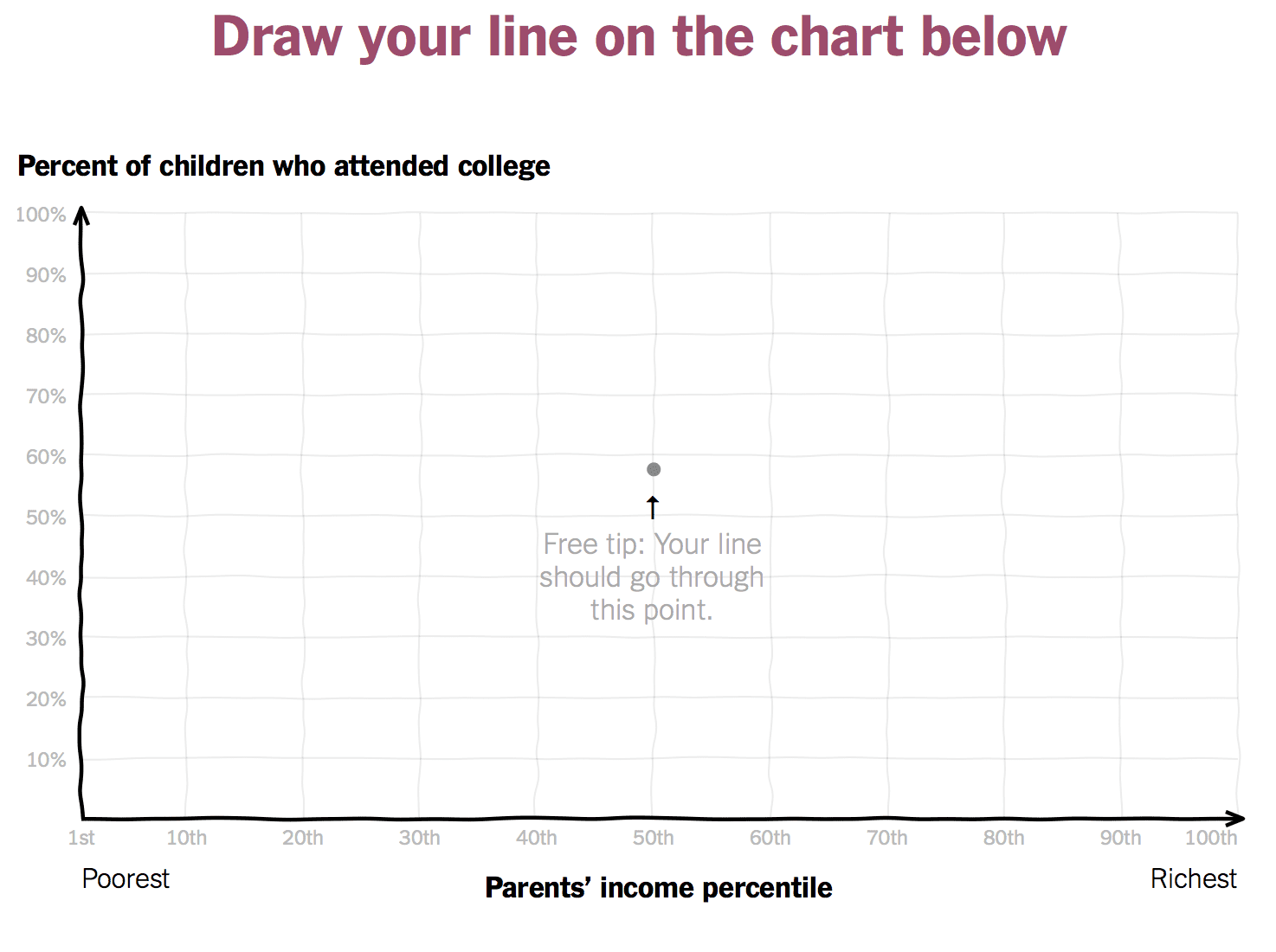
Andrew, this sounds a lot like what system dynamicists often do. If you show someone the results of a dynamic model, often they’ll say, “Sure; that was obvious” and see little value in the model. If you make them “draw a line in the sand” up front by drawing a graph of behavior over time, they’ll often be all over the map, and seeing the simulation run then becomes a real learning experience as they face up to the difference between their mental model and the results of the simulation model. The same thing happened for me here.
Back more directly to statisics, have you seen the SHELF package (https://cran.r-project.org/web/packages/SHELF/index.html)? Grace Zhang of GlaxoSmithKline gave a poster display on SHELF at JSM 2015.
“Well Done! You drew a more accurate picture of reality than about 98 percent of people who have tried so far.”
Only a few things (beyond the freebie) contributed to mt score:
1) I guessed at a (positive) linear slope, rather than some other shape
2) I recognized that low income does not prevent people from attending college, nor does high income guarantee college attendence.
I came in at “more accurate picture of reality than about 97 percent of people who have tried so far.” I didn’t draw a straight line, though. I drew a slightly logarithmic rise, based on the understanding (I think so, anyway) that family income follows a logarithmic distribution (log-normal).
I think I see now why my choice would be incorrect: because the graph doesn’t reflect the absolute or relative number of people at different income levels. It’s still a little confusing, though, thinking about the linear aspect of this data relationship vs. the logarithmic.
Any helpful explanatory comments would be greatly appreciated. Thanks in advance.
I’d love a version of this tool where we ask many domain experts to plot a prior for a specific problem & compare their curves.
Did you check out plotfit(), feedback(), and other functions from SHELF?
May be worth mentioning that SHELF is much more than a bunch of functions. It’s a very systematic protocol for eliciting expert judgements. I used it in my Masters thesis at Sheffield (in Statistics) and it’s absolutely amazing. I wish I’d learnt about it when I started to do my PhD in Linguistics.
Full disclosure: the author of SHELF, Jeremy Oakley, was my advisor.
No I haven’t. Just came to know about it from you. I will try it out, thanks.
I drew an S-curve, like most of the respondents did. Was quite surprised that it was a straight line, but after some reflection I think I know why my intuition was off: my intuition was in terms of college attendance vs. absolute income, rather than vs. income percentile. As they explain in the article, “The rise in inequality in recent decades means that there is now quite a large income gap between the very rich and merely affluent”, so without having much prior knowledge about what the cumulative distribution of income looks like, my guess was off. But in any case, the reality of the situation is dismal to contemplate.
Yeah, I think I misunderstood the question as well, or at least didn’t pay enough attention. I was certainly thinking in terms of some kind of absolute income rather than a probability integral transform of income. I wish they’d draw the graph for income as a fraction of GDP/capita to see if mine was accurate on that basis. I got both the lower end and the upper end fairly well, but missed the shape near the 1/3 an 2/3 point.
I think humans are just bad thinkers on any percentile scale.