
CDC should know better.
P.S. In comments, Zachary David supplies this correctly-scaled version:
It would be better to label the lines directly than to use a legend, and the y-axis is off by a factor of 100, but I can hardly complain given that he just whipped this graph up for us.
The real point is that, once the x-axis is scaled correctly, the shapes of the curves change! So that original graph really was misleading, in that it incorrectly implies a ramping up in the 3-10 year range.
P.P.S. Zachary David sent me an improved version:
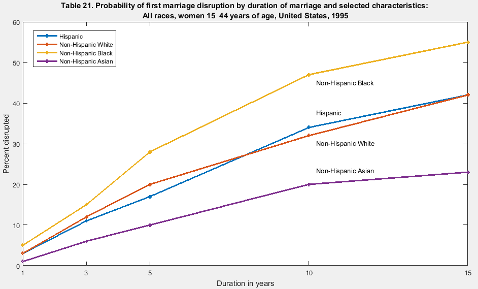
Ideally the line labels would be colored so there’d be no need for the legend at all, but at this point I really shouldn’t be complaining.
Yeah that’s pretty bad. It looks like that’s how they did every graph in that paper.
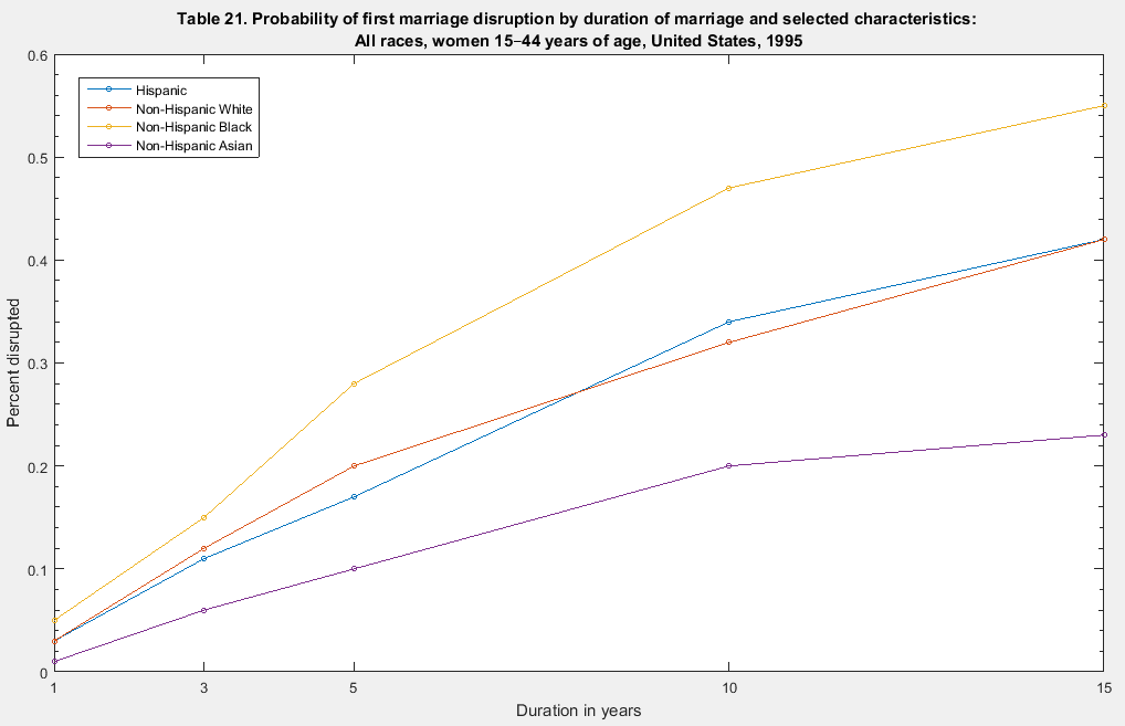
Apparently it’s just a graphical representation of the table on Page 55 where each x-axis tick corresponds to a column.
I used the data from the table and remade the graph as it should look: http://zacharydavid.com/wp-content/uploads/2015/06/CDC_first_marriage_disruption_probability.png
Thanks for that! Opposite curvature at the 5-year inflection. A different visual experience, and a different interpretation of risk over time.
You’re welcome! The curvature difference for sure intuits a completely different interpretation.
(now if I could just remind myself to format percentages correctly for visualizations. It’s probably been 5 years since I’ve ever bothered to multiply a percentage by 100)
A lot of the graphs in the paper are like that. I took it to be some sort of hyperbolic discounting. Irrational, but accurate!
Typo: “The real point is that, once the y-axis is scaled correctly”
If one wanted to use logarithms for intuitive purposes (à la Weber-Fechner’s law), what do you think of taking a logarithm of both axis?
Although the CDC scale clearly isn’t logarithmic either. It just looks lazy.
Elrod:
1. Thanks for pointing out the typo.
2. I don’t think a log axis on x makes any sense at all in this case. A year is a year.
I’m much more concerned with the figure caption than with scaling of the X axis. First, “probability” has very little to do with whether any particular marriage breaks up (well, except for maybe the marriage of a statistician who is infatuated with the concept of probability)…. the Y axis is correctly labeled, this is simply the “percent disrupted”. Second, the X axis is still mis-labeled, this is not at all by “duration of marriage” (e.g., those who have been married for 10 years are not necessarily more likely to split than those who have been married for 5 years… although see the above caveat regarding statisticians again…). The X axis should properly be something like “Time since marriage”, because Kaplan-Meier plots plot the cumulative incidence of the event.
Actually, the yearly probabilities would be interesting to see. Is there a peak? Are marriages most likely to break in (say) the 2nd year?
Would that cure be calculable simply as the derivative of this curve?
Back when I was studying these things (mid-1980s) the peak divorce rate was in the third year of marriage, and the cohort peak for that peak was the rate of divorce for the 1976 marriage cohort in 1979. (I only remember this because I got married in 1976, although that marriage has survived.)
Thanks! I was eyeballing the correctly scaled figure Zachary made and the slope of the non-Hispanic Black line seems to go from low to high to low around the same 3-5 year mark.
So, yes, what you say probably matches. The breakup peak probability seems bracketed in the 3-5 year mark. At least for blacks.
One interesting question arises from all of these axis errors: what plotting software were they using that didn’t automatically identify the x-axis as a numerical value? The resulting graphs are as if the software treated the entries as categorical variables.
I’m pretty sure you can get excel to do this if you try.
Let’s ask Reinhart and Rogoff.
Ouch. That must sting. I wonder if they get nightmares about Excel now.
TOO SOON
You know, I was thinking of them as an example of honest mistake vs Brooksian mistake.
(R&R’s errata here – http://www.carmenreinhart.com/user_uploads/data/36_data.pdf . Ash and Pollin found problems with the errata as well – http://www.peri.umass.edu/fileadmin/pdf/working_papers/working_papers_301-350/PERI_TechnicalAppendix_April2013.pdf – so I’m not sure how many points to give R&R. They admit their error but attempt to defend their original position with a flawed analysis of corrected data. Here’s Arin Dube’s analysis of their data (without the coding errors) using LOWESS and bootstrapping – http://www.nextnewdeal.net/rortybomb/guest-post-reinhartrogoff-and-growth-time-debt.)
lolol. The circumstances surrounding their original paper were so f**ked from the start. It’s not surprising they’d try their hardest to defend the original conclusion no matter what.
The Reinhart and Rogoff (2010) paper was published in the American Economic Review, which at the time had the foremost progressive policy for replication out of all major economics journals — requiring raw files and scripts. However, given the cachet of the researchers’ names, the AER decided to forgo its own policy and admit the paper without requiring data. This is why it turned out to be especially difficult for people to replicate their results.
Now this doesn’t imply malfeasance in itself, but when you watch the authors squirm to defend the results in any way possible, it makes you wonder if they made an active effort to take advantage of the situation.
Rahul, turns out you’re right. Didn’t even have to try hard. Shame on Excel. Shame.
I’m pretty sure not only can you do it, but that it is the default for linegraph. I always have to fight with it to get anything else, meaning that you actually have to put in a lot of empty rows and tell it to ignore rather than treat them as 0s.
ow would you even manage to collect data like that? “Choose the value closest to the number of years your first marriage lasted: 1, 3, 5, 10, 15”.
Really they probably have the year by year data, and it probably goes beyond 15 years. I’ve found that CDC data is often aggregated in bizarre ways. They do not like error bars for some reason, so instead the data gets aggregated to have large sample size in each bin. However, the most important thing to never combine hispanics with other races. That concern trumps all others.
This makes me concerned that those plots may be even more confusing than previously thought possible.
I’ve seen worse – http://www.venganza.org/images/PiratesVsTemp.png
Blasphemer!
This takes the cake for “creative” use of the x-axis.
So if I start with the presumption dm/dt = -k(m-m_inf) where m(t) = Pr(married) and m_inf is the asymptotic value of Pr(married) then the cumulative probability of “disruption”, i.e., ~married, is (1-m_inf)*(1-exp(-kt)) where k is the probability of disruption per year. Eyeballing the data, it looks like that function could fit the data reasonably well.