When you believe in things that you don’t understand

This would make Karl Popper cry. And, at the very end:

The present results indicate that under certain, theoretically predictable circumstances, female ovulation—long assumed to be hidden—is in fact associated with a distinct, objectively observable behavioral display.

This statement is correct—if you interpret the word “predictable” to mean “predictable after looking at your data.”

P.S. I’d like to say that April 15 is a good day for this posting because your tax dollars went toward supporting this research. But actually it was supported by the Social Sciences Research Council of Canada, and I assume they do their taxes on their own schedule.

P.P.S. In preemptive response to people who think I’m being mean by picking on these researchers, let me just say: Nobody forced them to publish these articles. If you put your ideas out there, you have to be ready for criticism.

Transitioning to Stan

Kevin Cartier writes:

I’ve been happily using R for a number of years now and recently came across Stan. Looks big and powerful, so I’d like to pick an appropriate project and try it out. I wondered if you could point me to a link or document that goes into the motivation for this tool (aside from the Stan user doc)? What I’d like to understand is, at what point might you look at an emergent R project and advise, “You know, that thing you’re trying to do would be a whole lot easier/simpler/more straightforward to implement with Stan.” (or words to that effect).

My reply: For my collaborators in political science, Stan has been most useful for models where the data set is not huge (e.g., we might have 10,000 data points or 50,000 data points but not 10 million) but where the model is somewhat complex (for example, a model with latent time series structure). The point is that the model has enough parameters and uncertainty that you’ll want to do full Bayes (rather than some sort of point estimate). At that point, Stan is a winner compared to programming one’s own Monte Carlo algorithm.

We (the Stan team) should really prepare a document with a bunch of examples where Stan is a win, in one way or another. But of course preparing such a document takes work, which we’d rather spend on improving Stan (or on blogging…)

On deck this week

Mon: Transitioning to Stan

Tues: When you believe in things that you don’t understand

Wed: Looking for Bayesian expertise in India, for the purpose of analysis of sarcoma trials

Thurs: If you get to the point of asking, just do it. But some difficulties do arise . . .

Fri: One-tailed or two-tailed?

Sat: Index or indicator variables

Sun: Fooled by randomness

“If you are primarily motivated to make money, you . . . certainly don’t want to let people know how confused you are by something, or how shallow your knowledge is in certain areas. You want to project an image of mastery and omniscience.”

A reader writes in:

This op-ed made me think of one your recent posts. Money quote:

If you are primarily motivated to make money, you just need to get as much information as you need to do your job. You don’t have time for deep dives into abstract matters. You certainly don’t want to let people know how confused you are by something, or how shallow your knowledge is in certain areas. You want to project an image of mastery and omniscience.

Continue reading

“Schools of statistical thoughts are sometimes jokingly likened to religions. This analogy is not perfect—unlike religions, statistical methods have no supernatural content and make essentially no demands on our personal lives. Looking at the comparison from the other direction, it is possible to be agnostic, atheistic, or simply live one’s life without religion, but it is not really possible to do statistics without some philosophy.”

This bit is perhaps worth saying again, especially given the occasional trolling on the internet by people who disparage their ideological opponents by calling them “religious” . . . So here it is:

Sometimes the choice of statistical philosophy is decided by convention or convenience. . . . In many settings, however, we have freedom in deciding how to attack a problem statistically. How then do we decide how to proceed?

Schools of statistical thoughts are sometimes jokingly likened to religions. This analogy is not perfect—unlike religions, statistical methods have no supernatural content and make essentially no demands on our personal lives. Looking at the comparison from the other direction, it is possible to be agnostic, atheistic, or simply live one’s life without religion, but it is not really possible to do statistics without some philosophy. Even if you take a Tukeyesque stance and admit only data and data manipulations without reference to probability models, you still need some criteria to evaluate the methods that you choose.

One way in which schools of statistics are like religions is in how we end up affiliating with them. Based on informal observation, I would say that statis- ticians typically absorb the ambient philosophy of the institution where they are trained—or else, more rarely, they rebel against their training or pick up a philosophy later in their career or from some other source such as a persuasive book. Similarly, people in modern societies are free to choose their religious affiliation but it typically is the same as the religion of parents and extended family. Philosophy, like religion but not (in general) ethnicity, is something we are free to choose on our own, even if we do not usually take the opportunity to take that choice. Rather, it is common to exercise our free will in this setting by forming our own personal accommodation with the religion or philosophy bequeathed to us by our background.

For example, I affiliated as a Bayesian after studying with Don Rubin and, over the decades, have evolved my own philosophy using his as a starting point. I did not go completely willingly into the Bayesian fold—the first statistics course I took (before I came to Harvard) had a classical perspective, and in the first course I took with Don, I continued to try to frame all the inferential problems into a Neyman-Pearson framework. But it didn’t take me or my fellow students long to slip into comfortable conformity. . . .

Beliefs and affiliations are interesting and worth studying, going beyond simple analogies to religion.

P.S. See here for some similar thoughts from a few years ago. The key point is that a belief is not (necessarily) the same thing as a religion, and I don’t think it’s helpful for people to use “religion” as a generalized insult that is applied to beliefs that they disagree with.

“More research from the lunatic fringe”

A linguist send me an email with the above title and a link to a paper, “The Effect of Language on Economic Behavior: Evidence from Savings Rates, Health Behaviors, and Retirement Assets,” by M. Keith Chen, which begins:

Languages differ widely in the ways they encode time. I test the hypothesis that languages that grammatically associate the future and the present, foster future-oriented behavior. This prediction arises naturally when well-documented e§ects of language structure are merged with models of intertemporal choice. Empirically, I find that speakers of such languages: save more, retire with more wealth, smoke less, practice safer sex, and are less obese. This holds both across countries and within countries when comparing demographically similar native households. The evidence does not support the most obvious forms of common causation. I discuss implications for theories of intertemporal choice.

I ran this by another linguist who confirmed the “lunatic fringe” comment and pointed me to this post from Mark Liberman and this followup from Keith Chen. My friend also wrote:

I think it’d be well-nigh impossible to separate the effect of speaking West Greenlandic from living in West Greenland, or more reasonably, speaking Finnish from living in Finland. Who else speaks Finnish (maybe some Swedes?)

My reply:

B-b-but . . . the paper is scheduled to appear in the American Economic Review! Short of Science, Nature, and Psychological Science, that’s probably the most competitive and prestigious journal in the universe.

More seriously, this is an interesting case because I have no intuition about the substance of the matter (unlike various examples in psychology and political science). The theoretical microeconomic model in the paper seems ridiculous to me, that’s for sure, but I have no good way to think about the cross-country comparisons, one way or another.

Small multiples of lineplots > maps (ok, not always, but yes in this case)

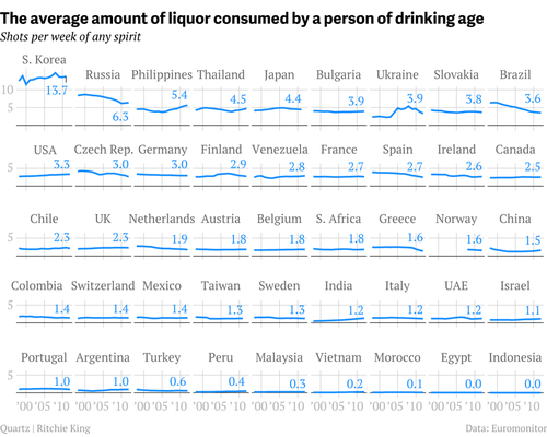
Kaiser Fung shares this graph from Ritchie King:

6a00d8341e992c53ef01a73d6fafa0970d-500wi

Kaiser writes:

What they did right:

– Did not put the data on a map
– Ordered the countries by the most recent data point rather than alphabetically
– Scale labels are found only on outer edge of the chart area, rather than one set per panel
– Only used three labels for the 11 years on the plot
– Did not overdo the vertical scale either

The nicest feature was the XL scale applied only to South Korea. This destroys the small-multiples principle but draws attention to the top left corner, where the designer wants our eyes to go. I would have used smaller fonts throughout.

I agree with all of Kaiser’s comments. I could even add a few more, like using light gray for the backgrounds and a bright blue for the lines, spacing the graphs well, using full country names rather than three-letter abbreviations. There are so many standard mistakes that go into default data displays that it is refreshing to see a simple graph done well.

Kaiser continues:

One way to appreciate the greatness of the chart is to look at alternatives.

Here, the Economist tries the lazy approach of using a map: (link)

Economist_alcohol

For one thing, they have to give up the time dimension.

A variation is a cartogram in which the physical size and shape of countries are mapped to the underlying data. Here’s one on Worldmapper (link):

Worldmapper_cartogram_alcohol

One problem with this transformation is what to do with missing data.

Yup. Also, the big big trouble with the transformed map is that the #1 piece of information it gives you is something we all know already—that China has a lot of people. Sure, if you look carefully you can figure out other things—hey, India has a billion people too but it’s really small on the map, I guess nobody’s drinking much there—but that’s all complicated reasoning involving mental division.

To put it another way, if this distorted map works—and it may well “work,” in the sense of grabbing attention and motivating people to look deeper at these data, which is the #1 goal of an infographic—if it does work, it’s doing so using the Chris Rock effect, in which we enjoy the shock of recognition of a familiar idea presented in an unfamiliar way.

Kaiser continues:

Wikipedia has a better map with variations of one color (link).

I agree that this one is better than the Economist map above. Wikipedia’s uses an equal-area projection (I think) so you don’t get so distracted by massive Greenland, a sensible color scheme with a natural ordering (unlike the Economist’s where it’s obvious that red is highest and pink is next, but then you have to go back to the legend to figure out how the other colors are ordered), also the legend has high numbers on top and low on bottom which again is sensible.

Still and all, the original grid of lines is better for me because (a) it shows the comparisons quantitatively (which in this case makes sense; those differences are huge (actually, so huge that it makes me wonder whether the comparisons are appropriate; is wine drinking in Portugal so much different than downing shots of soju in Korea?)) and, (b) it shows the time trends (most notably, the declines in Russia and Brazil, the increase from a low baseline in India, and Korea’s steady #1 position).

The click-through solution

Let me conclude, as always in this sort of discussion, that displaying patterns in the data is not the only reason for a graph. Another reason is to grab attention. If an unusually-colored map catches people’s eyes, maybe that’s the best way to go. My ideal solution would be click-through: the Economist (or wherever) has the colorful map with instructions to click to see the informative grid of line plots, then you can click again and get a spreadsheet with all the numbers.

Advice: positive-sum, zero-sum, or negative-sum

There’s a lot of free advice out there. I offer some of it myself! As I’ve written before (see this post from 2008 reacting to this advice from Dan Goldstein for business school students, and this post from 2010 reacting to some general advice from Nassim Taleb), what we see is typically presented as advice to individuals, but it’s also interesting to consider the possible total effects if the advice is taken.

It’s time to play the game again. This time it’s advice from sociologist Fabio Rojas for Ph.D. students. I’ll copy his eight points of advice, then, for each, evaluate whether I think it is positive or negative sum:
Continue reading

Understanding Simpson’s paradox using a graph

Joshua Vogelstein pointed me to this post by Michael Nielsen on how to teach Simpson’s paradox.

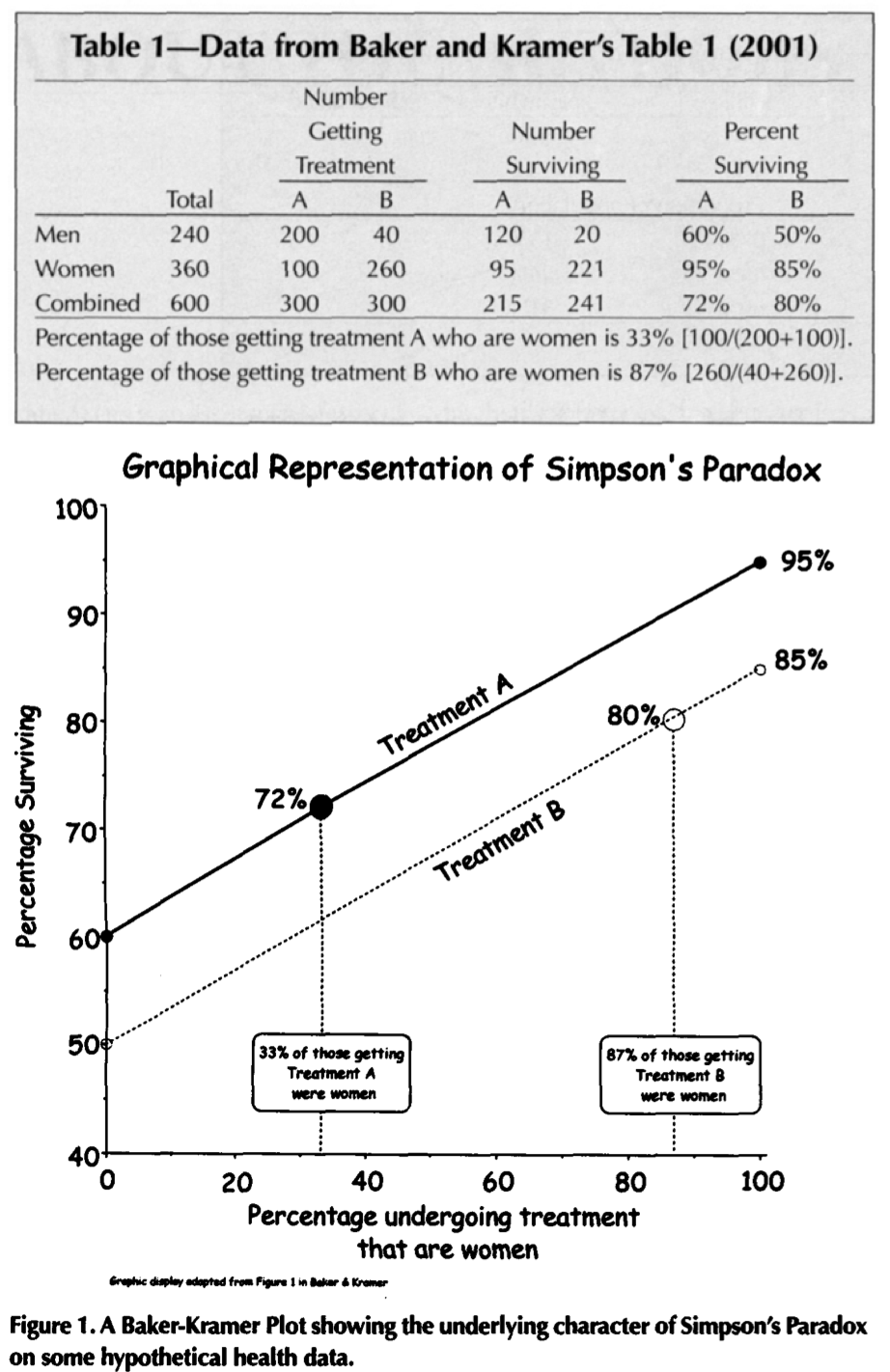
I don’t know if Nielsen (and others) are aware that people have developed some snappy graphical methods for displaying Simpson’s paradox (and, more generally, aggregation issues). We do some this in our Red State Blue State book, but before that was the BK plot, named by Howard Wainer after a 2001 paper by Stuart Baker and Barnett Kramer, although in apparently appeared earlier in a 1987 paper by Jeon, Chung, and Bae, and doubtless was made by various other people before then.

Here’s Wainer’s graphical explication from 2002 (adapted from Baker and Kramer’s 2001 paper):

Screen Shot 2014-04-08 at 3.09.53 PM

Continue reading

How literature is like statistical reasoning: Kosara on stories. Gelman and Basbøll on stories.

In “Story: A Definition,” visual analysis researcher Robert Kosara writes:

A story

  • ties facts together. There is a reason why this particular collection of facts is in this story, and the story gives you that reason.
  • provides a narrative path through those facts. In other words, it guides the viewer/reader through the world, rather than just throwing them in there.
  • presents a particular interpretation of those facts. A story is always a particular path through a world, so it favors one way of seeing things over all others.

The relevance of these ideas to statistical graphics is apparent.

From a completely different direction, in “When do stories work? Evidence and illustration in the social sciences,” Thomas Basbøll and I write:

Storytelling has long been recognized as central to human cognition and communication. Here we explore a more active role of stories in social science research, not merely to illustrate concepts but also to develop new ideas and evaluate hypotheses, for example in deciding that a research method is effective. We see stories as central to engagement with the development and evaluation of theories, and we argue that for a story to be useful in this way, it should be anomalous (representing aspects of life that are not well explained by existing models) and immutable (with details that are well-enough established that they have the potential to indicate problems with a new model).

We draw a connection to posterior predictive checking, which I earlier had argued is fundamentally connected with statistical graphics and exploratory data analysis (see this paper from 2003 and this one 2004).

I don’t have anything more to say on this right now. I just wanted to juxtapose these two perspectives, each of which connect statistical graphics to literature, but in a different way. Kosara focuses on the idea that stories have narrative and viewpoint, and Basbøll and I focus on the idea that effective stories are anomalous and immutable. All these ideas seem important to me, and it would be interesting to think about how they fit together.

On deck this week

Mon: How literature is like statistical reasoning: Kosara on stories. Gelman and Basbøll on stories.

Tues: Understanding Simpson’s paradox using a graph

Wed: Advice: positive-sum, zero-sum, or negative-sum

Thurs: Small multiples of lineplots > maps (ok, not always, but yes in this case)

Fri: “More research from the lunatic fringe”

Sat: “Schools of statistical thoughts are sometimes jokingly likened to religions. This analogy is not perfect—unlike religions, statistical methods have no supernatural content and make essentially no demands on our personal lives. Looking at the comparison from the other direction, it is possible to be agnostic, atheistic, or simply live one’s life without religion, but it is not really possible to do statistics without some philosophy.”

Sun: I was wrong . . .

Bizarre academic spam

I’ve been getting these sorts of emails every couple days lately:

Respected Professor Gelman

I am a senior undergraduate at Indian Institute of Technology Kanpur (IIT Kanpur). I am currently in the 8th Semester of my Master of Science (Integrated) in Mathematics and Scientific Computing program. I went through some of your previous work and found it to be very interesting, especially ‘Discussion of the article “website morphing”‘. I am interested in working under your guidance in a full time research during this summer (May 2014 – July 2014)

I have a deep interest in Economics (especially Game Theory), Applied Mathematics and Statistics and I have consistently performed well in many courses. My past research experience convinced me of my potential for research and I am in search of an opportunity under your guidance to hone my analytic and research skills

As evident from my resume, most of my work till now hovers around analysis and application of abstract ideas, where in most cases I have had taken up famous research papers (like “On computable numbers with an application to the Entscheidungsproblem, A.M.Turing, 1936”) and build upon them to solve a particular problem, often applying my coding skills and knowledge of statistics. As a result of these experiences, I am confident of my solid problem solving skills

I strongly believe that this opportunity to work under your guidance in a research project would provide me with an invaluable experience in real life research. I would seek this opportunity as a long term commitment to continue working under you in future

Thank You for your time and cooperation. Attached is a copy of my resume for your reference

Yours faithfully

OK, I understand the basic economics here. I live in a rich country, this person lives in a poor country so he wants to come here. The success rate of any pitch is approximately N*p, so I assume he’s going for the traditional spam plan and maximizing N. He has access to a long list of emails of math, stat, econ, and engineering professors in the First World and he’s sending this message to all of us. Finally, he is demonstrating his access to computing skills by stripping out an article with my name on it. But I don’t think this particular student wrote the software to do this. I get so much of this sort of spam that I’m pretty sure there’s a free or pirated program do do this strip-cut-and-paste action.

What amazes me is that these spammers seem uniformly to pick the most inappropriate of my articles for these pitches. Always, it seems, they’ll pick a discussion or a comment or an article on the history of statistics or something else that’s not really so close to my most active research. Maybe it’s something about the program they use to grab an article title? Maybe it purposely takes the title of an article with very few citations on the theory that I’ll be impressed that the student “went through” something obscure?

The whole situation just makes me feel sad. I hate to see people lie. I mean, sure, I liked American Bluff as much as the next guy, but actual lying in real life—especially this sort of thing, a poor person lying to a rich person in a hopeless attempt to climb the ladder of economic opportunity—it’s just a sad, sad thing.

I was going to criticize this on blog but I’m just too tired of things like this. What’s really horrible is the news article which takes all this so seriously. My problem is not with people who run regressions and post them on the web—the more the merrier, I say—but with reputable news outlets whose editors should know better

A friend pointed me to this monstrosity. As an MIT grad, I’d like to think that Technology Review could do better.

To elaborate a bit: A one-paragraph blurb would be fine to me, you can report that someone ran some regressions on the GSS and came up with an amusing hypothesis. That’s enough, then move on to the real technology news of robots playing ping-pong or whatever. I’m not saying to suppress this sort of thing, just place it in the appropriate context. It is what it is. If you want to write a full article on it, fine, but then talk to someone who studies the subject area (you’re Technology Review, you can get these people on the phone!) and move the ball forward a bit. Otherwise why bother at all?

The Notorious N.H.S.T. presents: Mo P-values Mo Problems

A recent discussion between commenters Question and Fernando captured one of the recurrent themes here from the past year.

Question: The problem is simple, the researchers are disproving always false null hypotheses and taking this disproof as near proof that their theory is correct.

Fernando: Whereas it is probably true that researchers misuse NHT, the problem with tabloid science is broader and deeper. It is systemic.

Question: I do not see how anything can be deeper than replacing careful description, prediction, falsification, and independent replication with dynamite plots, p-values, affirming the consequent, and peer review. From my own experience I am confident in saying that confusion caused by NHST is at the root of this problem.

Fernando: Incentives? Impact factors? Publish or die? “Interesting” and “new” above quality and reliability, or actually answering a research question, and a silly and unbecoming obsession with being quoted in NYT, etc. . . . Given the incentives something silly is bound to happen. At issue is cause or effect.

At this point I was going to respond in the comments, but I decided to make this a separate post (at the cost of pre-empting yet another scheduled item on the queue), for two reasons:

1. I’m pretty sure that a lot fewer people read the comments than read the posts; and

2. I thought of this great title (see above) and I wanted to use it.

First let’s get Bayes out of the way

Just to start with, none of this is a Bayes vs. non-Bayes battle. I hate those battles, partly because we sometimes end up with the sort of the-enemy-of-my-enemy-is-my-friend sort of reasoning that leads smart, skeptical people who should know better to defend all sorts of bad practices with p-values, just because they (the smart skeptics) are wary of overarching Bayesian arguments. I think Bayesian methods are great, don’t get me wrong, but the discussion here has little to do with Bayes. Null hypothesis significance testing can be done in a non-Bayesian way (of course, just see all sorts of theoretical-statistics textbooks) but some Bayesians like to do it too, using Bayes factors and all the rest of that crap to decide whether to accept models of the theta=0 variety. Do it using p-values or Bayes factors, either way it’s significance testing with the goal of rejecting models.

The Notorious N.H.S.T. as an enabler

I agree with the now-conventional wisdom expressed by the original commenter, that null hypothesis significance testing is generally inappropriate. But I also agree with Fernando’s comment that the pressures of publication would be leading to the aggressive dissemination of noise, in any case. What I think is that the notorious N.H.S.T. is part of the problem. It’s a mechanism by which noise can be spread. This relates to my recent discussion with Steven Pinker (not published on blog yet, it’s on the queue, you’ll see it in a month or so).

To say it another way, the reason why I go on and on about multiple comparisons is not that I think it’s so important to get correct p-values, but rather that these p-values are being used as the statistical justification for otherwise laughable claims.

I agree with Fernando that, if it wasn’t N.H.S.T., some other tool would be used to give the stamp of approval on data-based speculations. But null hypothesis testing is what’s being used now, so I think it’s important to continue to point out the confusion between research hypotheses and statistical hypotheses, and the fallacy of, as the commenter put it, “disproving always false null hypotheses and taking this disproof as near proof that their theory is correct.”

P.S. “The aggressive dissemination of noise” . . . I like that.

As the boldest experiment in journalism history, you admit you made a mistake

The pre-NYT David Brooks liked to make fun of the NYT. Here’s one from 1997:

I’m not sure I’d like to be one of the people featured on the New York Times wedding page, but I know I’d like to be the father of one of them. Imagine how happy Stanley J. Kogan must have been, for example, when his daughter Jamie got into Yale. Then imagine his pride when Jamie made Phi Beta Kappa and graduated summa cum laude. . . . he must have enjoyed a gloat or two when his daughter put on that cap and gown.

And things only got better. Jamie breezed through Stanford Law School. And then she met a man—Thomas Arena—who appears to be exactly the sort of son-in-law that pediatric urologists dream about. . . .

These two awesome resumes collided at a wedding ceremony . . . It must have been one of the happiest days in Stanley J. Kogan’s life. The rest of us got to read about it on the New York Times wedding page.

Brooks is reputed to be Jewish himself so I think it’s ok for him to mock Jewish people in print. The urologist bit . . . well, hey, I’m not above a bit of bathroom humor myself—and nor, for that matter, is the great Dave Barry—so I can hardly fault a columnist for finding a laugh where he can.

The interesting part, though, comes near the end of the column:

The members of the cognitive elite will work their way up into law partnerships or top jobs at the New York Times, but they probably won’t enter the billionaire ranks. The real wealth will go to the risk-taking entrepreneurs who grew up in middle- or lower-middle-class homes and got no help from their non-professional parents when they went off to college.

One of the fun things about revisiting old journalism is that we can check how the predictions come out. So let’s examine the two claims above, 17 years later:

1. “The members of the cognitive elite . . . probably won’t enter the billionaire ranks.” Check. No problem there. Almost nobody is a billionaire, so, indeed, most people with graduate degrees who are featured in the NYT wedding section do not become billionaires.

2. “The real wealth will go to the risk-taking entrepreneurs who grew up in middle- or lower-middle-class homes and got no help from their non-professional parents when they went off to college.” Hmmm . . . I googled rich people and found this convenient wikipedia list of members of the Forbes 400. Let’s go through them in order:

Bill Gates
Warren Buffett
Larry Ellison
Charles Koch
David H. Koch
Christy Walton
Jim Walton
Alice Walton
S. Robson Walton
Michael Bloomberg
Sheldon Adelson
Jeff Bezos
Larry Page
Sergey Brin
Forrest Mars, Jr.

Most of these had backgrounds far above the middle class. For example, of Gates, “His father was a prominent lawyer, and his mother served on the board of directors for First Interstate BancSystem and the United Way.” Here’s Buffett: “Buffett’s interest in the stock market and investing also dated to his childhood, to the days he spent in the customers’ lounge of a regional stock brokerage near the office of his father’s own brokerage company.” Koch: “After college, Koch started work at Arthur D. Little, Inc. In 1961 he moved back to Wichita to join his father’s business, Rock Island Oil & Refining Company.” And I don’t think I have to tell you about the backgrounds of the Waltons or Forrest Mars, Jr. Larry Page had more of a middle class background but not the kind that David Brooks was looking for: “His father, Carl Page, earned a Ph.D. in computer science in . . . and is considered a pioneer in computer science and artificial intelligence. Both he and Page’s mother, Gloria, were computer science professors at Michigan State University.” And here’s Sergei Brin: “His father is a mathematics professor at the University of Maryland, and his mother a researcher at NASA’s Goddard Space Flight Center.” Damn! Foiled again. They might have even really violated Brooks’s rule and paid for Brin’s college education.

That leaves us with Larry Ellison, Sheldon Adelson, Michael Bloomberg, and Jeff Bezos: 4 out of the Forbes 15. So, no, I think Brooks would’ve been more prescient had he written:

The real wealth will go to the heirs of rich people or to risk-taking entrepreneurs who grew up in rich or upper-class homes or who grew up middle class but got lots of help from their well-educated professional parents when they went off to college and graduate school.

But that wouldn’t have sounded as good. It would’ve been like admitting that the surf-and-turf at Red Lobster actually cost more than $20. As Sasha Issenberg reported back in 2006:

I went through some of the other instances where he [Brooks] made declarations that appeared insupportable. He accused me of being “too pedantic,” of “taking all of this too literally,” of “taking a joke and distorting it.” “That’s totally unethical,” he said.

This time, let me make it clear that I’m not saying that Brooks did any false reporting. He just made a prediction in 1997 that was way way off. I do think Brooks showed poor statistical or sociological judgment, though. To think that “the real wealth” will go to the children of the “middle- or lower-middle-class” who don’t even pay for their college education . . . that’s just naiveté or wishful thinking at best or political propaganda at worst.

Brooks follows up his claim with this bizarre (to me) bit of opinionizing:

The people on the New York Times wedding page won’t make $4 million a year like the guy who started a chain of erotic car washes. They’ll have to make do with, say, $1.2 million if they make partner of their law firms. Maybe even less. The cognitive elite have more status but less money than the millionaire entrepreneurs, and their choices as consumers reflect their unceasing desire to demonstrate their social superiority to people richer than themselves.

I honestly can’t figure out what he’s getting at here except that I think it’s a bit of “mood affiliation,” as Tyler Cowen might say. According to Brooks’s ideology (which he seems to have borrowed from Tom Wolfe), “the guy who started a chain of erotic car washes” is a good guy, and “the cognitive elite” are bad guys. One way you can see this is that the erotic car wash guy is delightfully unpretentious (he might, for example have season tickets to the local football team and probably has a really big house and and a bunch of cars and boats, and he probably eats a lot of fat steaks too), while the cognitive elite have an “unceasing desire to demonstrate their social superiority.” They’re probably Jewish, too, just like that unfortunate urologist from the first paragraph of Brooks’s article.

But the thing that puzzles me is . . . isn’t 1.2 million a year enough? I mean, sure, if this car wash guy really wants more more more, then he can go for it, why not. But it seems a bit rich to characterize a bigshot lawyer as being some sort of envious hater because he was satisfied to max out at only a million a year. I mean, that’s just sad. Really sad, if there are people out there who think they’re failures unless they make 4 million dollars a year. There just aren’t that many slots in the world for people like that. If you have that attitude, you’re doomed to failure, statistically speaking.

Why bother?

The question always comes up when I write about these political journalists: why spend the time? Wouldn’t the world be better off if I were to put the equivalent effort into Stan, or EP, or Waic, or APC, or MRP, or various other statistical ideas that can really help people out?

Even if you agree with me that David Brooks is misguided, does it really help for me to dredge up a 17-year-old column? Better perhaps to let these things just sit, forgotten for another 17 years, perhaps.

My short and lazy answer is that I blog in part to let off steam. Better for me to just express my annoyance (even if, as in this case, it took me an hour to look up all those Wiki pages and write the post) than have it fester in my mind, distracting me from more important tasks.

My longer answer is: Red State Blue State. I do think that statistical misunderstandings can lead to political confusion. After all, if you really think that a good ticket for massive wealth is having lower-middle-class parents who won’t pay for college . . . well, that has some potential policy implications. But if you go with the facts and look at who the richest Americans really are and where they came from, that’s a different story.

Also, more generally, I wish people would revisit their pasts and correct their mistakes. I did it with lasso and I wish Brooks would do it here. What a great topic for his next NYT column: he could revisit this old article of his and explain where he went wrong, and how this could be a great learning experience. A lesson in humility, as it were.

I’ll make a deal with David Brooks: if you devote a column to this, I’ll devote a column to my false theorem—the paper my colleague and I published in 1993 that we had to retract because our so-called theorem was just wrong. I mean wrong wrong wrong, as in someone sent us a counterexample.

But I doubt Brooks will take me up on his offer, as I don’t think he ever ran a column on his mistake regarding the prices at Red Lobster, nor did he ever retract the “potentially ground-shifting” but false claims he publicized awhile ago in his column.

So, even though I would think it would be excellent form, and in Brooks’s best interests, to correct his past errors, he doesn’t seem to think so himself. I find myself in the position of Albert Brooks in that famous scene in Lost in America in which he tries in vain to persuade the casino manager to give back all the money his wife just gambled away: “As the boldest experiment in advertising history, you give us our money back.”
Am I too negative?

For background, you can start by reading my recent article, Is It Possible to Be an Ethicist Without Being Mean to People? and then a blog post, Quality over Quantity, by John Cook, who writes:

At one point [Ed] Tufte spoke more generally and more personally about pursuing quality over quantity. He said most papers are not worth reading and that he learned early on to concentrate on the great papers, maybe one in 500, that are worth reading and rereading rather than trying to “keep up with the literature.” He also explained how over time he has concentrated more on showcasing excellent work than on criticizing bad work. You can see this in the progression from his first book to his latest. (Criticizing bad work is important too, but you’ll have to read his early books to find more of that. He won’t spend as much time talking about it in his course.) That reminded me of Jesse Robbins’ line: “Don’t fight stupid. You are better than that. Make more awesome.”

This made me stop and think, given how much time I spend criticizing things. Indeed, like Tufte I’ve spent a lot of time criticizing chartjunk! I do think, though, that I and others have learned a lot from my criticisms. There’s some way in which good examples, as well as bad examples, can be helpful in developing and understanding general principles.

For example, consider graphics. As a former physics major, I’ve always used graphs as a matter of course (originally using pencil on graph paper and then moving to computers), and eventually I published several papers on graphics that had constructive, positive messages:

Let’s practice what we preach: turning tables into graphs (with Cristian Pasarica and Rahul Dodhia)

A Bayesian formulation of exploratory data analysis and goodness-of-fit testing

Exploratory data analysis for complex models

as well as many many applied papers in which graphical analysis was central to the process of scientific discovery (in particular, see this paper (with Gary King) on why preelection polls are so variable and this paper (with Gary King) on the effects of redistricting.

The next phase of my writing on graphics accentuated the negative, with a series of blog posts over several years criticizing various published graphs. I do think this criticism was generally constructive (a typical post might point to a recent research article and make some suggestions of how to display the data or inferences more clearly) but it certainly had a negative feel—to the extent that complete strangers started sending me bad graphs to mock on the blog.

This phase peaked with a post of mine from 2009 (with followup here), slamming some popular infographics. These and subsequent posts sparked lots of discussion, and I was motivated to work with Antony Unwin and write the article that eventually became Infovis and statistical graphics: Different goals, different looks and was published with discussion in the Journal of Computational and Graphical Statistics. Between the initial post and the final appearance of the paper, my thinking changed, and I became much more clear on the idea that graphical displays have different sorts of goals. And I don’t think I could’ve got there without starting with criticism.

(Here’s a blog post from 2011 where I explain where I’m coming from on the graphics criticism. See also here for a slightly broader discussion of the difficulties of communication across different research perspectives.)

A similar pattern seems to be occurring in my recent series of criticisms of “Psychological Science”-style research papers. In this case, I’m part of an informal “club” of critics (Simonsohn, Francis, Ioannidis, Nosek, etc etc), but, again, it seems that criticism of bad work can be a helpful way of moving forward and thinking harder about how to do good work.

It’s funny, though. In my blog and in my talks, I talk about stuff I like and stuff I don’t like. But in my books, just about all my examples are positive. We have very few negative examples, really none at all that I can think of (except for some of the examples in the “lying with statistics” chapter in the Teaching Statistics book). This suggests that I’m doing something different in my books than in my blogs and lectures.

Association for Psychological Science announces a new journal

spec

The Association for Psychological Science, the leading organization of research psychologists, announced a long-awaited new journal, Speculations on Psychological Science. From the official APS press release:

Speculations on Psychological Science, the flagship journal of the Association for Psychological Science, will publish cutting-edge research articles, short reports, and research reports spanning the entire spectrum of the science of psychology. We anticipate that Speculations on Psychological Science will be the highest ranked empirical journal in psychology. We recognize that many of the most noteworthy published claims in psychology and related fields are not well supported by data, hence the need for a journal for the publication of such exciting speculations without misleading claims of certainty.

– Sigmund Watson, Prof. (Ret.) Miskatonic University, and editor-in-chief, Speculations on Psychological Science

I applaud this development. Indeed, I’ve been talking about such a new journal for awhile now.