The sister blog has moved to the Washington Post. It’s harder to leave comments there, so I’ll post my comments to Monkey Cage posts here instead.
Political scientist Lisa Martin wrote a post on student evaluations of teaching, based on a recent paper where she writes:
Many female faculty believe that they face prejudice in student evaluations of teaching (SETs), and that this prejudice may be exaggerated by developments such as online evaluations and the prevalence of sites such as RateMyProfessor. However, systematic studies of SETs are mixed in their findings of gender bias.
As a statistician, I always like to hear this sort of moderate statement. On the blog, Martin shows the following graph based on data from the political science departments of “publicly available SET data from two large public universities, one in the South and the other on the West Coast”:
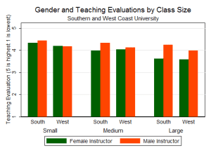
The graph left me with two questions and a comment:
1. If the data were public, why are the names of the universities not given on the graph. Why keep it secret?
2. What do data from other departments look like? Instead of worrying about which of the comparisons above are large or statistically significant, why not just see if these patterns replicate for professors of sociology, economics, etc?
3. I strongly recommend a dotplot or lineplot with error bars, instead of those long bars that make it hard to see the comparisons of interest.
I would ask about differences between the skills of the professors and the mix of courses they get stuck teaching.
We need another example like the Stanford admissions apparently being gender biased ;-)