Someone who wishes to remain anonymous writes:
I’ve been following your blog a long time and enjoy your posts on visualization/statistical graphics matters. I don’t recall however you ever describing the details of your setup for plotting. I’m a new R user (convert from matplotlib) and would love to know your thoughts on the ideal setup: do you use mainly the R base? Do you use lattice? What do you think of ggplot2? etc.
I found ggplot2 nearly indecipherable until a recent eureka moment, and I think its default theme is a waste tremendous ink (all those silly grey backgrounds and grids are really unnecessary), but if you customize that away it can be made to look like ordinary, pretty statistical graphs.
Feel free to respond on your blog, but if you do, please remove my name from the post (my colleagues already make fun of me for thinking about visualization too much.)
I love that last bit!
Anyway, my response is that I do everything in base graphics (using my own defaults), and usually I make a graph by using some previous graph as a template. That works for most of my graphs. Here’s an example, and here’s another.
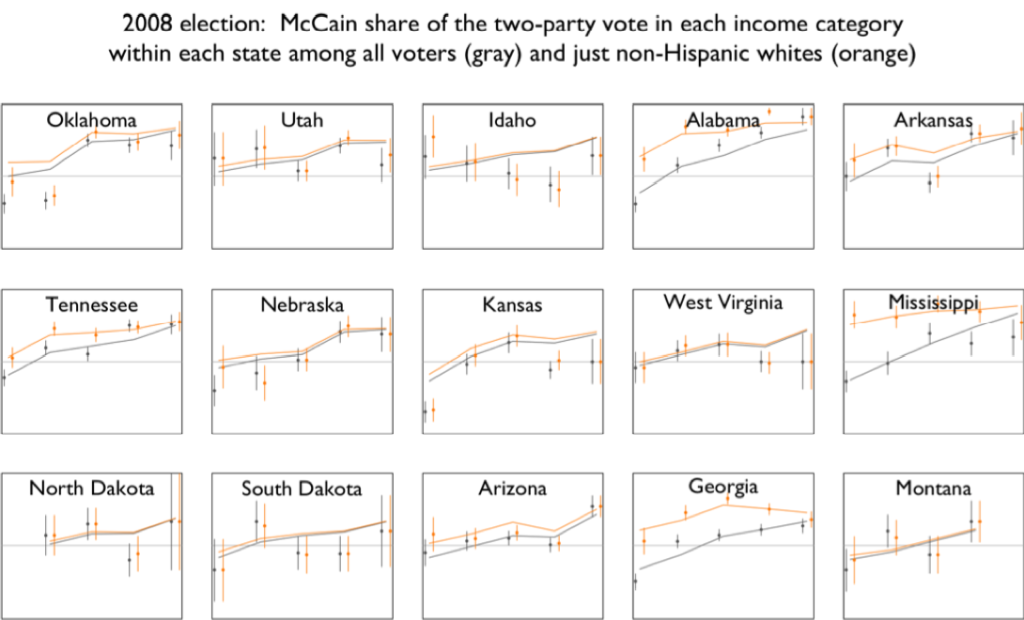
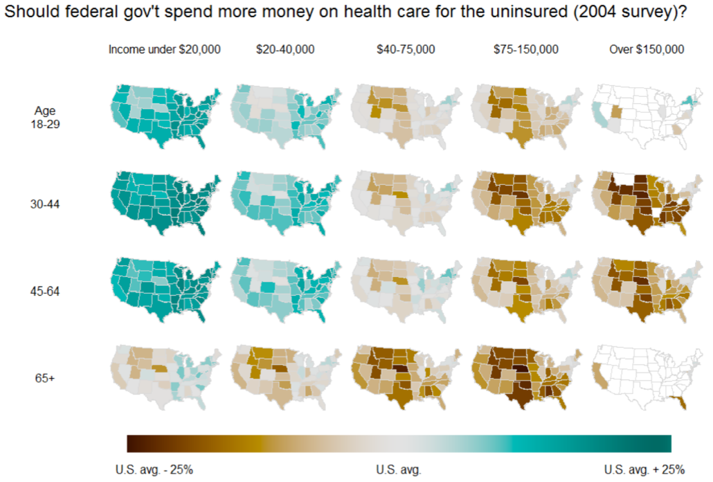
But the beautiful grids of maps (see here, for example), those I did by asking Yu-Sung, Daniel, Yair, etc., to make them, and then going back and forth making them better. That reminds me: I have to finish a paper I’m writing with Yair about the details of what makes these graphs work. We’ve talked about having these maps made by default in the “mrp” package but I don’t think we’re quite there yet.
If I could start over, maybe I’d use lattice or ggplot2. I use what I’m comfortable with, but it’s not always so great. I don’t know that I can make any general recommendations, except that once you have a graph you like, you can use it as a starting point for your next plot. My own graphs have gradually improved over the decades (as I discuss in this presentation). I think someone starting out now should be able to do much better.

P.S. I’ve purposely included some not-so-fancy graphs here (and some made by others working with me) to emphasize that statistical graphics is an everyday job, it’s not just about creating showcase pieces.
I usually start with base graphics. You can combine graph types and graphs from almost any package, and you don’t have to organize your data in a particular way. If I have to do multiple, lattice-style graphs, then I’ll jump straight to the lattice package.
If I’m creating a graph that I want to share and particularly if I’m saving my “recipe” to reuse in the future, I’ll tend to use lattice or ggplot2, since they dynamically adjust to show everything. (The biggest pain with base graphics is that the first plot determines the bounds of the graph, so you often have to dance around with the order in which you plot or with xlim= and ylim= to display everything you want, which is okay for quick graphs but not very useful for when you get a new set of data and want to plot it in the same way.)
When what I want to plot aligns well with ggplot2, it’s magical. When I want to tweak the graph a bit, ggplot2 can be frustrating. I also find that what I want to put into a non-trivial graph requires too much fiddling with data structures for my taste.
I’d love to use ggplot2 exclusively. I like the way lattice works, though combining things on one graph is more complex than I’d like. I end up using base graphics for most plots I do.
@Wayne: I’d love to know what situations you encounter that require data fiddling to work with ggplot2. Maybe you don’t use plyr? It has a similar data philosophy to ggplot2, and works hand-in-hand to solve the data manip side of visualisation. I’ve outline my thoughts on the issue in http://vita.had.co.nz/papers/tidy-data.html
I think Wayne is saying that he has to fiddle with ggplot data structures, not data frames. That is, things like changing the theme etc.
I’m just getting used to ggplot2, I think it’s a fantastic bit of software, but I do find it kind of annoying to try to figure out how to do something as simple as change the title on a graph from the full on ggplot() + … + … formulation (it’s pretty easy with qplot of course, but if you have a complex problem ggplot jumps from simple with qplot, directly to enormously high dimensional)
This is where cheat sheets and examples help a lot though.
“This is where cheat sheets and examples help a lot though.”
Yes indeed.
Since the major revison (0.9.3 ?) some of my old examples don’t work but between the R-help list, StackOverflow and the ggplot2 google groups I’m usually okay.
The things I find most awkward with ggplot2 are cases where I’m working with functional relationships (i.e. a model, but not necessarily a statistical one) rather than data. For example – if I’m making a plot of a family of functional relationships with different parameter values, making figures of probability distributions, or visualizing some ODE simulation results. It’s not a huge deal, there’s always a way to do it with a bit of extra code to package things into a dataframe (qplot may work in some cases).
The other case that’s a bit awkward is if I’m working with inherently dense data, such as image data or a large number of data points. Functions like geom_tile() or geom_point() don’t scale so well speed-wise due to their generality, so I often code up some data reduction steps to work with such data interactively.
None of this is a criticisim with ggplot2, its focus is elsewhere so these particular use cases just take a little extra work.
Yeah, model type data can be a bit of a pain – I have a whole lot of helper functions scattered around the place to make this easier. A better package for visualising models is one of the things on my to do list.
I also agree about the mismatch between ggplot2’s need for data frames and certain types of data (like raster images and maps) – it’s something I plan to work on in a future version.
In terms of data fiddling, it’s getting everything in the proper layout in a data.frame, which might be considerably different from how I have the data for analysis (or the results of analysis, which may be very oddly organized, depending on the package I’m using).
Also — and this may be pilot error — I had quite a few ggplot2 “recipes” break recently. They had to do with plotting, say, a time series, then throwing red bars (or other marks) over select point). I don’t have the ggplot2 code in front of me, but the way I did it worked a while back, but then at some point a new version of ggplot2 came out and either things had changed or you had tightened up error checking and something that shouldn’t have been working — but did — stopped working and I started getting errors that some things were not the proper length. (Sorry for being so vague. For anything fancy, I usually have a saved version of base graphics, lattice, and ggplot2 “recipes”, and I just went with the lattice version.)
FYI I think a big advantage of ggplot2 over lattice is the community at the ggplot2 mailing list: there’s over 3,000 people there who can help you get unstuck. There’s also an active stackoverflow community (http://stackoverflow.com/questions/tagged/ggplot2) if that’s what you prefer.
++ To this comment – I have lost count of the number of times I’ve got round my lack of knowledge based on community discussions.
I am a big fan of ggplot2 – thanks.
Hadley:
Yes, I suspect ggplot2 is better than base graphics, and when newcomers ask how to make graphs, I suggest lattice or ggplot2 (it’s hard for me to choose between them, as I don’t know either, but I’ve heard good things about both). I use base graphics not because I think it’s better but because I’m used to it, I’m at a local maximum. I certainly don’t consider the above post an endorsement of base graphics. If anything, it’s an anti-endorsement in that the above graphs do the job but mostly aren’t so pretty. And the pretty ones took lots of work.
Yeah, I don’t think ggplot2 make senses for everyone – if you already have the tools to do what you need, there’s no point in throwing them out and starting from scratch.
It would be great if you would post the source code for some of your favorite graphs.
Karl:
It would be great if I could find the source code for some of these . . . in the meantime, there is the R graph gallery!
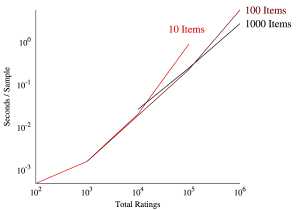
The first graph is actually gnuplot, which I love for its thorough documentation and example suite. The source is pretty straightforward:
#!/bin/bash
end10=`awk -F, ‘{if($2==10) print $4}’ irt_scale.csv | sort -n | tail -1`
end100=`awk -F, ‘{if($2==100) print $4}’ irt_scale.csv | sort -n | tail -1`
end1000=`awk -F, ‘{if($2==1000) print $4}’ irt_scale.csv | sort -n | tail -1`
gnuplot << TOEND
set terminal postscript enhanced color font 'Times-Roman, 20'
set output "irt_scale.eps"
set datafile separator ","
set title ""
set tic scale 0
set border 3
set rmargin 10
set xtics nomirror
set xlabel "Total Ratings"
set format x "10^{%T}"
set log x
set ytics (1e-4, 1e-3, 1e-2, 1e-1, 1e0) nomirror
set ylabel "Seconds / Sample"
set format y "10^{%T}"
set log y
set label "10 Items" at graph 0.65, first "2 * $end10" left font "Times-Roman, 25" tc rgb "#FF0000"
set label "100 Items" at graph 1.025, first "$end100" left font "Times-Roman, 25" tc rgb "#880000"
plot \
"< awk -F, '{if(\$2==10) print \$0}' irt_scale.csv" using 3:4 with lines ls 1 lw 3 lc rgb "#FF0000" notitle, \
"< awk -F, '{if(\$2==100) print \$0}' irt_scale.csv" using 3:4 with lines ls 1 lw 3 lc rgb "#880000" notitle, \
"< awk -F, '{if(\$2==1000) print \$0}' irt_scale.csv" using 3:4 with lines ls 1 lw 3 lc rgb "#000000" notitle
TOEND