Jarad Niemi sends along this plot:
and writes:
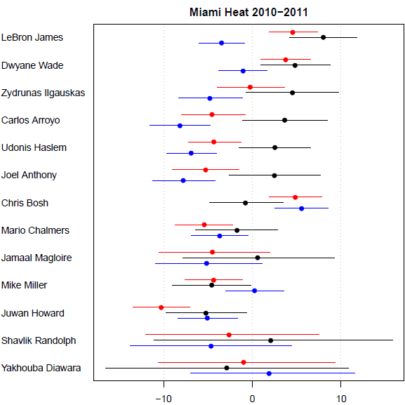
2010-2011 Miami Heat offensive (red), defensive (blue), and combined (black) player contribution means (dots) and 95% credible intervals (lines) where zero indicates an average NBA player. Larger positive numbers for offensive and combined are better while larger negative numbers for defense are better.
In retrospect, I [Niemi] should have plotted -1*defensive_contribution so that larger was always better. The main point with this figure is that this awesome combination of James-Wade-Bosh that was discussed immediately after the LeBron trade to the Heat has a one-of-these-things-is-not-like-the-other aspect. At least according to my analysis, Bosh is hurting his team compared to the average player (although not statistically significant) due to his terrible defensive contribution (which is statistically significant).
All fine so far. But the punchline comes at the end, when he writes:
Anyway, a reviewer said he hated the figure and demanded to see a table with the actual numbers instead.
Oof!
The scale looks like points per 48 minutes. It's a nice plot, the only change I would make is to present the defensive numbers as negative defensive numbers, since values below zero indicate good defense, and Miami has one of the best defenses in the league.
Niemi (and edk) you're very right about reversing the sign for defensive ratings. Other than that, I like the plot a lot. I really don't believe anyone would prefer a table. I know you say someone does, and I can't see why you'd lie about that. I also can't see why the reviewer would lie about it. And yet, I don't believe it. Maybe you made up the story about the reviewer, just to have a punch line?
Is the order of the players significant? Maybe they're ordered by minutes played? They should be in some order, for sure.
I can believe the reviewer didn't like it – though I agree that it's a useful plot.
I've struggled to get similar displays included in scientific papers – as a replacement for (familiar) grouped barplots. Once people take a few seconds to orient themselves to the graph, they're fine, but getting that far involves overcoming a lot of inertia.
Prof. gelmand and commenters,
When faced with such a reviewer, do you just change the graphic for a table? Or you put both, or yet you use a footnote to say that the table was requested by a reviewer? Or you argue with the editor?
thanks fot the advice,
Manoel.
I can see the reviewer's point.
Any plot with "good" going in two directions is a difficult plot.
There's no ordering given on the Y axis (salary? minutes? overall contribution?)
Is there some way in which the x axis is equivalent on offense and defense (not just zero point, but scale)?
The major point seems to be Bosh bashing; if that's the case why not have him first? (or at least the big 3 first).
zbicyclist, I agree that the plot needs to be changed, but I think Niemi is saying the reviewer didn't want a plot at all, he wanted a table instead! I think Andrew goes too far when he says _all_ plots should be tables instead, but this is a case where a good plot would be, conservatively, a zillion times better than a table.
Manoel: it depends. What are the chances the paper be accepted, either way? How much do I think of the paper's results, or the journal – enough to present my message less-than-perfectly? Will the other authors even let me submit the paper with a figure not a table? What other things in the paper are likely to cause disputes?
Sorry to be so pragmatic, but often other battles have to be prioritized.
zbicyclist and phil: the ordering on the y axis seems to be the lower limit of the overall player contribution interval. Admittedly, that is a pretty arbitrary ordering. As it is, the list shows players ranked on their worst night.
zbicyclist's list is great for improving this chart. Sorting out the order is the most important thing. I'd also use a small-multiples format instead of having all 3 series on one chart.
why can't journals accept charts in the main text, and tables in the appendix?
typically tables that try to convey both mean and intervals are unreadable.
the problem with interpreting this model (I'm going off topic) is that the intervals are so wide that there are few statistically significant pairwise differences; even in cases where they exist, we run into the nontransitive problem which is difficult to explain to non statisticians.
Defense should be red.
I have been behind on my RSS reading and just saw this post come up and thought I would respond to some of the questions. First off, I went back to the original referee response and the quote is