While putting together a chapter on inference from simulations and monitoring convergence (for a forthcoming Handbook of Markov Chain Monte Carlo; more on that another day), I came across this cool article from 2003 by Jarkko Venna, Samuel Kaski, and Jaakko Peltonen, who show how tools from multivariate discriminant analysis can be used to make displays of MCMC convergence that are much more informative than what we’re used to. There’s also an updated article from 2009 by Venna with Jaakko Peltonen and Samuel Kaski.
After a brief introduction, Venna et al. set up the problem:
It is common practice to complement the convergence measures by visualizations of the MCMC chains. Visualizations are useful especially when analyzing reasons of convergence problems. Convergence measures can only tell that the simulations did not convergence, not why they did not. MCMC chains have traditionally been visualized in three ways. Each variable in the chain can be plotted as a separate time series, or alternatively the marginal distributions can be visualized as histograms. The third option is a scatter or contour plot of two parameters at a time, possibly showing the trajectory of the chain on the projection. The obvious problem with these visualizations is that they do not scale up to large models with lots of parameters. The number of displays would be large, and it would be hard to grasp the underlying high-dimensional relationships of the chains based on the component-wise displays.
Some new methods have been suggested. For three dimensional distributions advanced computer graphics methods can be used to visualize the shape of the distribution. Alternatively, if the outputs of the models can be visualized in an intuitive way, the chain can be visualized by animating the outputs of models corresponding to successive MCMC samples. These visualizations are, however, applicable only to special models.
This seems like an accurate summary to me. If visualizations for MCMC have changed much in 2003, the news certainly hadn’t reached me. I’d only add a slight modification to point out that with high resolution and small multiples, we can plot dozens of trace plots on the screen at once, rather than the three or four which has become standard (because that’s what Bugs does).
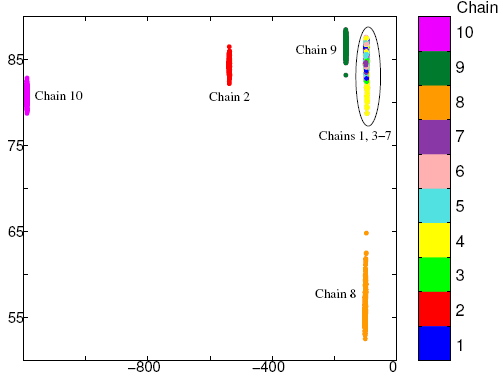
In any case, it’s a problem trying to see everything at once in a high-dimensional model. Venna et al. propose to use discriminant analysis on the multiple chains to identify directions in which there is poor mixing, and then display the simulations on this transformed scale.
Here’s an example, a two-dimensional linear discriminant analysis projection of 10 chains simulated from a hierarchical mixture model:
And here’s another plot, this time showing the behavior of the chains near convergence, using discriminative component analysis:
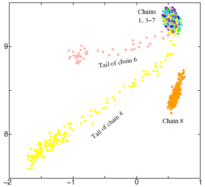
The next step, once these patterns are identified, would be to go back to the original parameters in the models and try to understand what’s happening inside the chains.
Venna et al. have with what seems like a great idea, and it looks like it could be implemented automatically in Bugs etc. The method is simple and natural enough that probably other people have done it too, but I’ve never seen it before.
P.S. I wish these people had sent me a copy of their paper years ago so I didn’t have to wait so long to discover it.
Oh, cool.
Presumably one could plot the loadings of the parameters on the same plot: this might provide a way to see the poorly converging parameters on the same plot.