Alek Tabarrok posts this beautiful graph that was prepared for the ultimate in bureaucratic institutions:
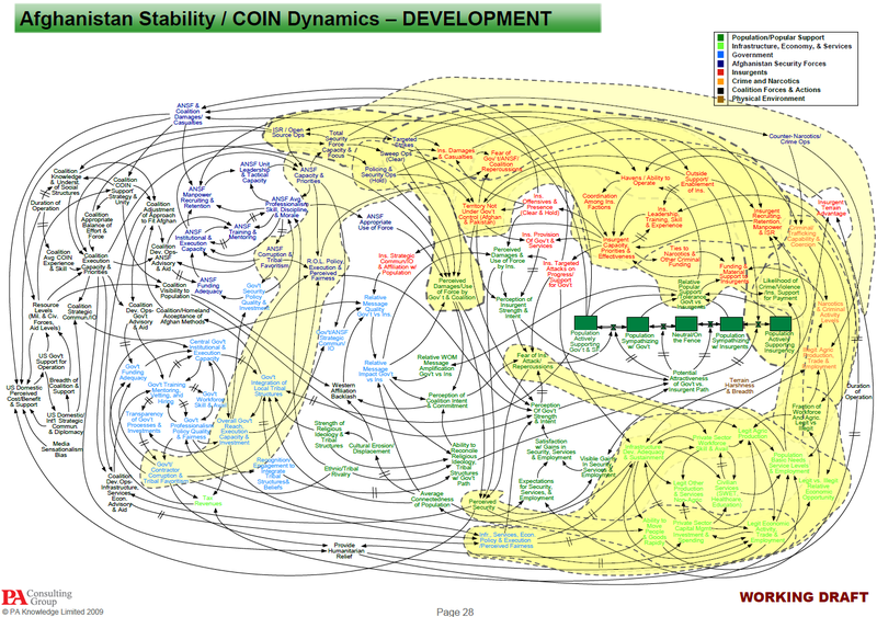
The comments at the blog are an interesting mix of agreement with Alex (people taking the tangled graph as a symbol of the difficulty, possibly hopelessness of the U.S. military effort in the Middle East) and disagreement (people pointing out that large-scale operations are inherently complicated, and the graph is capturing this complexity).
I’ve never been involved in any planning more complicated than setting up a M.A. program, and that had a budget approximately one-zillionth that of the Afghan war. Without any experience in large projects, I will limit my comments to the graph itself.
To start with, I think the graph would be improved by making the arrows lighter–gray rather than black–and maybe by reducing the number of arrows overall. I understand the goals of showing the connections between the nodes, but as it is, the graph is dominated by the tangle of lines.
A larger problem is that the picture gives no sense of priorities. All the items are the same size and it’s not clear where the focus to be. I looked at the original powerpoint presentation, which puts all the nodes in context. It looks like a good presentation. But I can’t really see what’s gained from the super-complicated picture. I can understand the value of a complicated graph showing suppliers and contractors and purchasers and so forth, but I don’t see what you get out of this sort of map where most of the nodes are vaguely-defined concepts.
As I noted above, I’m a complete stranger to the world of military planning. I’m reacting based on my understanding of graphical display: I’m suspicious of the combination of a complex display and lack of precision in the details.
This connects, I think, to my debate with Nathan Yau on the topic of pretty but impossible-to-read data visualizations. I didn’t like the pretty visualizations because, judging them as statistical graphics, they didn’t do a good job of displaying information; Yau liked the visualizations because they grab your interest and motivate you to explore the topic further. The “data visualizations of the year” really are impressive if you think of them as super-cool illustrations (replacements for the usual photos or drawings that might accompany a newspaper or magazine article) rather than as visual displays of quantitative information.
Similarly, I suspect the graph displayed above does not do much to directly help the planning for Afghanistan, but it certainly does a good job at conveying the complexity of the situation! Maybe that was the point.
P.S. I looked carefully at the graph and could only find one nodes that is an orphans (that is, with no arrows pointing toward it). That node: “Media Sensationalism Bias.” Shouldn’t there be another node leading to it, labeled “Pay $$ to friendly journalists”? There are two slides at the end on “Claim the Information Initiative” but I don’t see any discussion there of “Media Sensationalism Bias.”
P.P.S. Full disclosure: some of my own research is military funded. But it’s not related to this project.
LOL
What about a much simpler statement of "the problem"?
You cannot enforce your own values (that's hubris & ethnocentrism) on a society which doesn't want them most especially a tribal society (also Iraq…).
Afghanistan is known as "the graveyard of empires" for some reasons!
Thanks for commenting on the graph as a graph. That is why I am commenting here and not on Marginal Revolution.
I have a hard time trying to figure out how well the graph conveys the information it is trying to convey, because I have no idea what information the graph is trying to convey. The graph is really that bad. If the information is really that complex, and nothing can be simply left out, that graph has to be at least fifteen separate slides.
I looked at the graph and my first thought was that that is a good location for a city. It looks like a map of a harbor.
Many people have argued that the US military now uses powerpoint way too much, and I think that would be an interesting topic of discussion.
The graph appears as to be a graphical representation of a systems dynamics model, – if so, this visual is referred to as a causal loop diagram. This view of such a model shows the entities and general relationships in the model – the detailed relationships are shown in a stock-and-flow diagram (which are more detailed, and even more challenging to digest). If the model is fully specified – it can be evaluated, critiqued, rejected etc quantitatively.
Paul, the graph is in fact a causal loop diagram. It was produced by PA Consultants which acquired a small Cambridge, MA system dynamics consulting firm called Pugh-Roberts several years ago. I've been told that PA is doing a lot of system dynamics work these days and they use these diagrams as a way of specifying models.
There's a good explanation of causal loop diagrams on wikipedia.
Ed, the original powerpoint deck that PA produced was made up of several different slides.
A functioning simulation that can be played with is a much better way to explore a complex system such as this. Causal loop diagrams are often a precursor to designing a simulation and perhaps PA produced one.
Michael: Until I'm given some good evidence otherwise, I'm with Bill Easterly on this one. I can believe that such models could make sense in some settings, but it all seems a bit implausible in this example. For example, how do they plan to quantify "Media Sensationalism Bias"?
Simon Buckingham Shum writes here to defend this diagram, but if you read his post carefully, he's really just defending these graphs in general, not in this particular (multi-billion-dollar) case.
Andrew, I agree. To clarify my earlier comment, I don't think these diagrams communicate anything other than this is a complex problem. The diagrams are off-putting and confusing. I just thought the back story was interesting.
That said, I often develop similar diagrams with clients as a way of involving the client in a computer model building exercise. When you start with a blank page and build a diagram like this with a team, the process of creating the diagram can be a useful way to capture the thinking of the subject matter experts and provide a roadmap to modelers.
But too often the SMEs and modelers that developed these diagrams become enamored with it and want to share it with others as a way of showing the complexity and sophistication of their thinking. As happened here, that nearly always backfires.
The proper use of these diagrams is similar to a wireframe when developing a software application. The diagrams are a good way for SMEs and modelers to communicate their understanding to each other in early drafts before the real modeling work begins, but that's it.
HI,
I agree that the connections and links here are complicated, like reality.
I hope it is a sketch of a dynamic model that could be used answer questions like 'how do we reduce heroin production without all the farmers starving?'.
As to software the diagram is also discussed over at Mark Bernstein's blog http://www.markbernstein.org/Dec09/Counterinsurge…
Perhaps also, software wise Flyinglogic at http://flyinglogic.com/ would be fun. It actually can be used to run dynamic models.
Dave
These diagrams are not supposed to convey any information! As others have said they're just representations of system dynamics models (http://en.wikipedia.org/wiki/System_dynamics).
These models are helpful to make decisions when there are many interacting factors affecting the state of the system, like in a… war.
They're used to MAKE decisions; you program all the relations in a computer and then simulate what can happen with different courses of action.
DaveG, Jenizaro: As I commented above, until I'm given some good evidence otherwise, I'm with Bill Easterly on this one. I can believe that such models could make sense in some settings, but it all seems a bit implausible in this example. For example, how do they plan to quantify "Media Sensationalism Bias"?
As a causal loop diagram it is a map of a much more complex stock and flow diagram for a systems dynamics model.
You don't open up a map book and say 'why have they put all these roads on here when I'm only interested in national parks and this particular route between them.' In the same way, I think you are expecting this diagram to convey a single, simple point, when actually it contains a host of interrelated information that may become relevant to the peruser.
Moreover, if this model has been built in concert with the client, it will have become a record of their shared understanding, and each element relate to possibly hours of discussion, argument and breakthrough. The point of having it all there is having it all there.
In some ways its complexity might actually be the point, not just to communicate how complex the problem is but actually to show that there are clearly defined paths one can chart through the issues, finding solutions for complex, seemingly intractable problems.
As for quantifying intangibles such as “Media Sensationalism Bias”, there are a whole host of techniques available for reliably quantifying subjective measures, I have open on the desk in front of me Keeney and Raiffa’s ‘Decisions with Multiple Objectives’ which has numerous chapters for putting together such scoring systems, or you could try Doug Hubbard (http://www.amazon.co.uk/How-Measure-Anything-Intangibles-Business/dp/0470539399/ref=sr_1_2?ie=UTF8&s=books&qid=1262710692&sr=1-2 is quite good) and his method of “expert calibration”, or in fact some kind of subjective enumeration technique – the possibilities are vast.
The negative commentary this has received seems largely to be fear of the unknown, which I thought as statisticians you would be particularly keen to avoid.
While the graph may have meaning, and may be convey that meaning on close analysis, from a casual observation point of view it is quite overwhelming.
Validating the key points of variance in the graph, or the areas which have the greatest influence would be extremely difficult due to the number of interactions and latency in interactions. Do you have any mechanism to take this latency into account?