I said I wouldn’t do more posts on the election, but . . . Eric Rauchway merged our provisional county data with Census numbers on %black and made some graphs, which I played with a little to get the following:
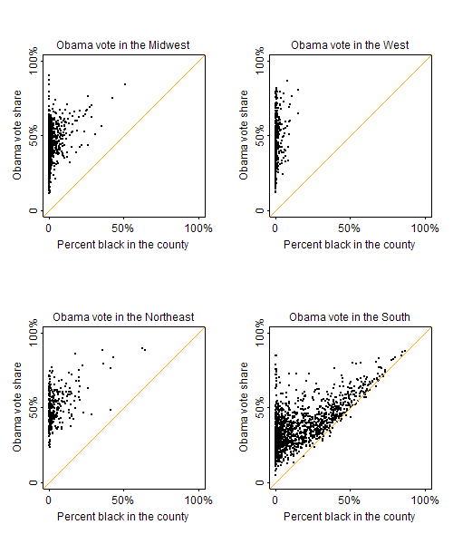
Percent black acts as a floor on Obama’s vote share; beyond that, it predicts his vote better in some regions than others.
But really there are two things going on. First, Obama’s getting nearly all the black vote; second, depending on the region, whites are voting differently in places with more or fewer African Americans.
Then I had a thought. Obama got 96% of the black vote. If he got 96% in every county–which can’t be far from the truth–then we can use simple algebra to figure out his share of the non-black vote in every county. If B is the proportion black in the county and X is the (unknown) Obama vote share among non-blacks, then, for each county,
obama.vote = 0.96*B + X*(1-B)
And so
X = (obama.vote – .96*B) / (1 – B)
This is only an approximation–for one thing, it assumes turnout rates are the same among blacks and others–but it can’t be too far off, I think. And it leads to the following graph:
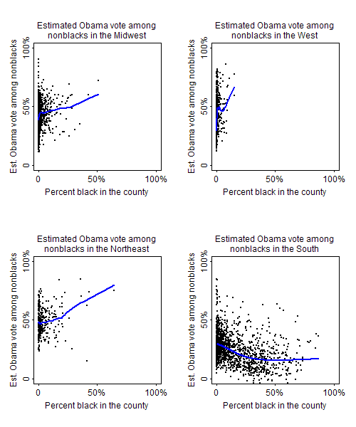
(Lowess lines are shown in blue.) None of this is a huge surprise: outside the south, places with more African Americans tend to be liberal urban areas where people of other ethnicities also vote for Democrats; in the south, many African Americans live in counties where the whites are very conservative.
Notes:
1. These graphs are non-blacks, not whites. Some of the variation has to be explainable by the presence of other minority groups.
2. For a few of the southern counties, our estimates of X are negative; that just means that Obama got less than 96% of the black vote there, or there was differential turnout, or some combination of these.
P.S. More graphs here (from Ben Lauderdale).
Pingback: Race, region, and Obama. « The Edge of the American West
Pingback: More race, region, and Obama. « The Edge of the American West
Pingback: Estimated votes by county among non-blacks | Red State, Blue State, Rich State, Poor State