I said I wouldn’t do more posts on the election, but . . . Eric Rauchway merged our provisional county data with Census numbers on %black and made some graphs, which I played with a little to get the following:
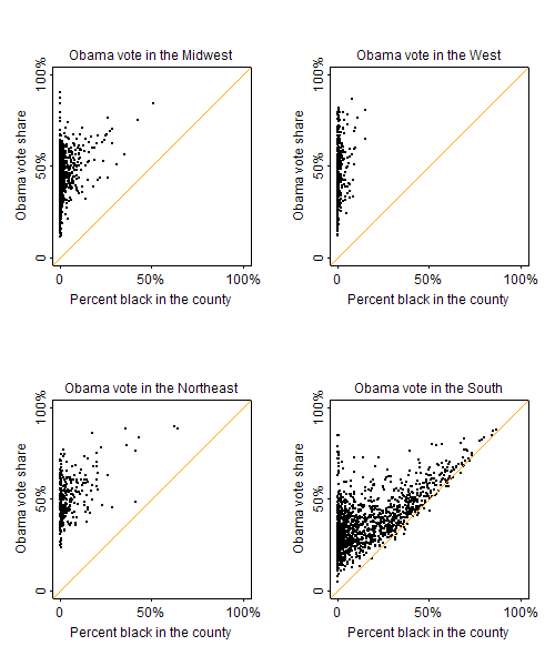
Percent black acts as a floor on Obama’s vote share; beyond that, it predicts his vote better in some regions than others.
But really there are two things going on. First, Obama’s getting nearly all the black vote; second, depending on the region, whites are voting differently in places with more or fewer African Americans.
Then I had a thought. Obama got 96% of the black vote. If he got 96% in every county–which can’t be far from the truth–then we can use simple algebra to figure out his share of the non-black vote in every county. If B is the proportion black in the county and X is the (unknown) Obama vote share among non-blacks, then, for each county,
obama.vote = 0.96*B + X*(1-B)
And so
X = (obama.vote – .96*B) / (1 – B)
This is only an approximation–for one thing, it assumes turnout rates are the same among blacks and others–but it can’t be too far off, I think. And it leads to the following graph:
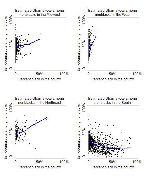
(Lowess lines are shown in blue.) None of this is a huge surprise: outside the south, places with more African Americans tend to be liberal urban areas where people of other ethnicities also vote for Democrats; in the south, many African Americans live in counties where the whites are very conservative.
Notes:
1. These graphs are non-blacks, not whites. Some of the variation has to be explainable by the presence of other minority groups.
2. For a few of the southern counties, our estimates of X are negative; that just means that Obama got less than 96% of the black vote there, or there was differential turnout, or some combination of these.
That's an excellent piece of lateral thinking.
X axis should be logarithmic I think. Too much of the data is compressed up against the left side.
It would be interesting to know whether the white vote or other vote groups are sensitive to black percentage even among the areas where the black population is a very small fraction.
Hm:
So you assume the most extensive Democratic GOTV campaign in history accomplished nothing?
Your two notes seem to indicate there's something wrong with your assumptions.
For Georgia and quite a few other states, the actual black, white, and other turnout was recorded and is avalable from the state secretary of state. Why not get the actual data and use that?
Also, this:
Probably that explains Alaska and Montana, two states with few blacks that still voted for McCain. Or not.
More assumptions than evidence.
Jayskew,
1. I'm not assuming that the get out the vote campaign had no effect, just that the eventual turnout rate among blacks aren't much different than among others, by county. You can play around with the formulas above and see how things change if you allow black turnout to be higher in some places. I don't think it will make big differences in the results.
2. Getting data from Georgia and other states seems like a good way to validate and improve the model. I agree with you that somebody should do this.
3. I don't understand what you're saying about Alaska and Montana; these Republican-leaning states seem to be consistent with the general pattern noted.
4. I don't know why you say "more assumptions than evidence." I had over 3000 data points and only one assumption!