John Kastellec made this graph of seats and votes in 2006 and 2008. For each year, the dot is what actually happened and the line is our estimated seats-votes curve based on modeling from the previous election year.
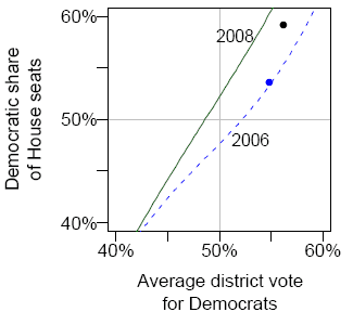
The Democrats did well in both years, but they didn’t get as many seats as we would’ve expected, given their vote share. As I’ve already discussed, the Democrats’ 56% share of the average district vote was pretty impressive, a 5.7 percentage point gain since 2004:
But the Democrats performed less well than expected in converting votes to seats. This explains to me why Charlie Cook et al. felt that the Democrats’ performance was disappointing. At the level of voters, however (and of public opinion), the party did fine in congressional voting.
How much is this data skewed by the number of non-contested seats?