Amazon.com has this cool website showing which sorts of political books people are buying in which states:
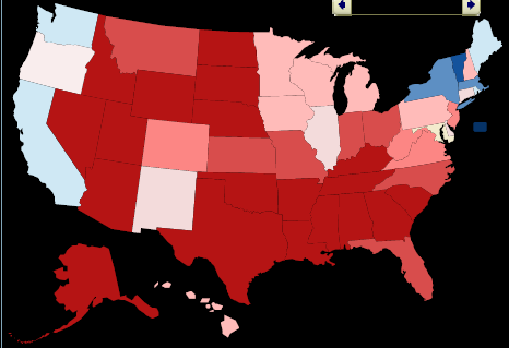
What struck me was the similarity of this to the “voting patterns of the rich” map from our book:
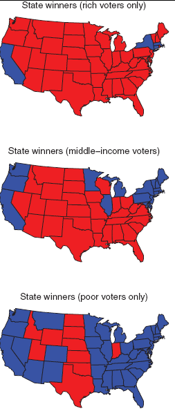
I wonder what data from Wal-Mart from Wal-Mart would look like. Maybe like one of the lower of the two maps? I’m not sure, though, since, even at Wal-Mart, buyers of political books are more politically active and thus maybe more like “rich people” in their red-blue divisions.
At one time Walmart was a pretty good site to buy books, even high level mathematics books. They were so cheap that they even beat Amazon even though you have to pay sales tax when ordering from Walmart. Today the situation is different. Nevertheless don't think of Walmart customers as necessarily unintellectual. On some items they have the absolute best price anywhere.
Is there some subtlety to the shading that I don't grasp? Or are there just a whole lot more conservative political books sold than liberal ones? (This might be a general phenomenon, or a phenomenon connected to the existence of one or two mega-bestsellers on the right during the timespan indicated.)
My calculation is based on the fact that Texas looks like it should overwhelm New York, and I would guess that Georgia and Florida together beat out California, based on the darkness of shading.
Actually, it's extremely interesting looking at different time periods. If you go back a couple months in 2008, you start to see some striking differences from any of the income-based maps, because Montana and North Dakota turn blue (or almost blue) in several of the months.
And if you look at 2004, for most of the year almost the entire country is fairly dark blue, until July or August of that year when everything turned red. Was there a swift boat book as well as the ad?
I never really thought of using data such as the amazon purchases. The graph pretty much represents what I thought, but what data could we find from other sources(like walmart as you mentioned)?