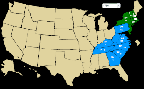
Katy Gartside pointed me to this site. It’s fun to see the new states gradually being added as the years go on. Here was the exciting 1796 election. (At that time most people weren’t allowed to vote.)
And here’s the Twentieth Century Reversal. First, the McKinley-Bryan matchup of 1896:
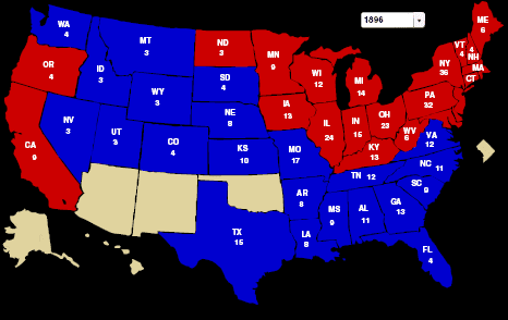
Red states in the northeast, upper midwest, and west coast; blue in the south, plains, and mountain west. That sounds right . . . hey, wait a minute!
Let’s go to the Bush-Gore map from 2000. The red states have switched to blue and vice-versa:
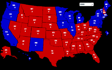
See here for more on the Twentieth Century Reversal, including some scatterplots. It turns out that, at the local level, it was not a simple switching of red to blue or a simple switching of party positions.
P.S. The historical maps on the above-linked site are great, but don’t take the probabilities on the site seriously.
Pingback: DYSPEPSIA GENERATION » Blog Archive » Cool historical maps