Below are 50 little graphs (from chapter 5 in the Red State, Blue State book) showing the 90th percentile and 10th percentile in income, within each state, for the past forty years. The patterns are pretty striking: the high end has increased pretty consistently in almost all the states, and the low end increased a lot in poor states, especially for the first half of the series. I don’t really know what more to say about this–we made the graphs because we are trying to understand the differences between rich and poor states in the past 20 years, and what has made them into “blue” and “red” states–but the graphs are full of interesting patterns. Incomes are inflation-adjusted and presented on a logarithmic scale (with a common scale for all the graphs), and the states are ordered from poorest to richest.
OK, here’s the picture:
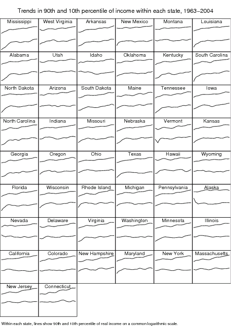
The states above are ordered from poorest to richest.
And here are the trends since 1981, plotted vs. avg income within states:
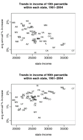
In poor states, the poor have been doing better; in rich states, the rich have been doing better.
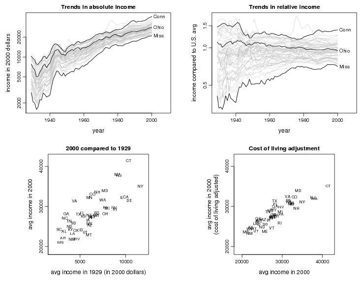
Income inequality between states
All states have been getting richer over the decades (as measured by average real incomes). Up until about 1980, income inequality between states decreased, then since then it’s increased slightly (which is consistent with the above scatterplots). Here’s the key picture:
Further discussion is here.
Pingback: Thick Culture » County Inequality and Party Vote