John Sides posts these useful graphs:

As John writes, “The party loyalty of Democrats has been increasing over time and has essentially hovered at 90% since 1992. (And Republicans are similarly loyal to the Republican nominee.)” Here’s the story from the 2000 election:

To which I’d also add this (from this paper with Joe Bafumi and David Park):
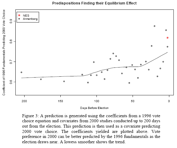
This shows the improvement in prediction given party ID and also demographics and political ideology.
The short story: voters are more predictable than they themselves realize.
P.S. John’s graphs are fine, but the y-axis shouldn’t go below 0 or above 100%.
And how about labelling the x-axes. I assume the first one is year, but what is the x-axis for the second?
Grr.
It's a William S. Cleveland thing. His "Elements of Graphing Data", published in the Eighties, would rather keep the box out of the way of the data than have a line indicating the limits of the data. I disagree, and, like Tufte, I don't see the need for any box at all if it's not going to indicate real limits.
R is full of Clevelandisms, which is part of what stops me from getting into it. I'm aware I could probably hack the default code to get rid of them, but I'd have to get deeply into R first. Catch 22.
(lowess smoothed trend lines is a *good* Clevelandism though, and I wish someone would implement it in VBA for Excel :-)
Bob O'H: the x-axis is day of interview from roughly mid-December 1999 to Election Day 2000. If you read the original post, it's clear. Apologies.
Andrew, re the y-axis: It's a Stata default. I've never thought about it, and I guess I don't have strong feelings either way. If the graphs were for publication rather than a blogpost, I would probably ditch the box, as Derek suggests.
John,
Yes, this was more of a criticism of the defaults than a comment on your particular graph.