Some browsers don’t seem to be able to display this image very well for some reason, so you may need to try the PDF version.
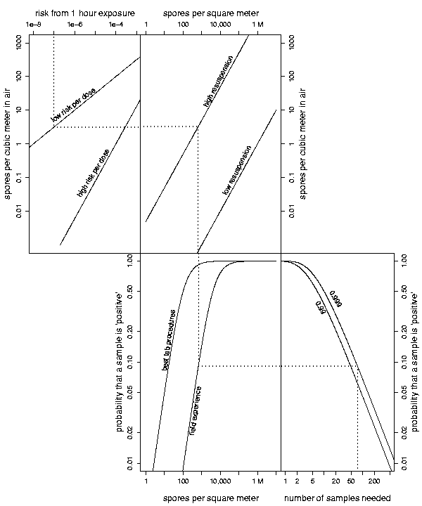
This is a rather complicated graphic that relates an acceptable risk of contracting anthrax (upper left) to the number of samples you should take to check for anthrax in a building (lower right). The relationship between risk and airborne concentration of spores is very uncertain; the relationship between airborne and surface concentrations is highly variable, depending on activity levels and surface type and other factors; detection probabilities can vary quite a bit; and you might decide that you want to be 99% sure or 99.9% sure that, if the building is contaminated at an unacceptable level, you will obtain at least one ‘positive’ sample.
I like this graphic: I think that by playing around with it for a few minutes, you can understand how the various assumptions affect the outcome. I think it is more effective than, say, 8 different plots of “number of samples needed” versus “acceptable risk level”, representing different combinations of assumptions for dose-response, resuspension, and detection probability. But a statistician friend says it’s “too clever by half.”
What do you think?
This might be where multimedia wins the day. If one could click at any point so the dotted line updates to intersect the point, then it would be a lot nicer, along with keeping the calculation transparent to the reader.
I like it! If this is too clever by half, I wonder what your friend would say about Lipka's Graphical and Mechanical Computation? (http://preview.tinyurl.com/ytfnou — see, for example, figure 37 or perhaps something like the integraph in section 109)
Phil,
The graphs don't show up clearly on my browser.
Rather than specifying dimensions for the image in your html code that differ from the actual image dimensions, you should shrink the image using any number of available software options. Upload the newly shrunken image and include that in your post in place of the large image that is artificially reduced in size (and drastically reduced in resolution).
It seems that some browsers do not display the image well (it looks fine in Safari and Camino, so I was unaware of this problem). Sorry about that. Some slow news day, I'll re-post a modified version that is lower-resolution from the get-go.
I vote All Together Too Clever By Half, under the proviso that I don't know the importance of several items listed.
Let's suppose I run a government office that has just received a letter full of fine, white powder. The envelope wasn't even opened; from the puffs of powder coming out of it as it was handled, it was clear that something was amiss. The envelope has been quarantined, and we need to figure out the risk of contracting anthrax from sampling the area…
Is that even what this graph is meant to help us with? If I'm the boss at the government agency, I decide the odds of contracting the disease that I find acceptable, and then I tell the CDC people to do the appropriate number of tests? Let's assume so.
I start at 55, no 60, no 75 samples? The scale makes little sense to me. So, let's say they take 75 samples, they have a…what, .08 chance of a positive result, which tells me something — I'm not sure what — about the anthrax's density both on surfaces and in volumes. And from that, I get the odds that my secretary will get sick from sitting at her desk. Wait, is that right?
There's only a .08 chance of success if I have the CDC team do 75 samples. But I want a higher true-positive rate than that! So, I need the CDC to do over 900 tests to get a reliable result about whether my secretary will get anthrax?
It is confusing the devil out of me. Even if how it was to be used was clear, it has problems still. The scales for number of samples and probability of detection seem nonsensical to me. They're not linear, and they don't look logarithmic.
Also, where clearly defined curves exist, why do they need to be included? Why do the volume and surface concentrations both need to be there if they're related by a well-defined curve.
I'm happy to assume that my knowledge is insufficient to really give a critical assessment of the graph. But, until it is explained, it looks sketchy to me. But, our experiences may not match.
Caveat: I've mentioned before that I work for local government, and that people in local government are particularly ripe to be exploited by snake-oil peddlers. So, I may be a skeptic.
You may find it interesting to note that these types of connected graphs are somewhat common in aircraft manuals. Say you want to figure out how much runway you'll need to takeoff. There are a number of factors to take into account — runway surface, dray or wet, altitude, atmospheric pressure, temperature, aircraft weight (passengers, luggage, and fuel), wind, etc. Some manuals use a series of tables. Others use this style of connected graphs where you add a variable at each turn.
I found this examle on the web:
http://virtualskies.arc.nasa.gov/weather/youDecid…
I like them. By playing with the graphs, you can learn about the basic relationships b/w the variables.